TAALEEM SCHOOLS
Adding relevance and
purpose to a cluttered
IB school system
Creative Direction
Creative Strategy
Brand Design
Tone of Voice
Taaleem is one of the largest education providers in the United Arab Emirates. Part of their 2019 objectives was to refresh their brand communication. To create awareness and consideration in order to increase enrollments that had dropped dramatically to their competitors. One of their biggest steps was to strengthen brand perception through a change of strategy and a brand refresh that would unify all schools. Creating a solid, meaningful overall identity that would reflect the common values of Taaleem Schools.
The 4 main IB schools were the first on the list.
Our mission was to transform Taaleem schools on a level on its own. Where students are first, education is structured and every school is part of one solid overall foundation. To strengthen brand perception and bring Taaleem Schools closer to people's hearts.
Taaleem Schools Before


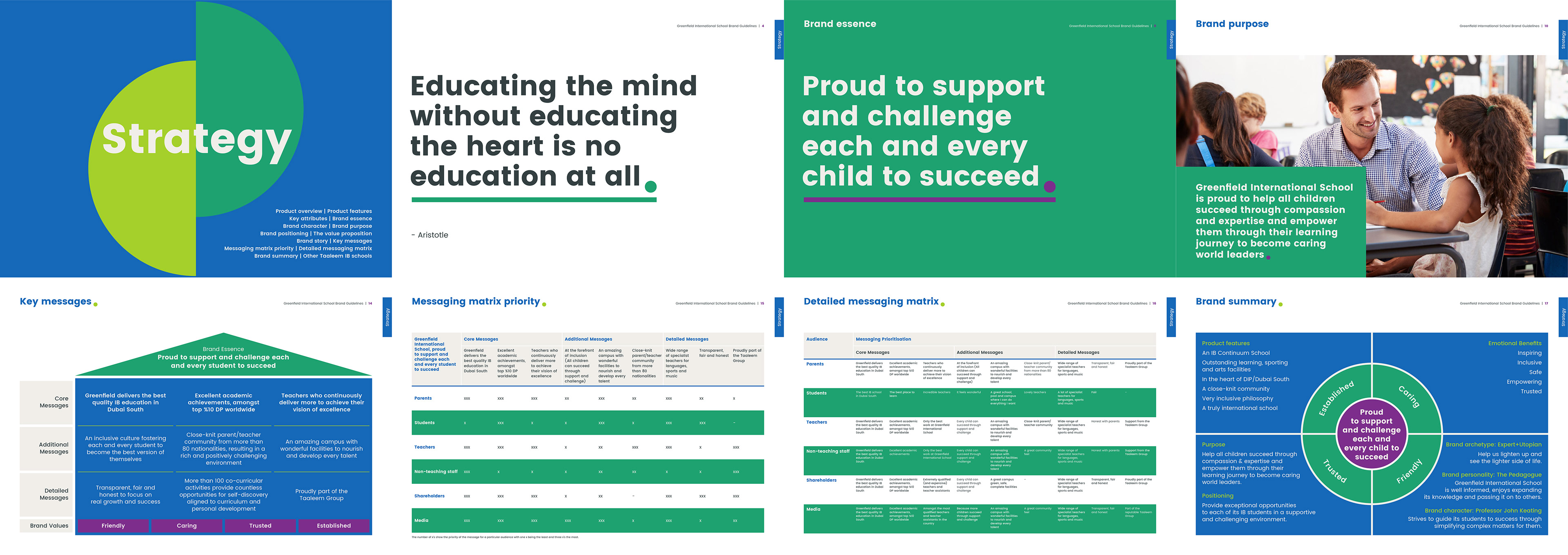
A Strategy to unify
and to differentiate.
We needed to bring forward the principles of Taaleem schools through a clear strategy that was both unified and diverse at the same time.
Understanding the overarching principles of Taaleem Schools was important to understanding and defining each schools individually.
Taaleem schools are not about tradition - they are about innovation and transformation
Taaleem schools are not about reenforcing students what to learn - they are about teaching students how to learn
Taaleem schools are not about controlling - they are about empowering and encouraging
Taaleem schools are not about defining students path - they are about guiding and giving students the tools to define their own path.
Taaleem schools is not about building an ideal leader of tomorrow - but helping and guiding the students to become the leaders they want to be.
Every school highlighted these same principles in their own way. Reflecting their brand essence and their individual brand personalities that sets them apart from each other, but keeping the values and foundations that brings them together..
Every School has
a different Mission.
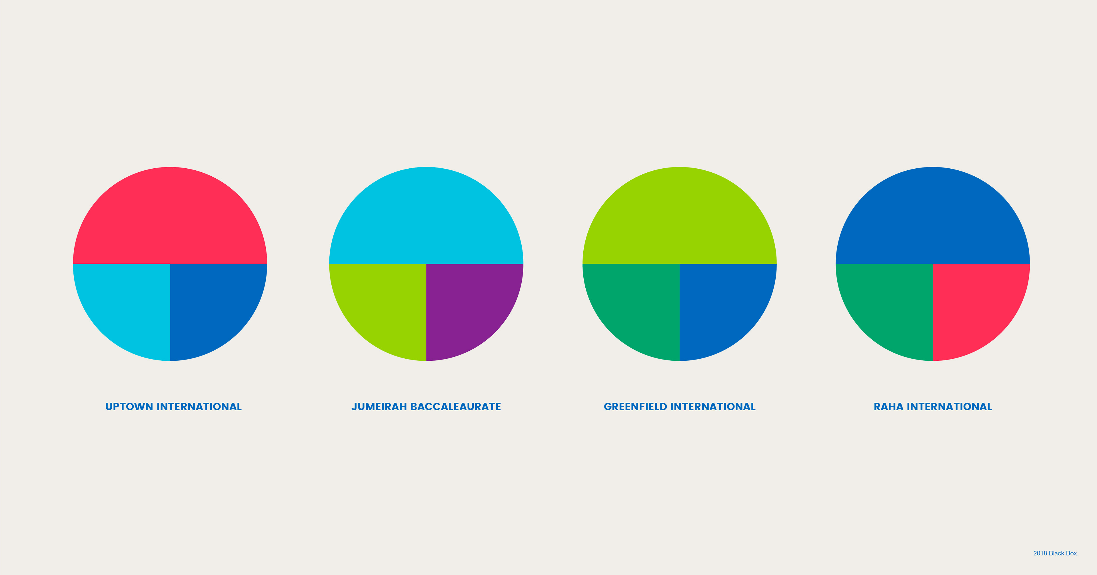
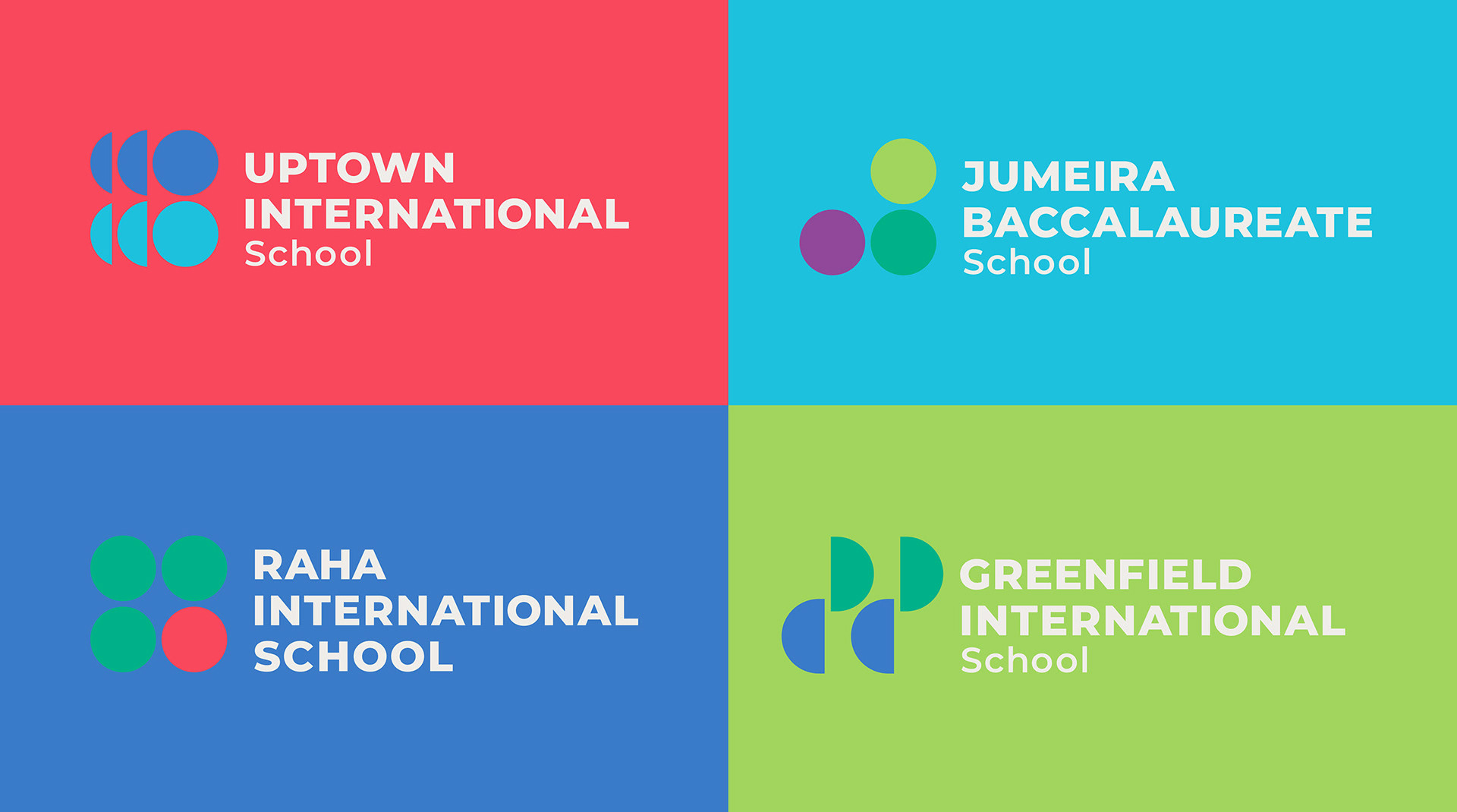
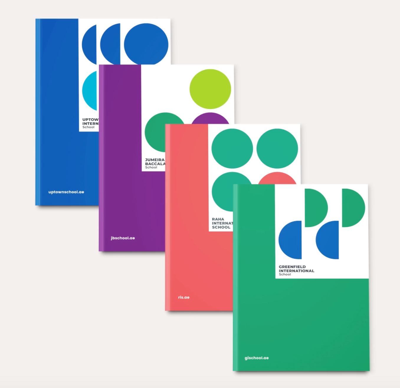
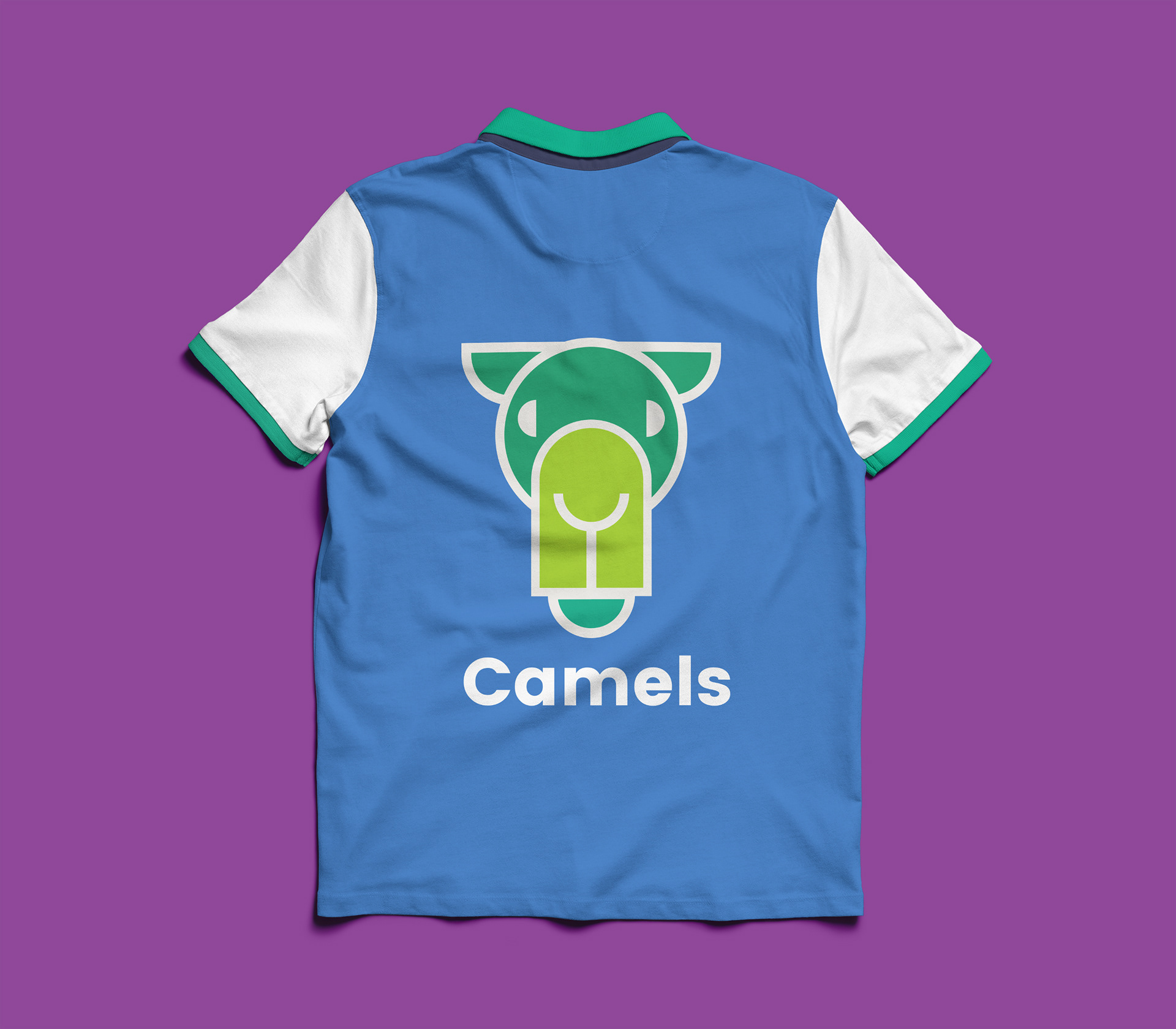
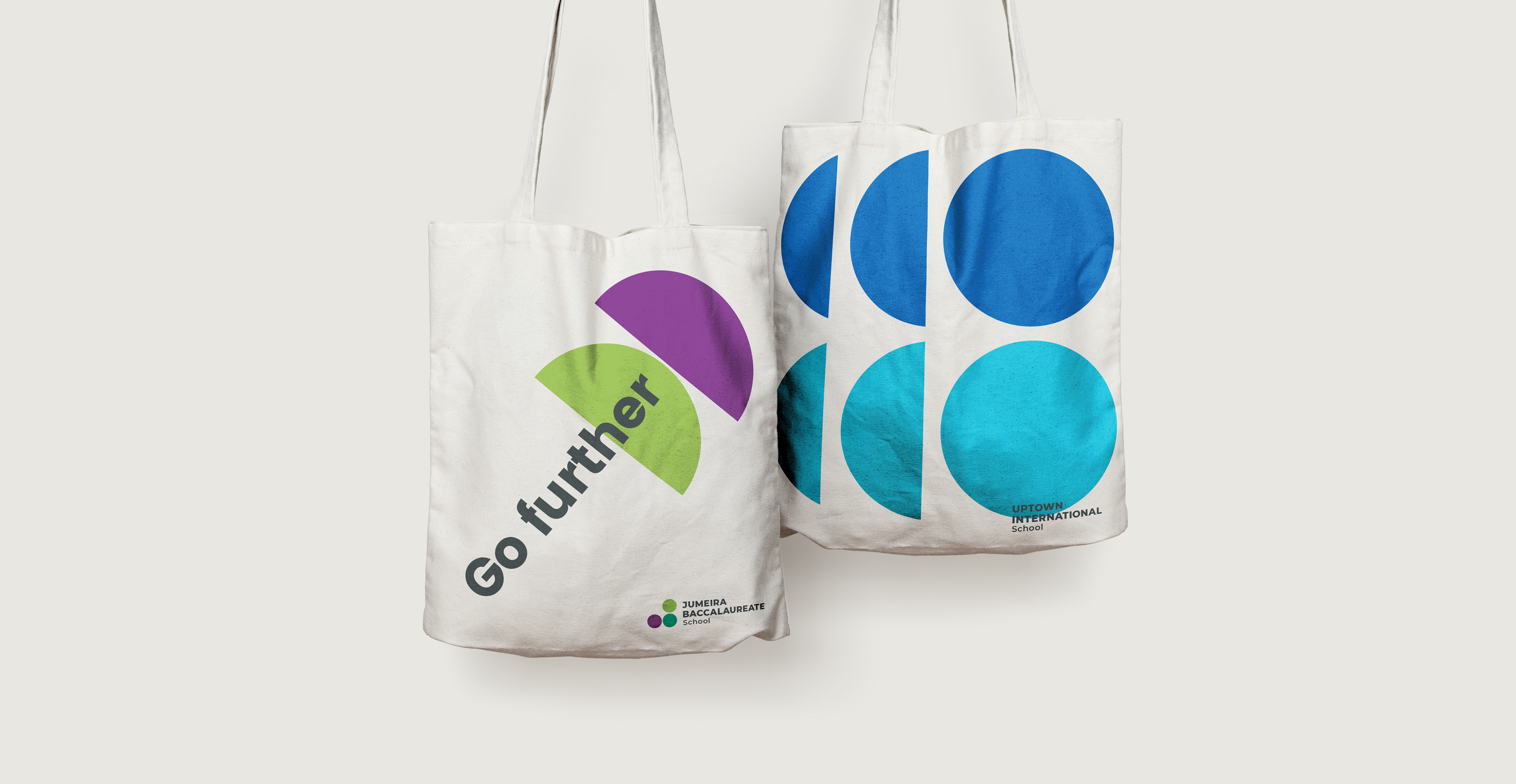
The brand architecture was key to bringing the IB schools together and at the same time, telling their brand stories through differentials that were unique to each school. Through very simple shapes reminiscent of our pre-school basic education templates, we created a logo system that would represent each of the schools visions.
IB Schools' Visions .
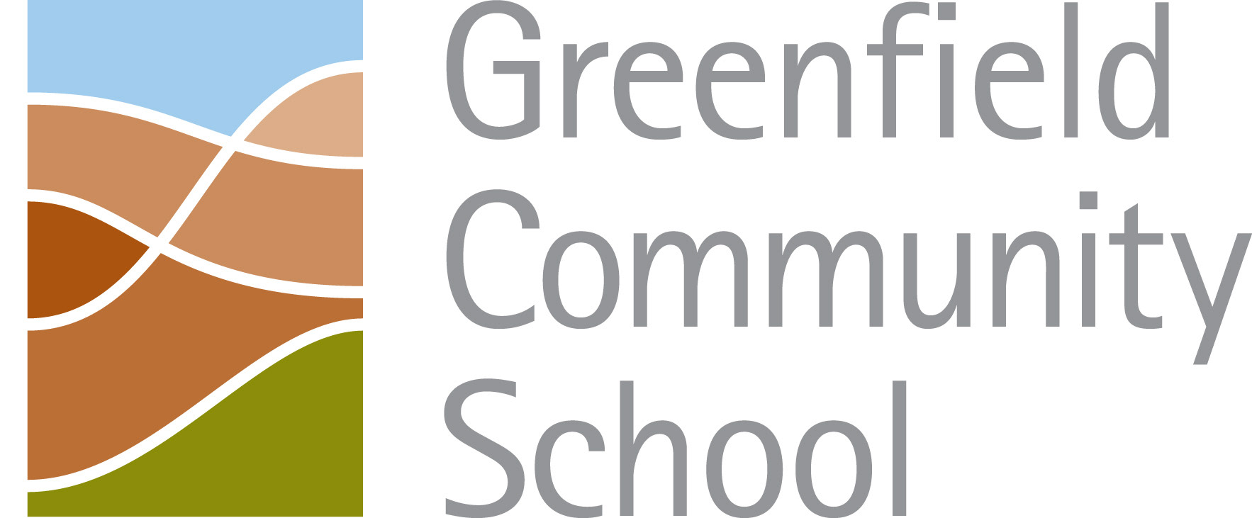
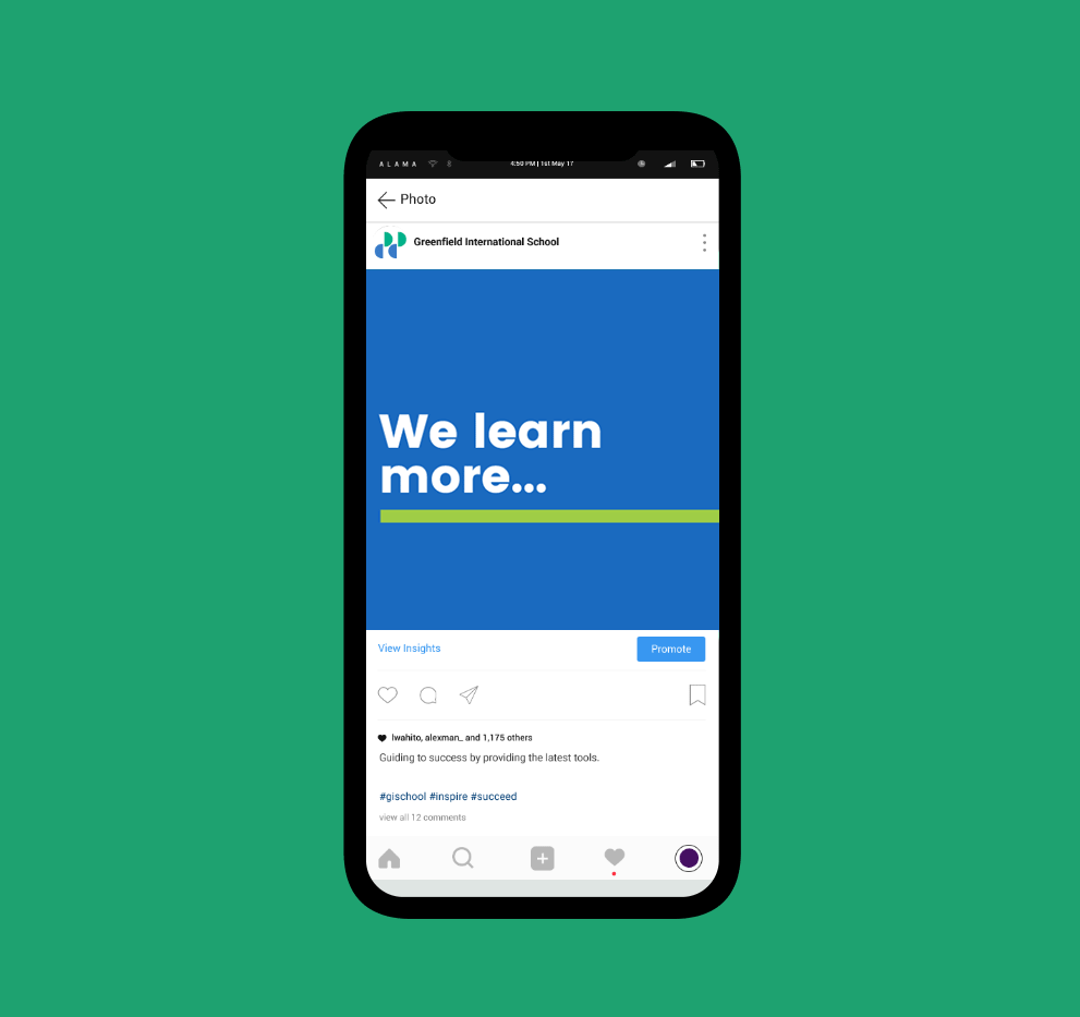
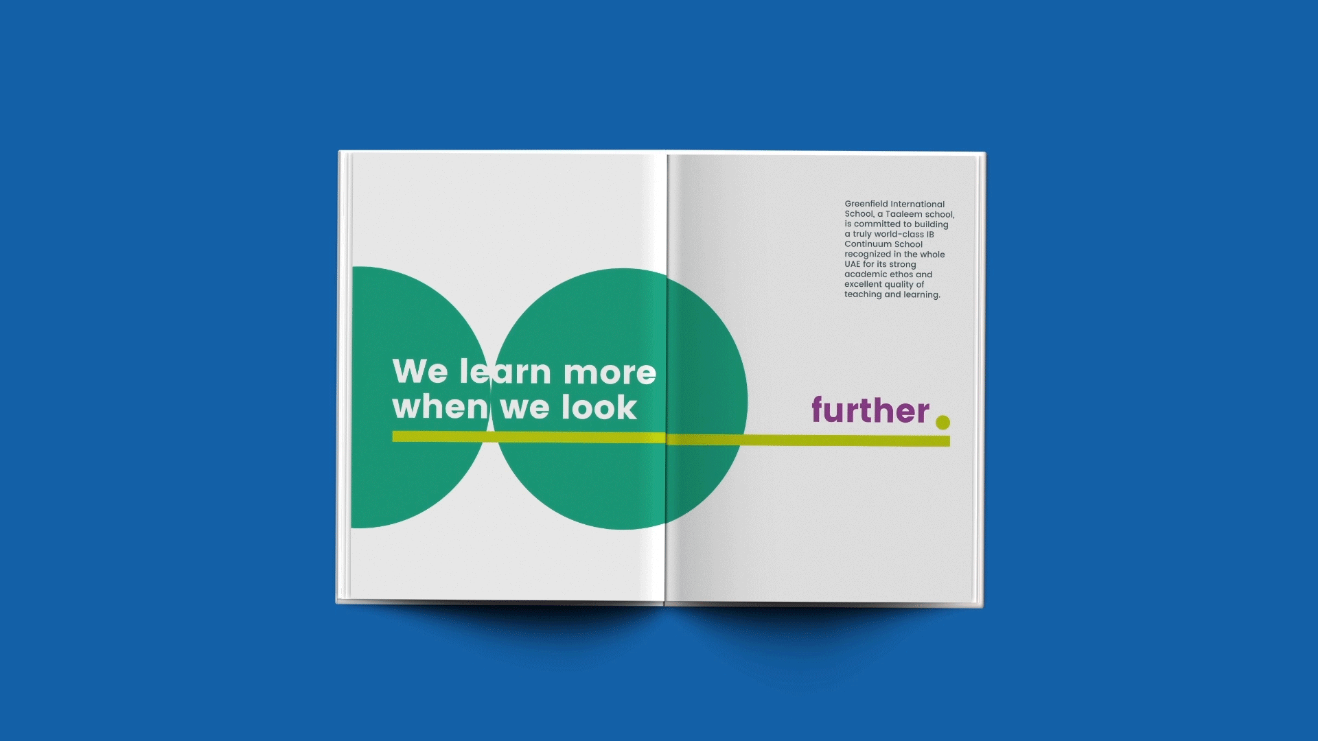
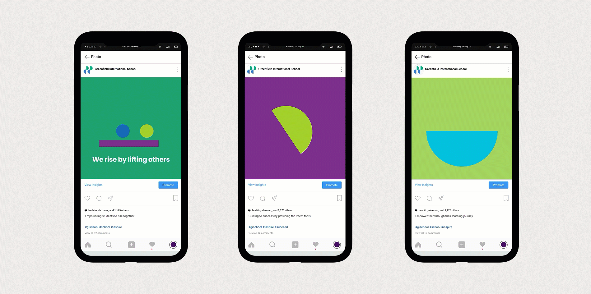
Greenfield International is about Going Hand in Hand
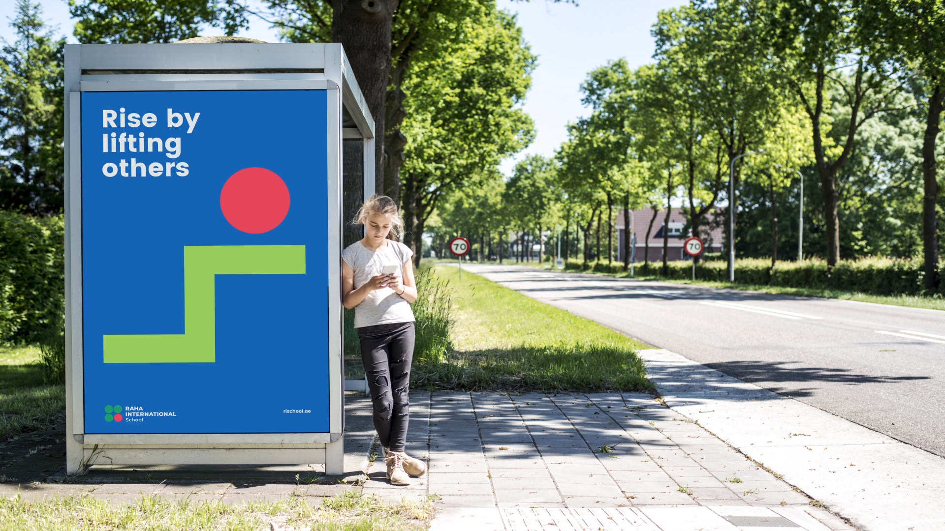
Jumeira Baccalaureate is about Putting Others First
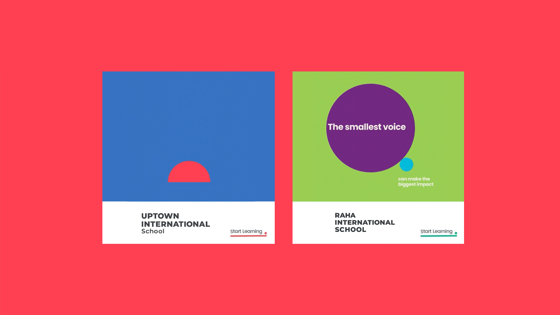
Uptown International is about Thinking Ahead
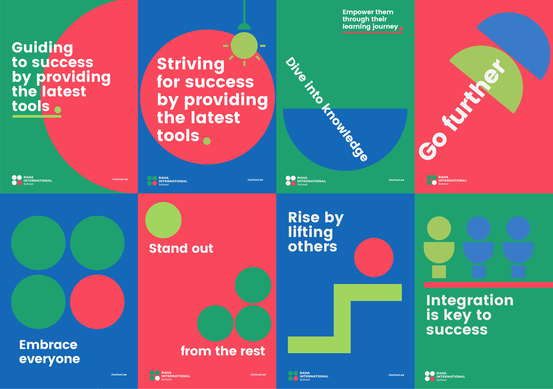
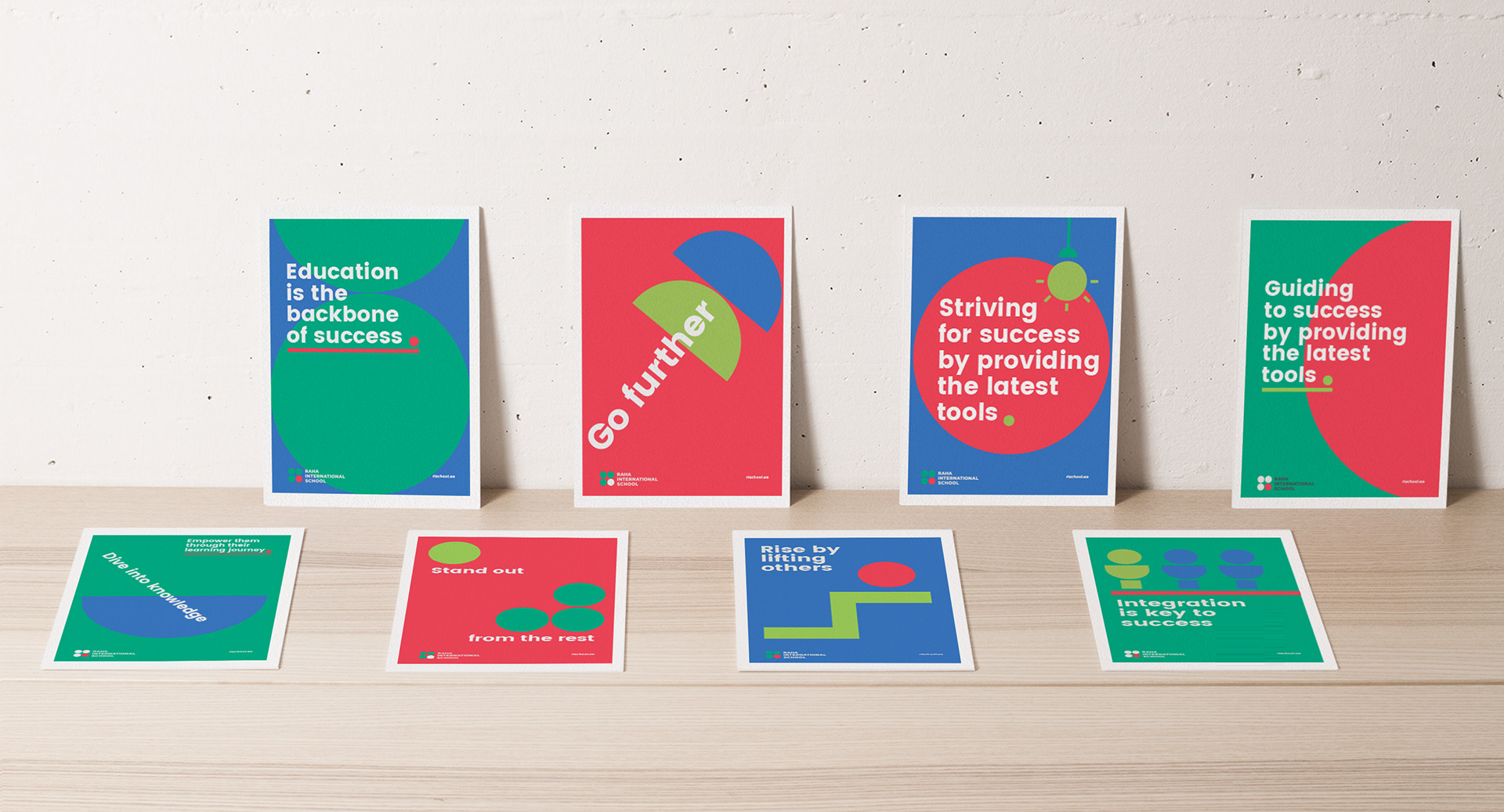
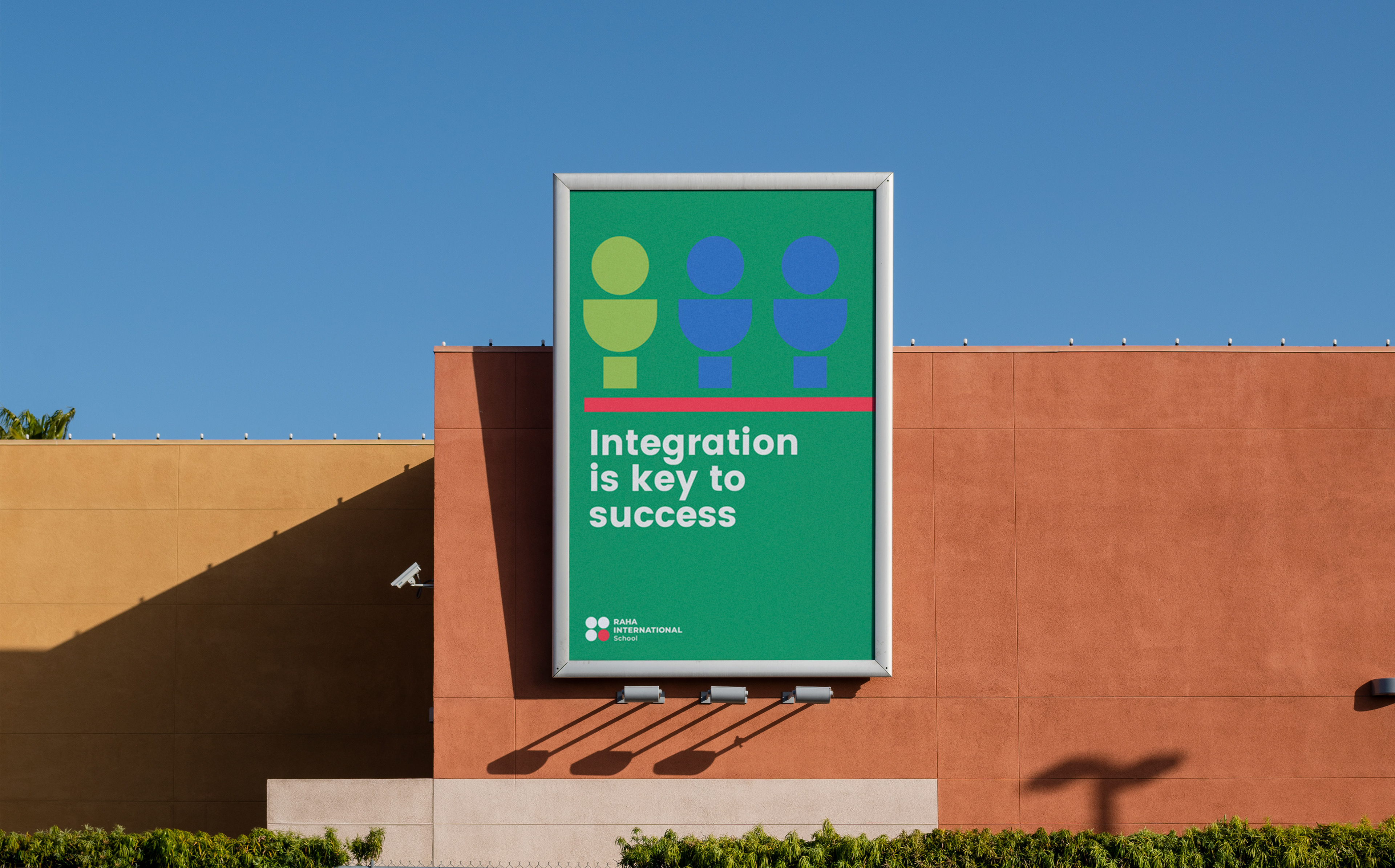
RAHA International is about Embracing Everybody

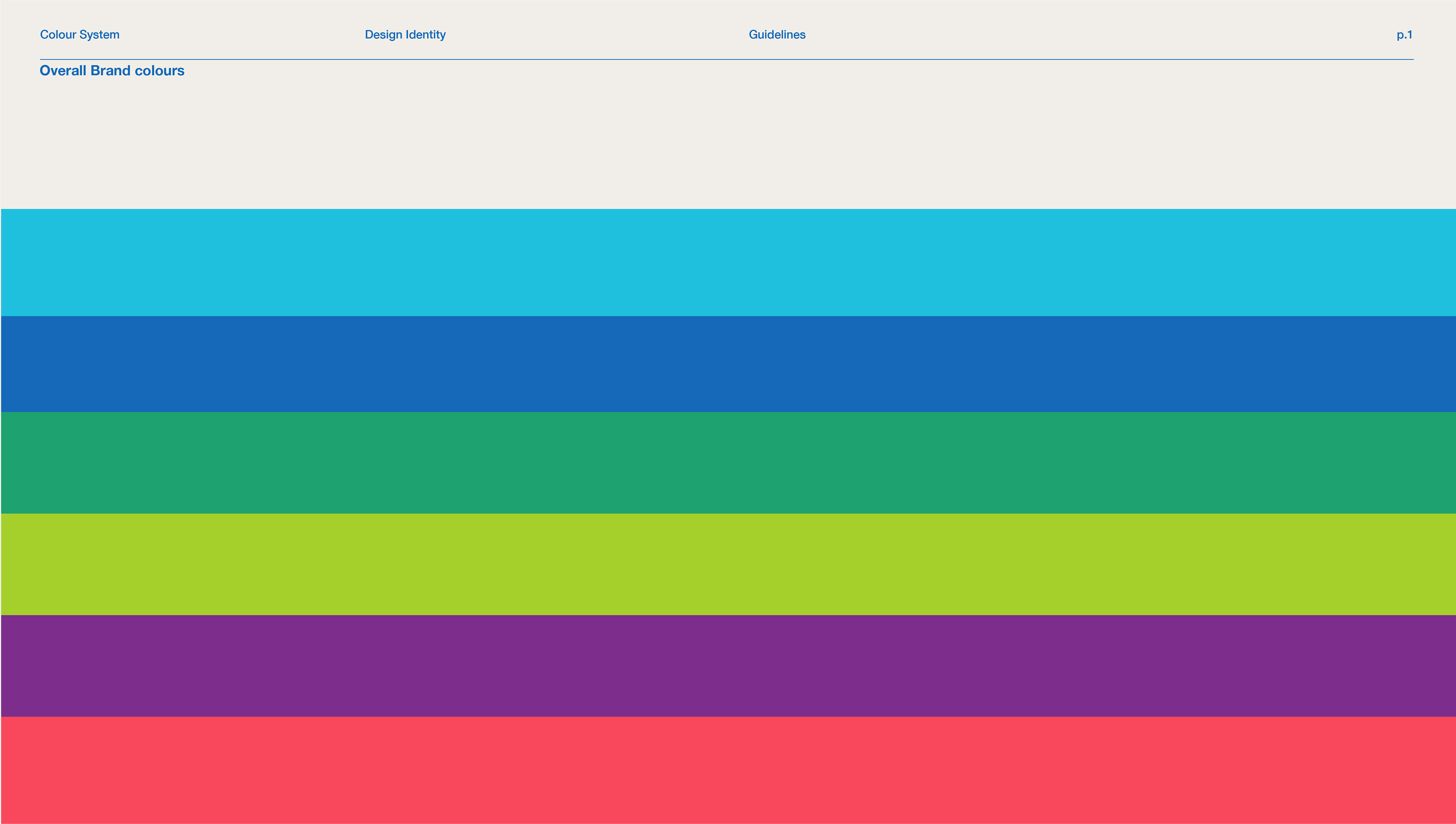
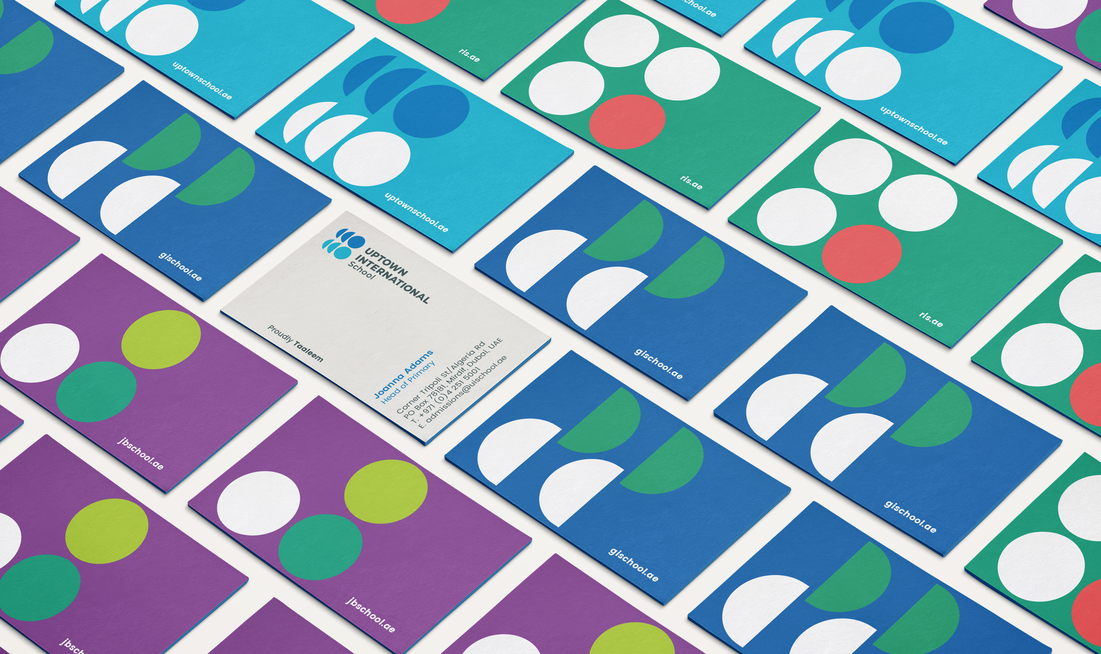
A language built
with a purpose
We framed the brand identity through a design system that felt contemporary and youthful. Giving Taaleem schools a personality and soul that could be taken to the hearts of children, teachers and adults.
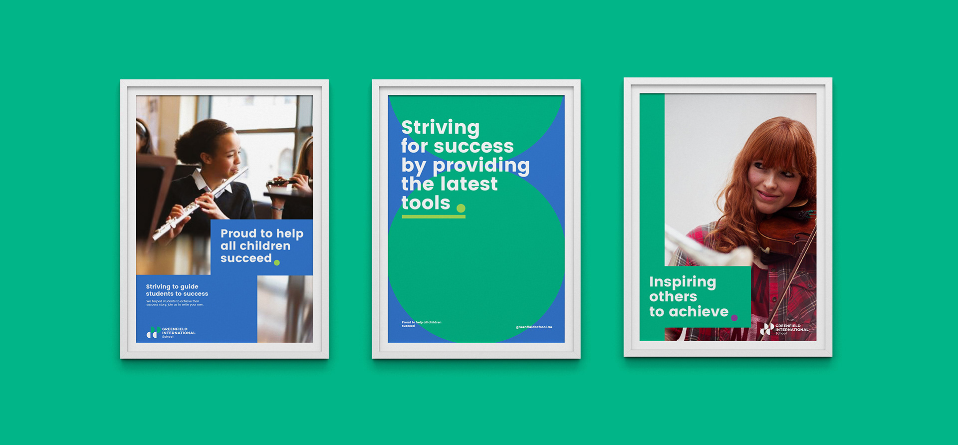
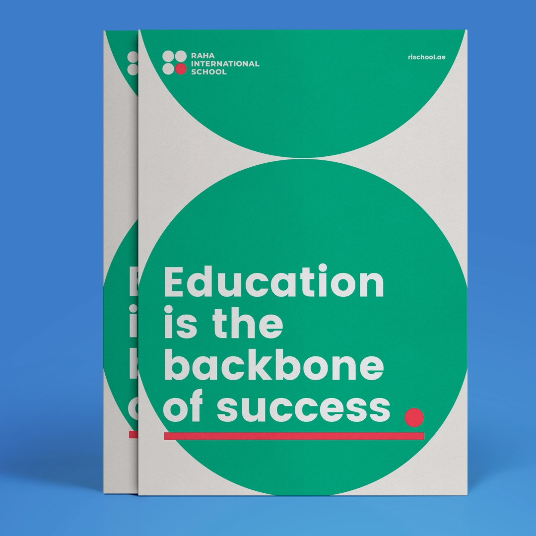
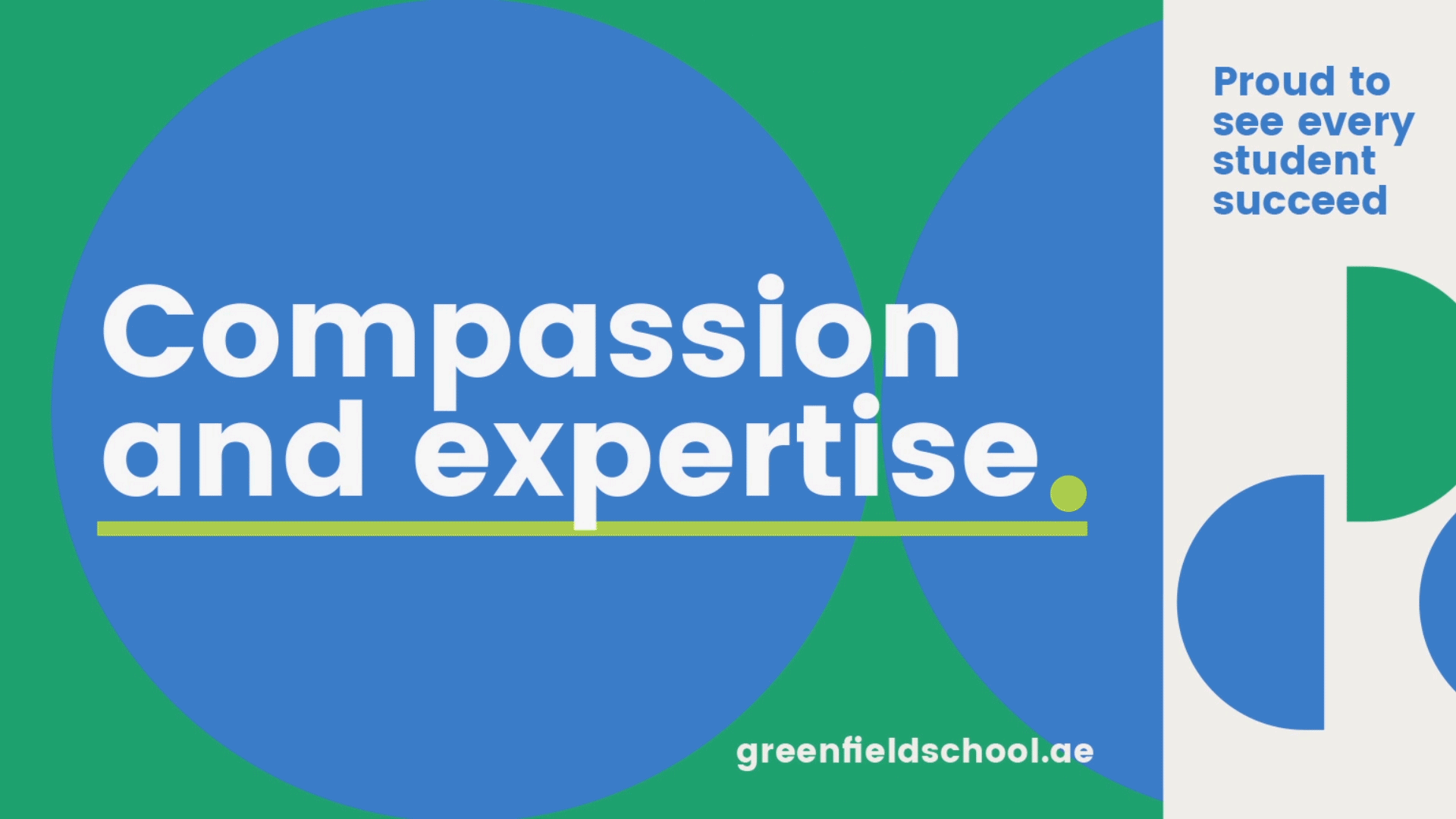


Communication made easy
to teach, inform and entertain.
Who said teaching can't be entertaining?...who said learning can't be fun?.
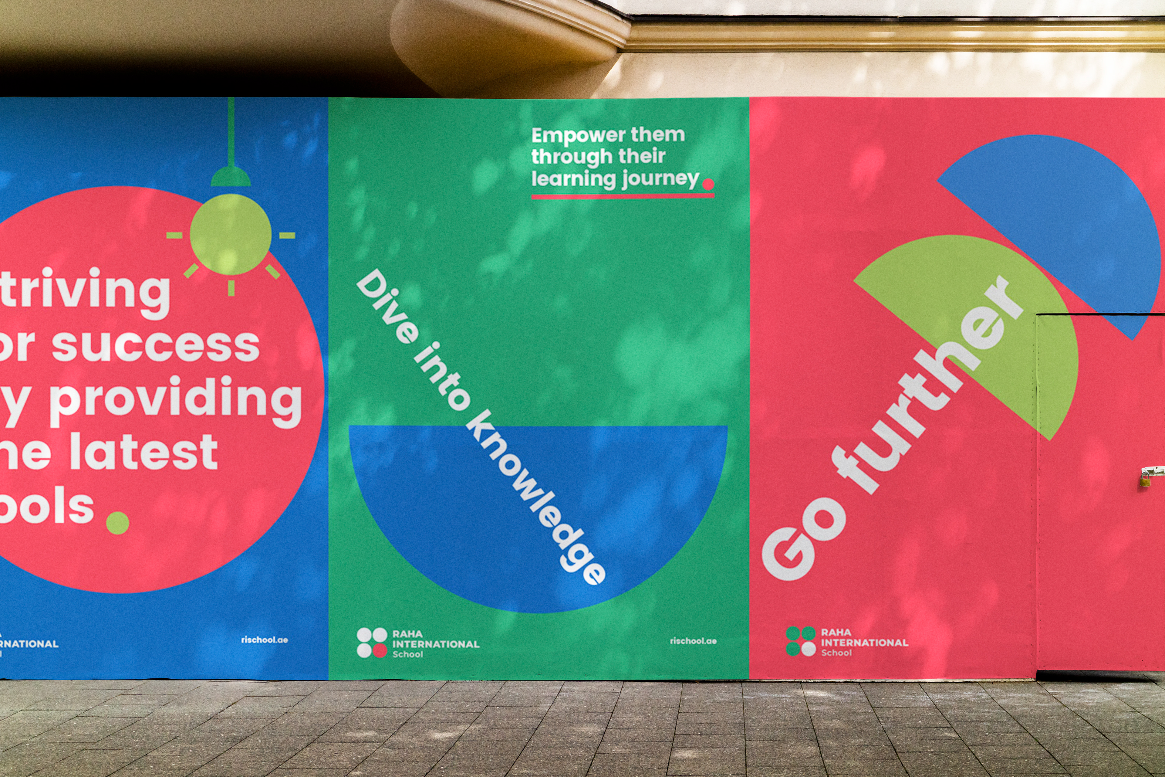
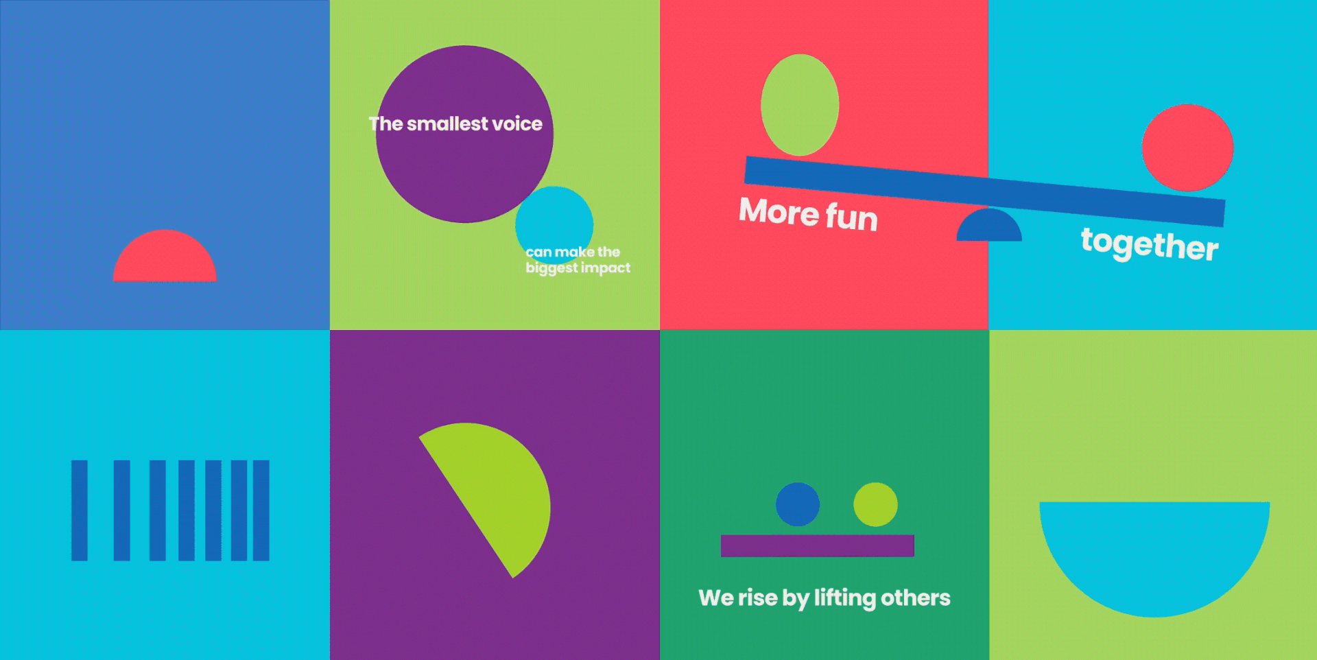
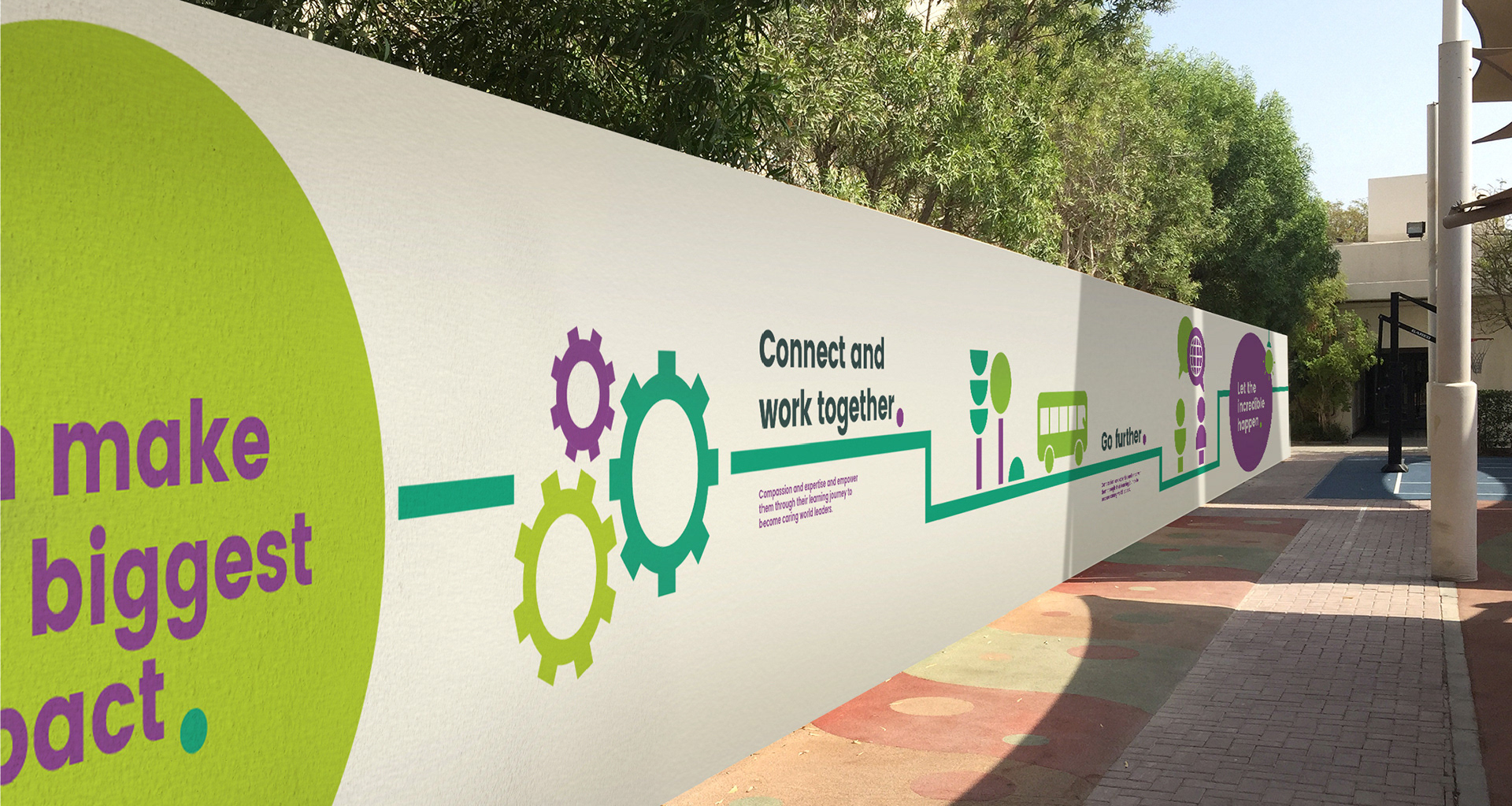
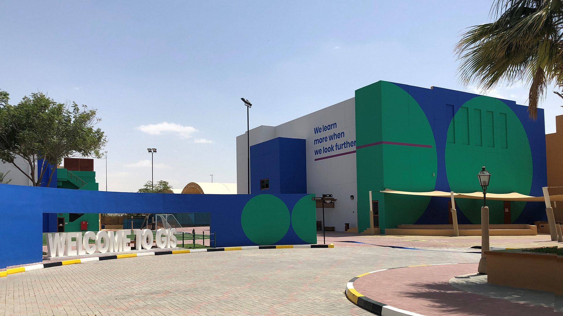
Education can be simple, fun, easy and still teach. The new overall brand communication conveys this message by stripping down the visual identity to its basic shapes to represent ideas and visual concepts. We created a language that is accessible easy to understand and fun. Just the way education should be.
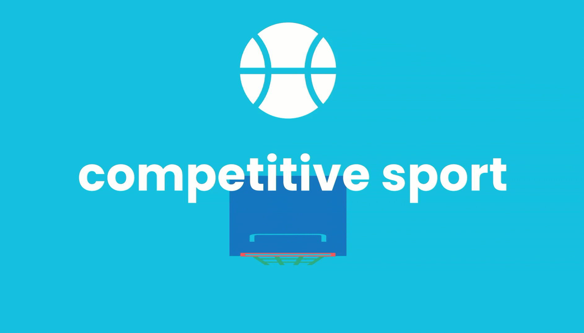
Through simple illustrations and animations we created a common language that was playful and quirky, communicating the overall brand message and reinforcing it's values.
We brought every schools'
personality to life.
Defining a visual animation style was key to unifying all of Taaleem schools. Creating a cohesive brand expression that serves as a signature for all of Taaleem schools and setting them apart form their competition, bringing life and energy to the overall brand communication.
Based on the main key brand elements, we built a visual platform for Taaleem schools to strengthen their messaging and build on their RTB's as well as an engaging system that would equally speak to kids, and adults


An entertaining way
to help schools deliver
their message.
We build a communication platform for delivering their message and RTB's to both children an adults in an engaging and entertaining way through animated videos based on each of the schools' main values. Strengthening the overall visual identity and adding to Taleem's objective of a cohesive communication framework.
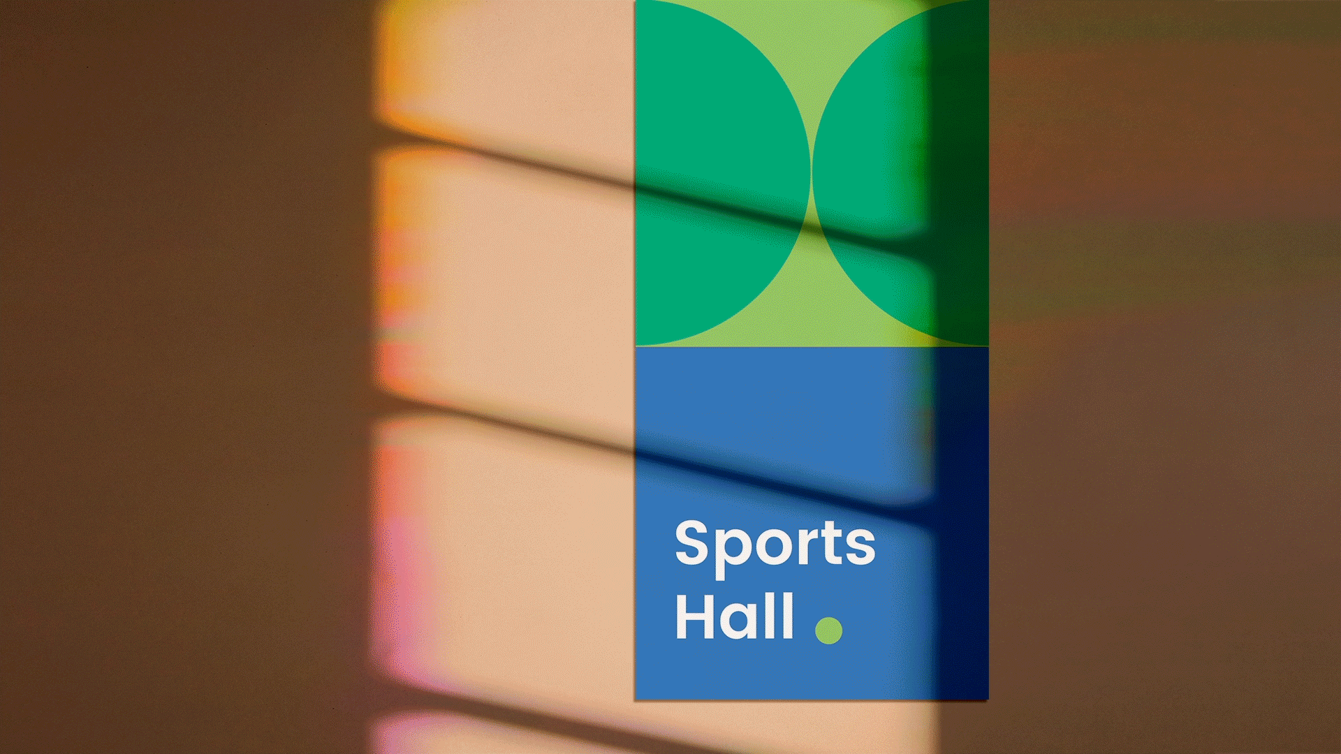
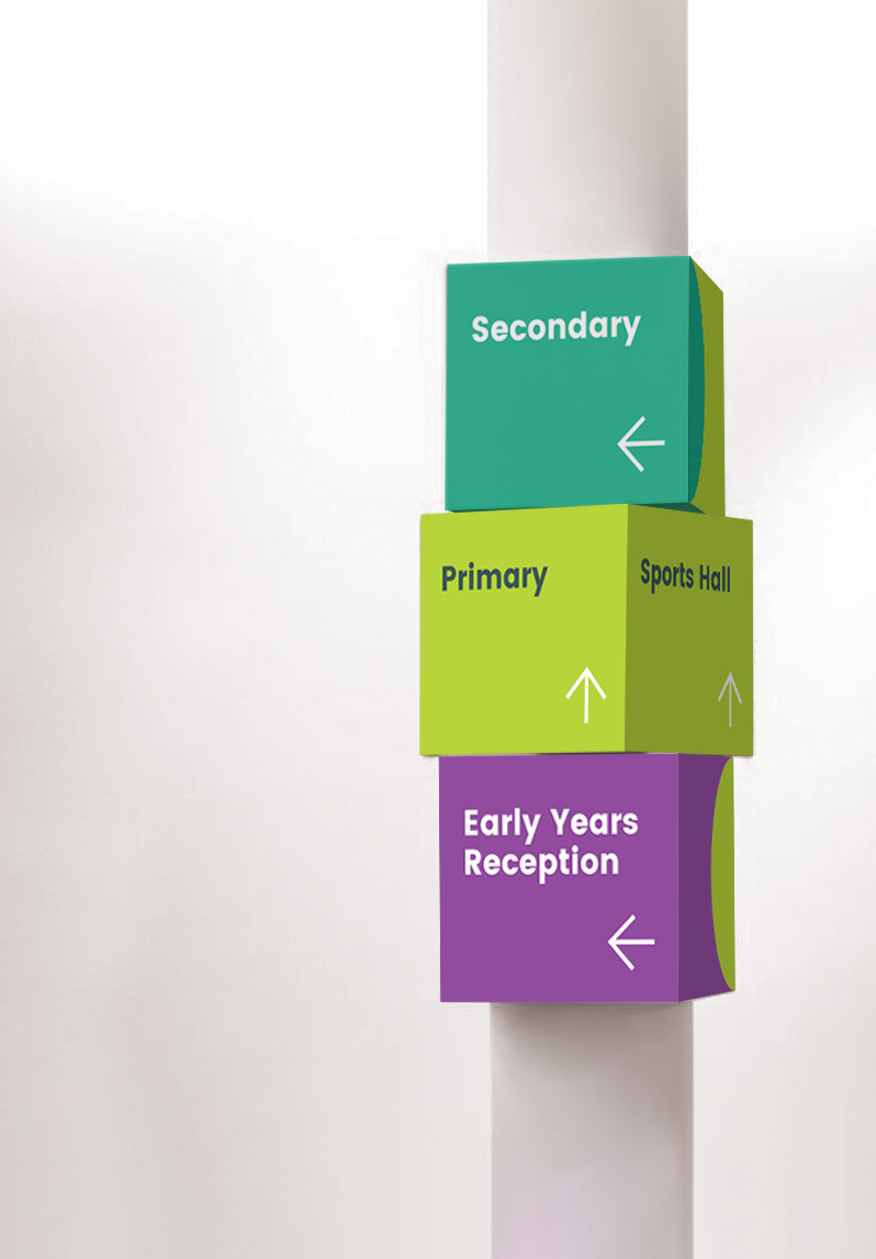
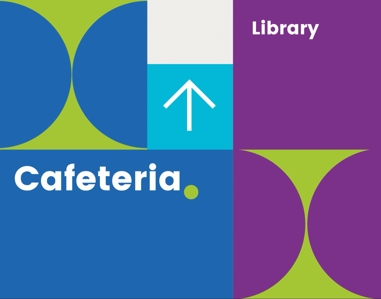
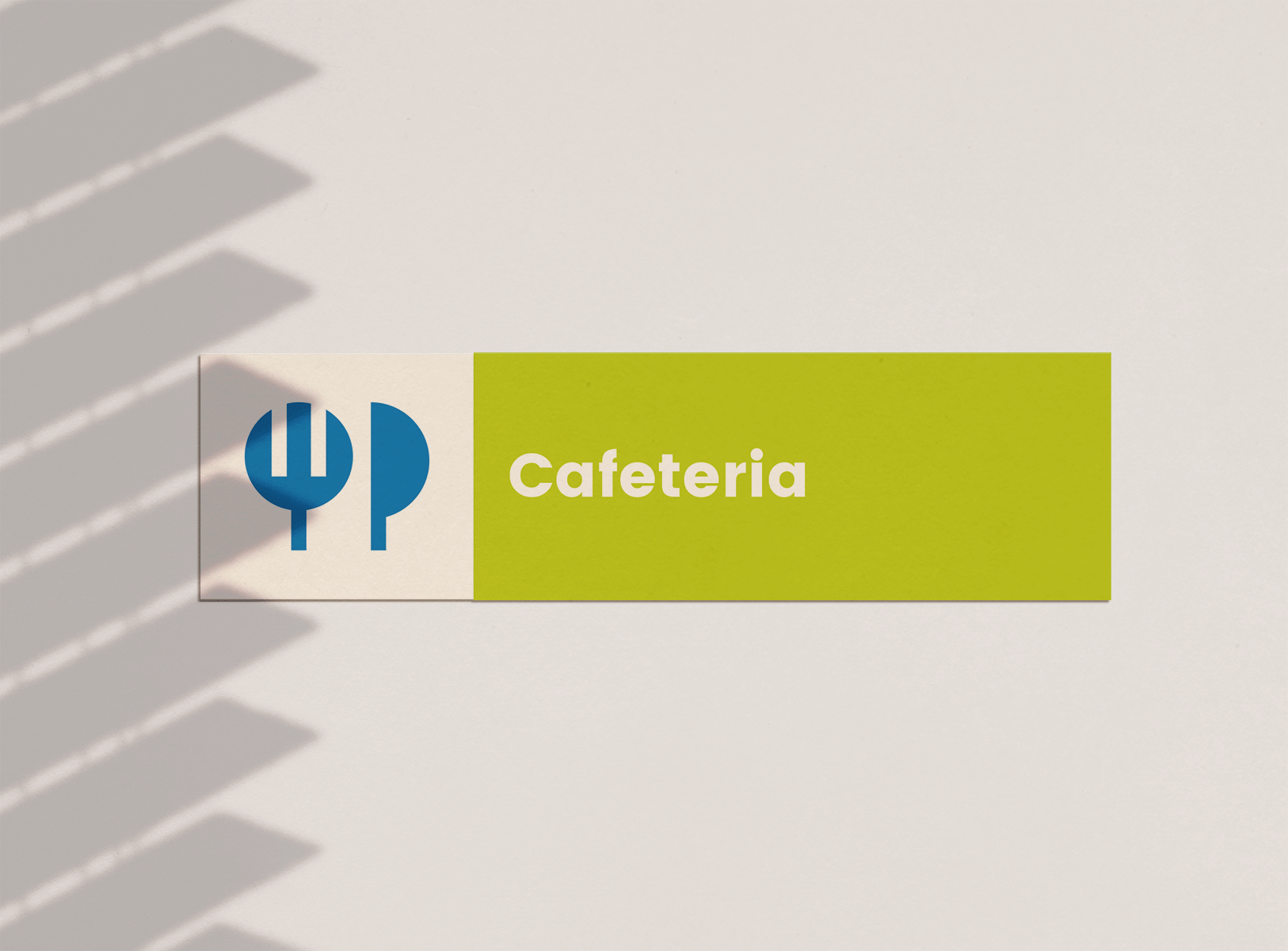
We created a visual system that could educate both children, and adults.


And help everyone find their way
And we put students visions
and insights above everything.

Thank You
AWARDS:
-Gold. Best Development of a Visual Identity. Transform Awards, MENA. 2020
-Gold. Best Creative Strategy for an existing brand. Transform Awards, MENA. 2020
-Bronze. Best Visual Identity for education sector. Transform Awards, MENA. 2020