
BELLAVIA RISTORANTE/
Giving Italian heritage &
tradition a modern twist
Creative Direction
Creative Strategy
Brand Design
Tone of Voice
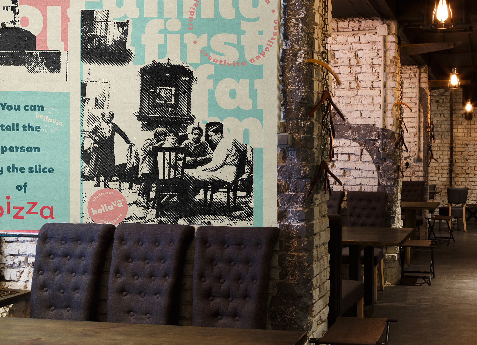
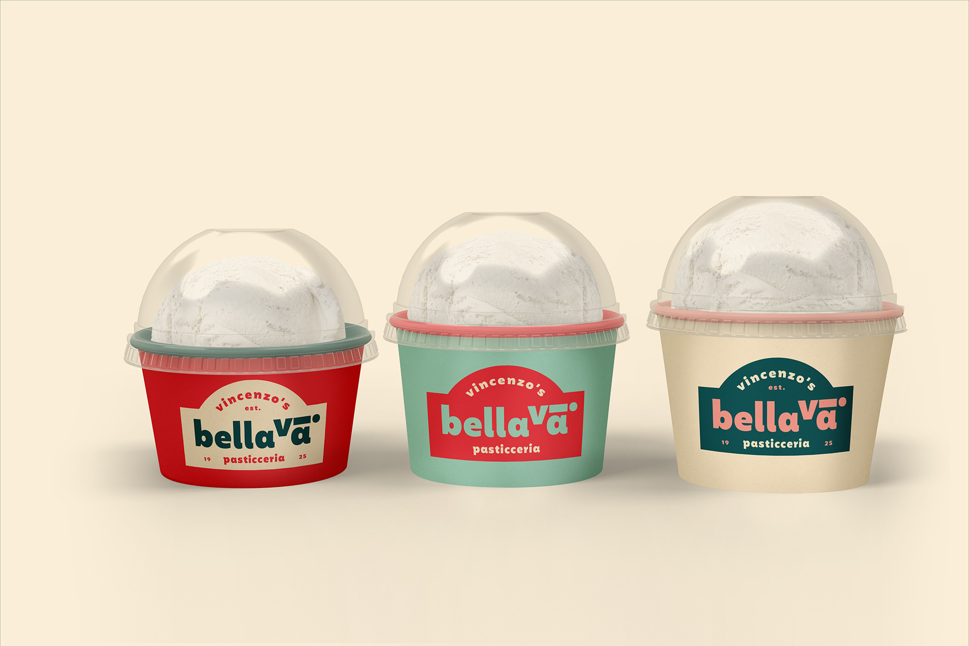
Bellavia is a traditional Italian family owned restaurant and bakery originally from Sicily and Napoli. It had always been an essential part of the day to day of locals. Making it part of their routines, where morning coffee, a slice of grandma's homemade Cannoli and a bit of homemade ragú are a daily expectation.
In 2015, the family split up and with this, the restaurant divided it's ownership. Vincenzo, the oldest son, kept the rights to Bellavia Pasticcieria and Restaurant and decided to give the restaurant a complete face-lift, rejuvenating its spirit and making it more appealing to a younger more international audience. Backed up by its family recipes and traditional Italian cuisine, the brand delivers on its promise of a very authentic experience without being cliché.
In 2019, Vincenzo decided to open its doors to the UAE. Setting Dubai as his first destination. The restaurant scene in Dubai is different from the Italian restaurant scene. Coming from a place where love, loyalty and attachment are acquired through generations of tradition and goodwill, In Dubai though, it was a clean slate. The competition and demand fall under a very different category. Where the idea of "Italian" is either far too cliché or completely over-rated, Bellavia had to make an entry with a mix of modern, traditional and out of the box. Claiming a different territory within the Italian restaurant scene.
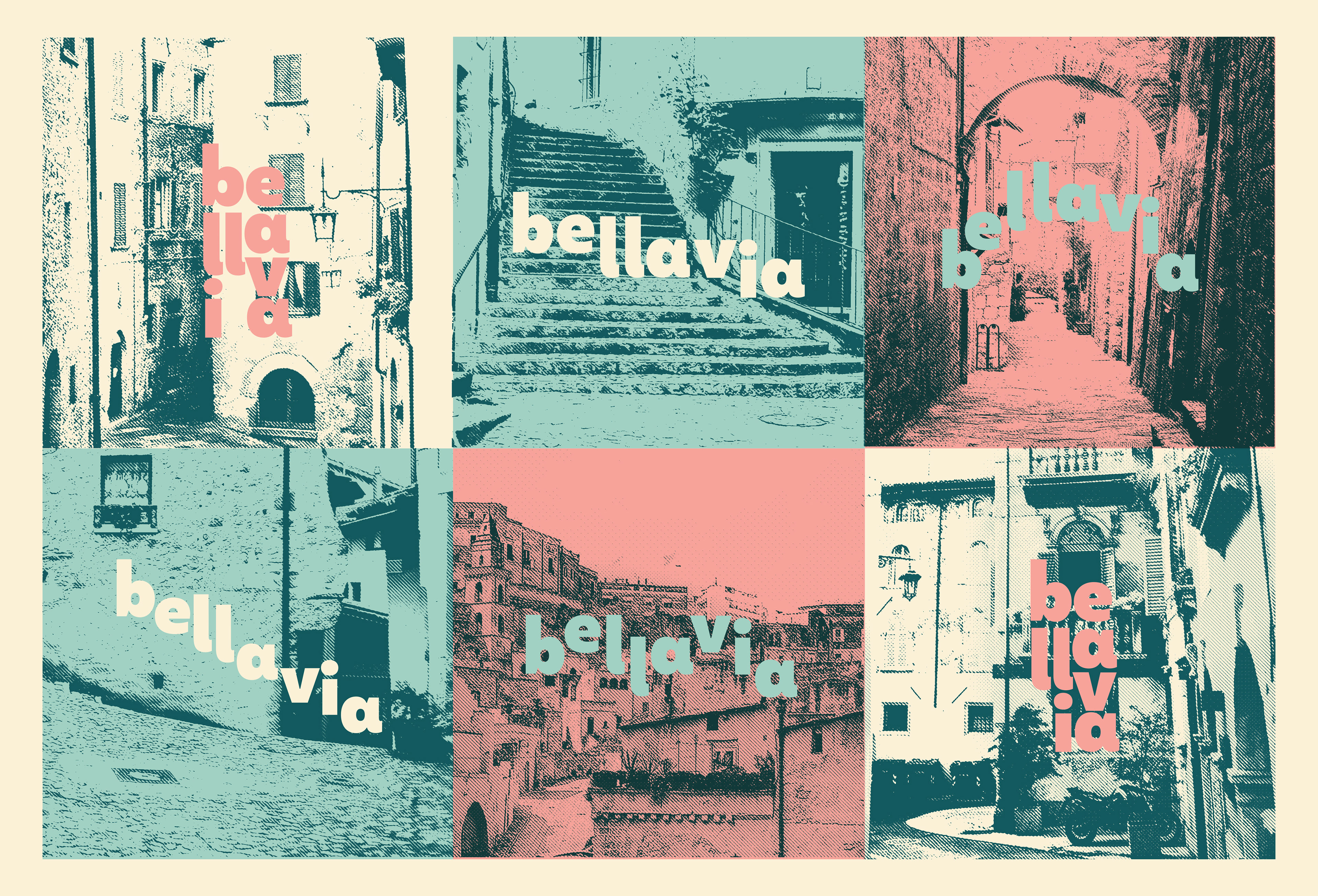
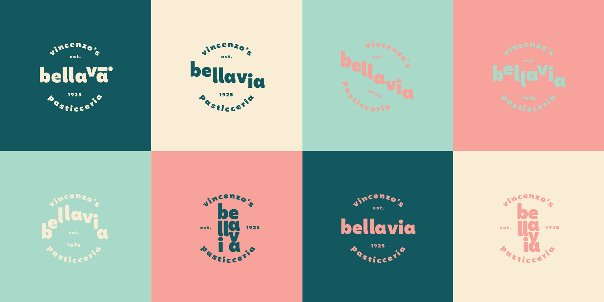
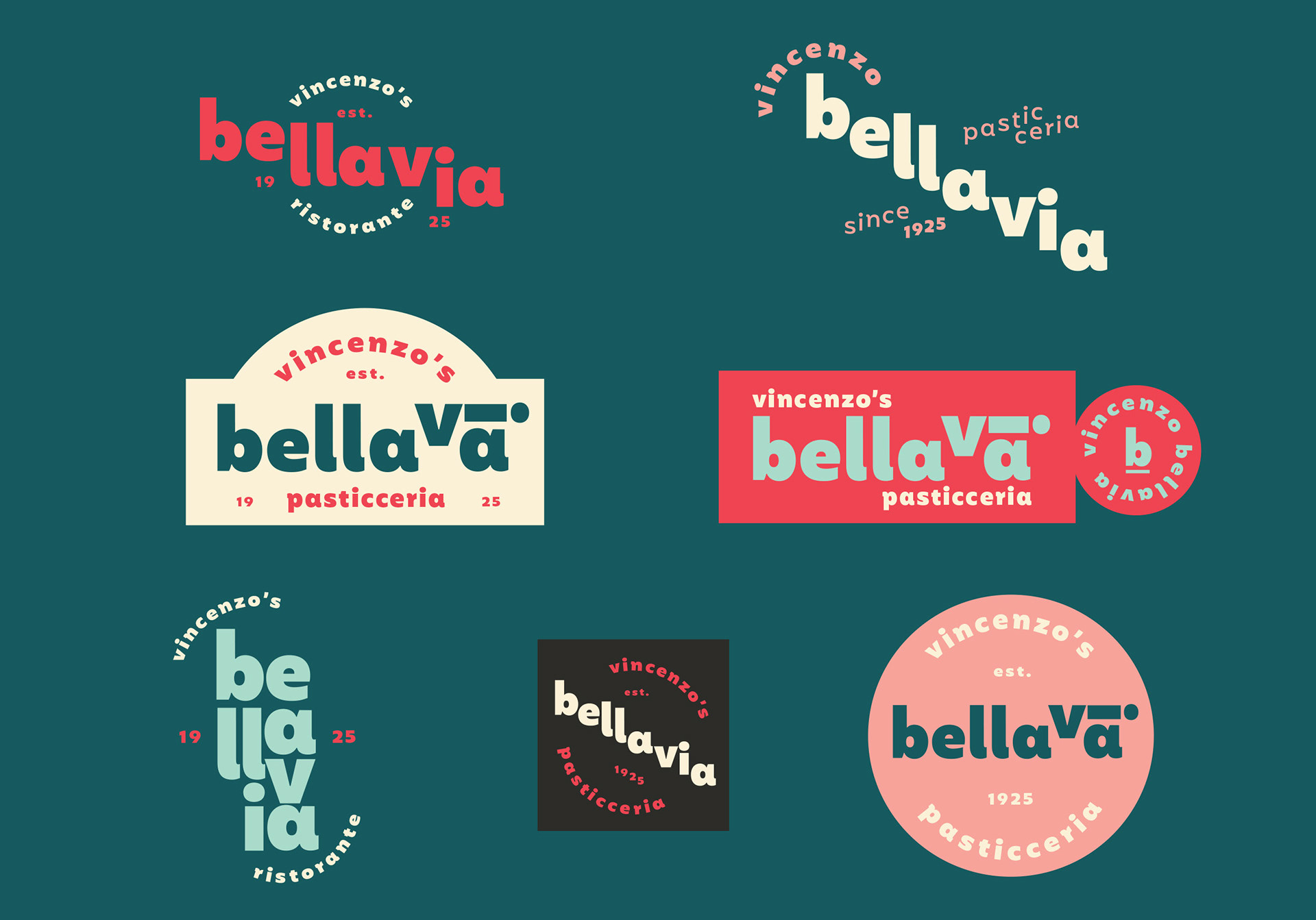
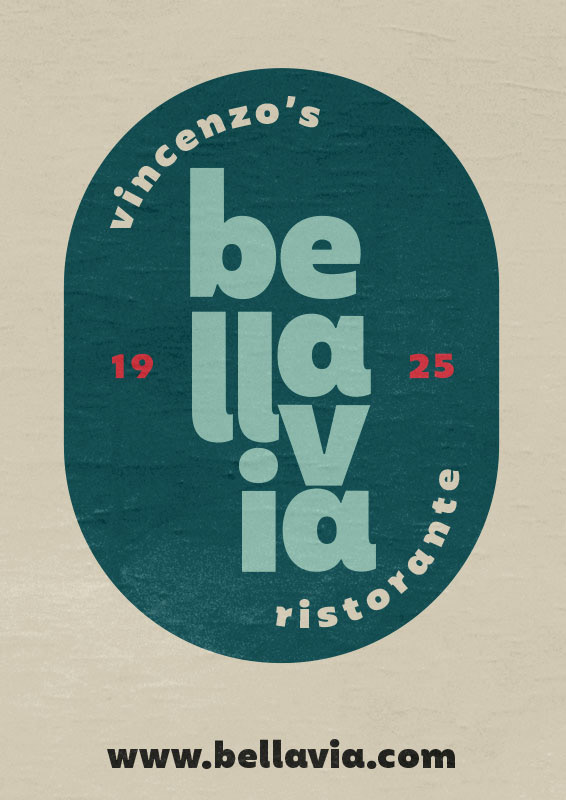
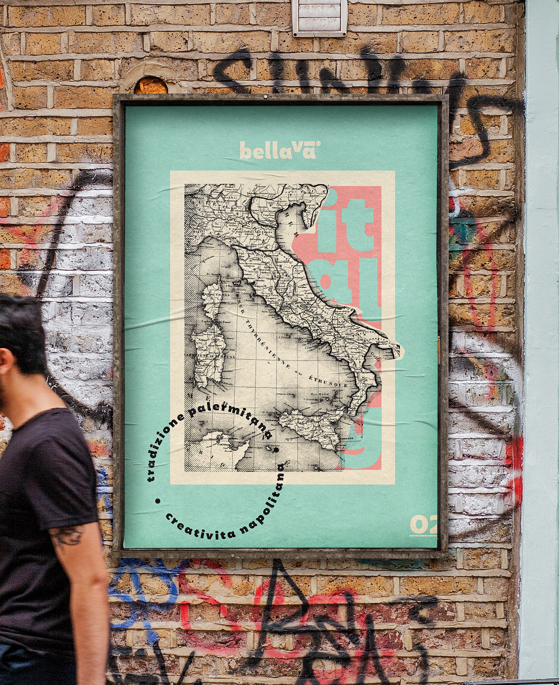
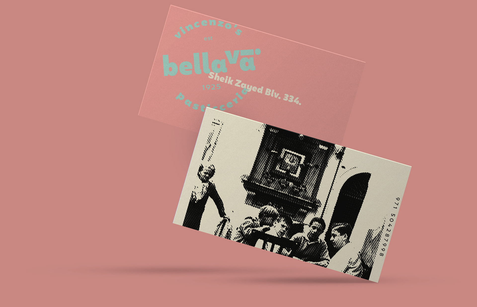
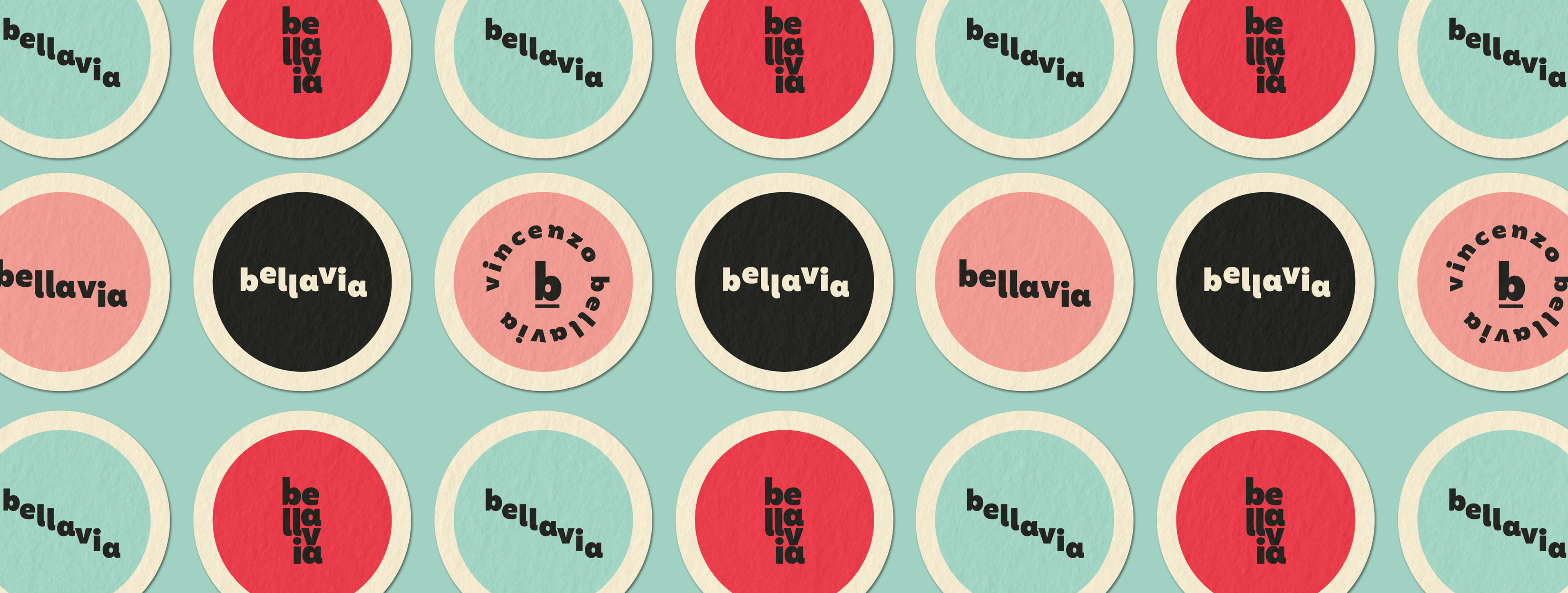
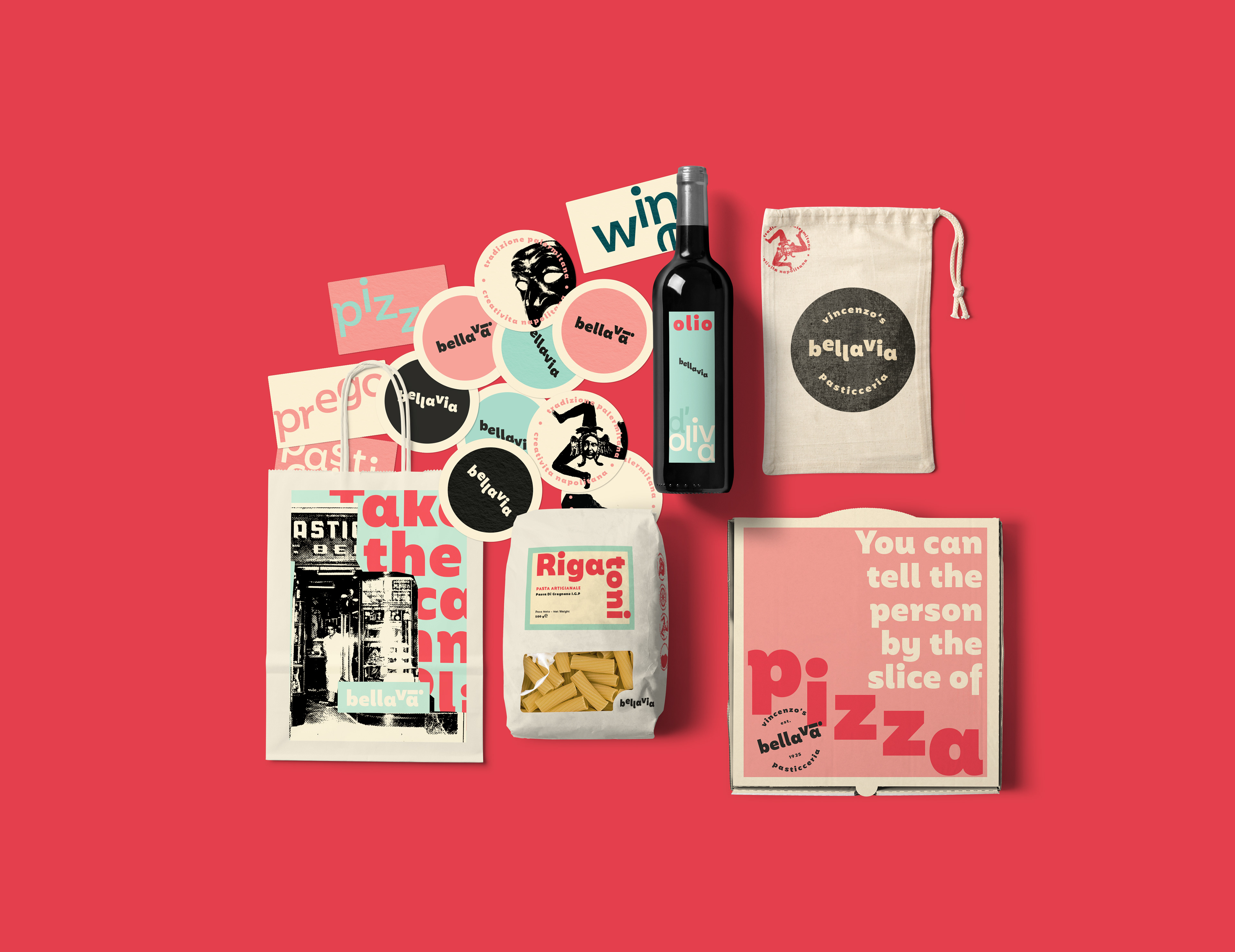
Italian small town structural and architectural features are taken as an inspiration for the logo and its' many different expressions.
The memory of Italy is brought across through staples that make up traditional Italian towns. What we understand and feel peculiar, witty and unique about Italy comes through elements such as its empowering arches, surprising stairways, stached buildings, narrow streets, steep inclinations, and prevalent slopes.
These features will be the inspiration for the brand identity and are represented through logo variations that speak of Italy through its many variations., each one highlighting a special piece of Italy.
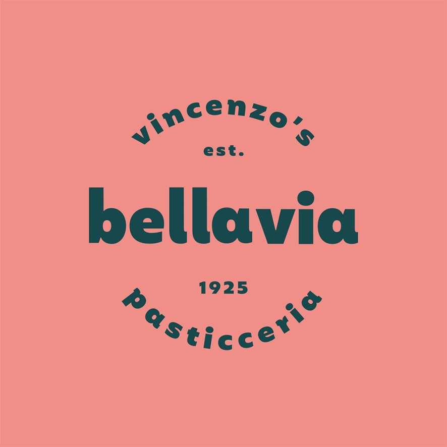
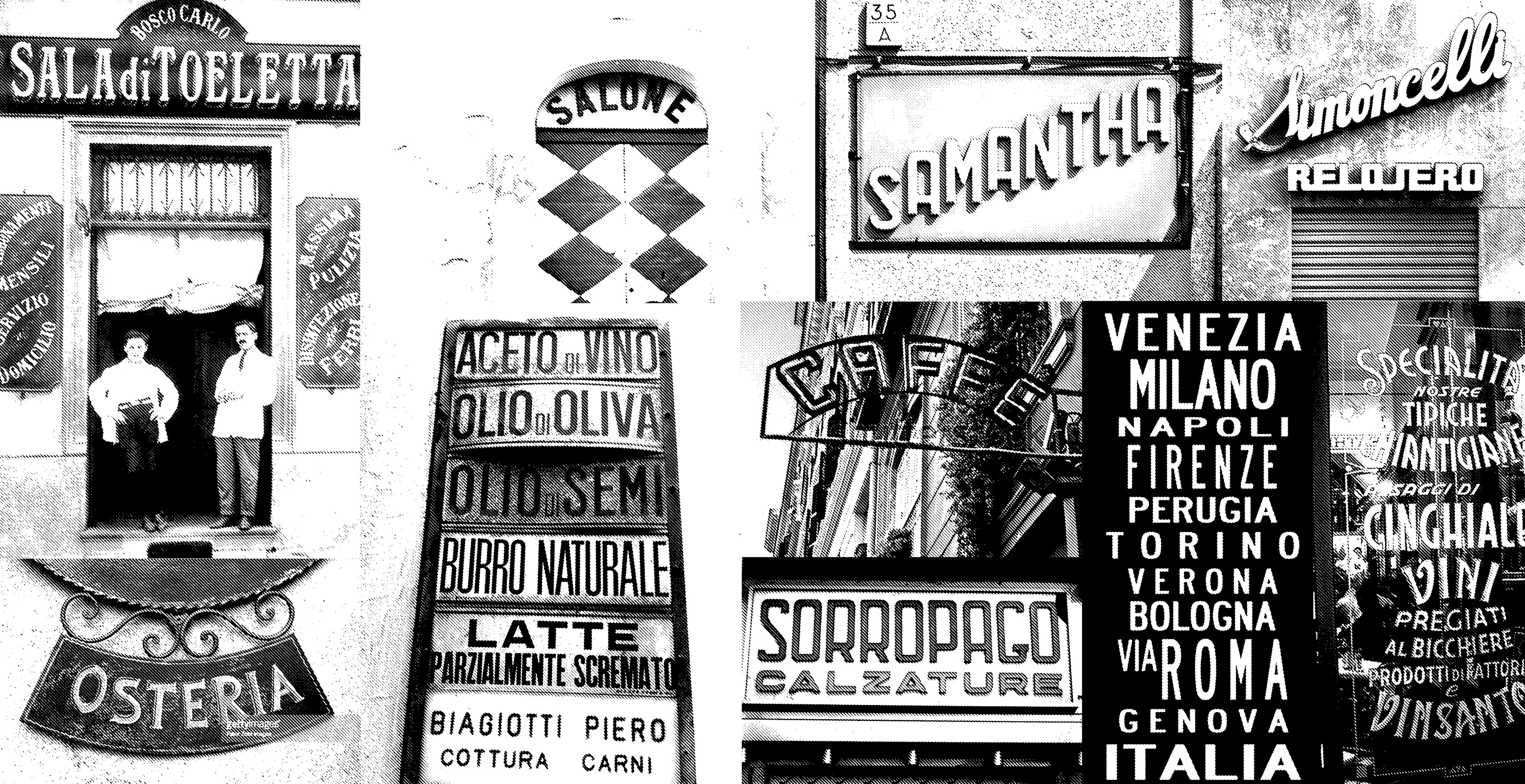
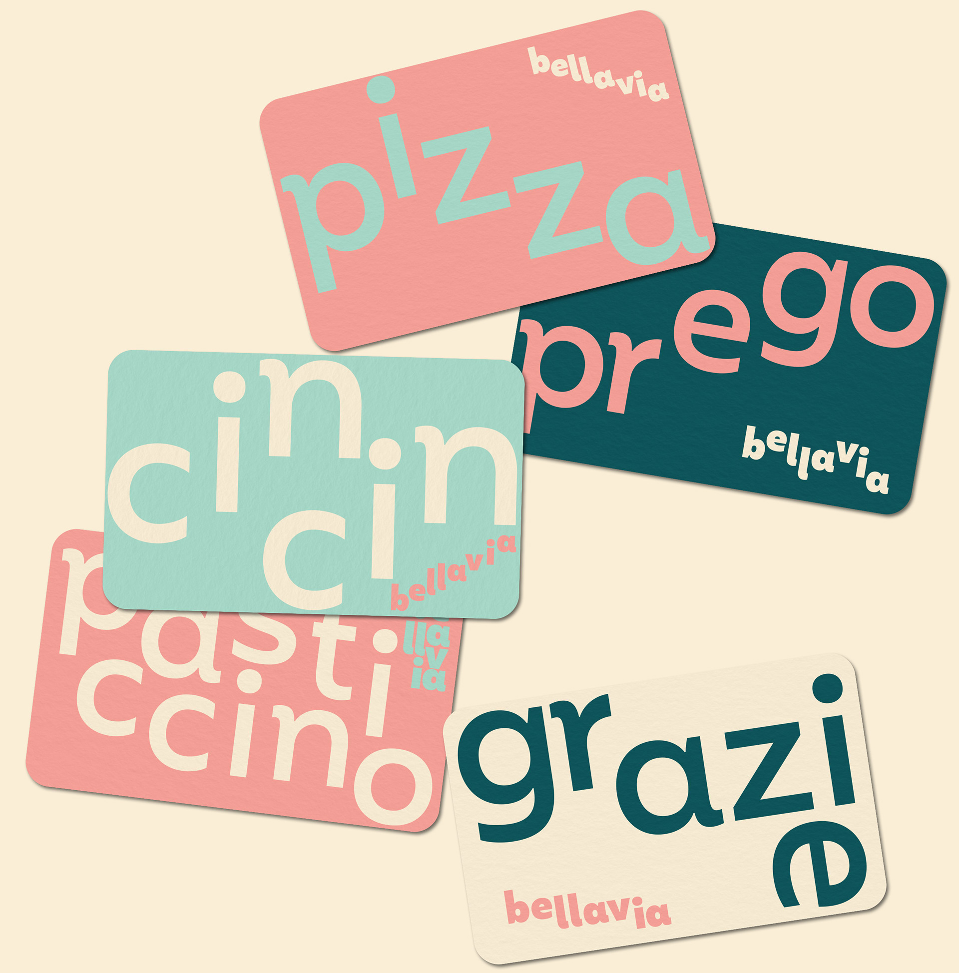
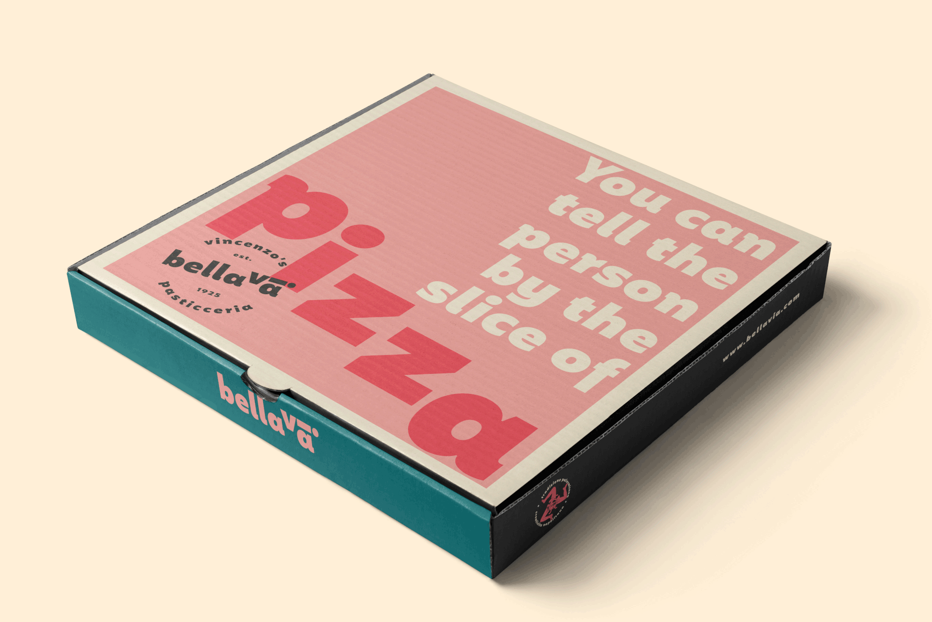
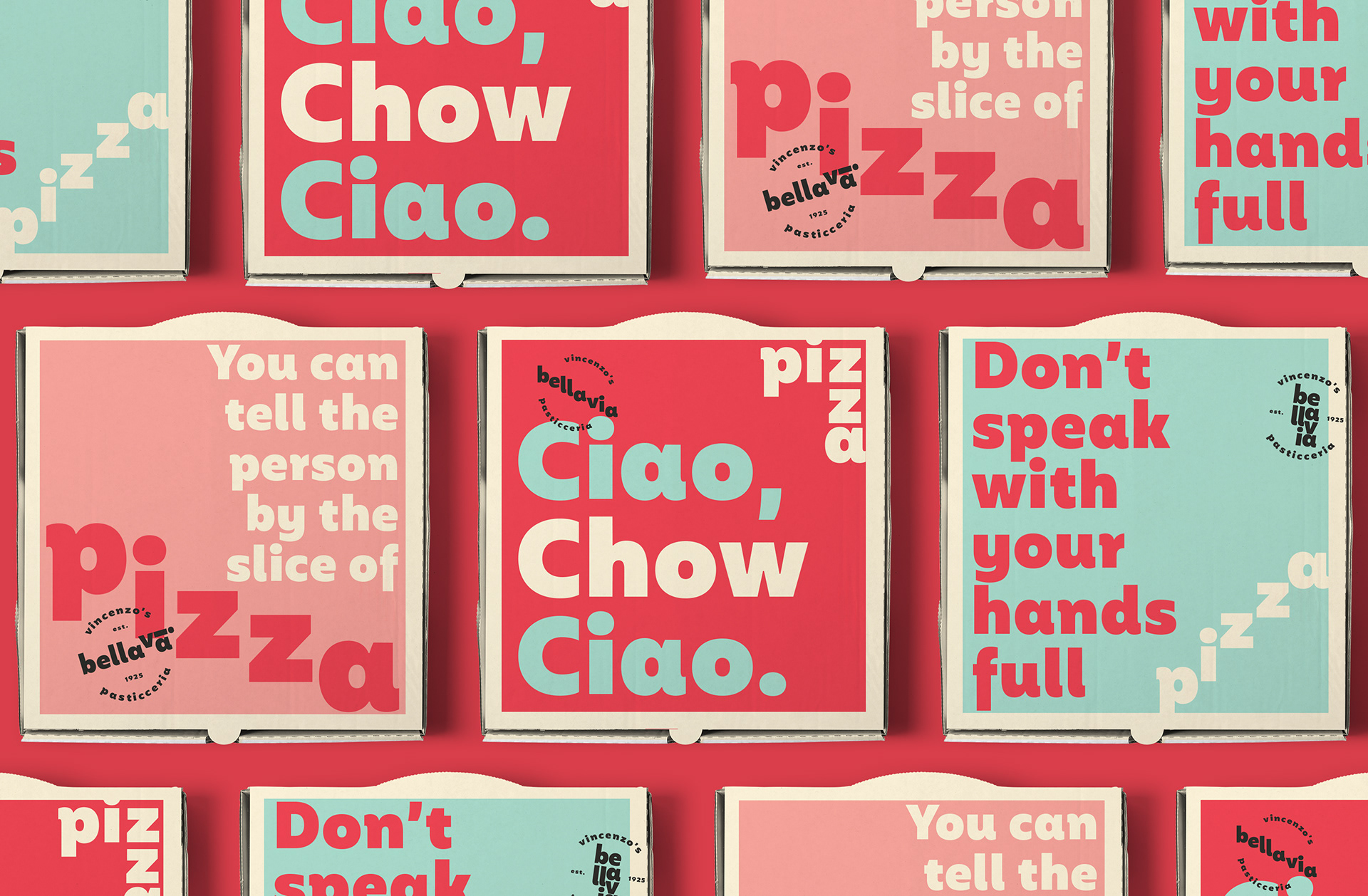
Typography inspiration is taken from traditional outdoor Italian small town signage.
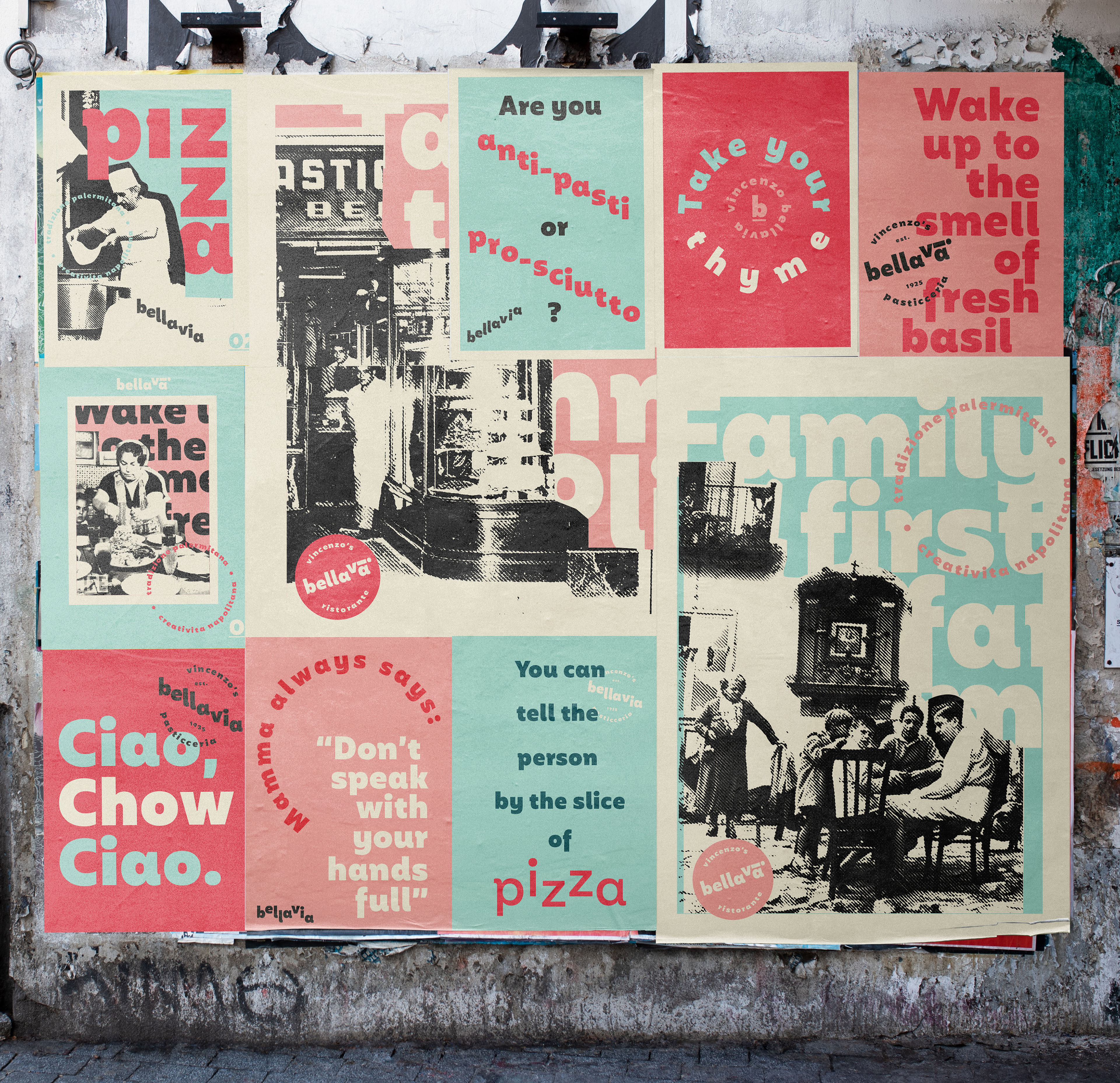
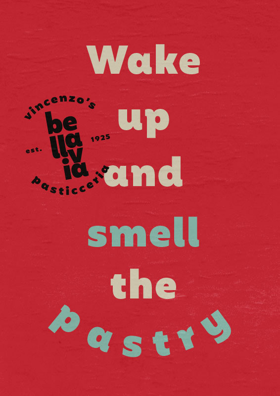
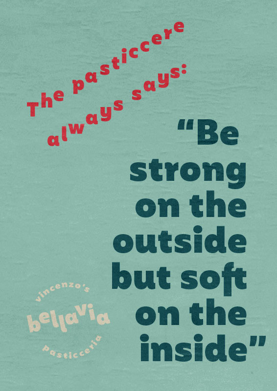
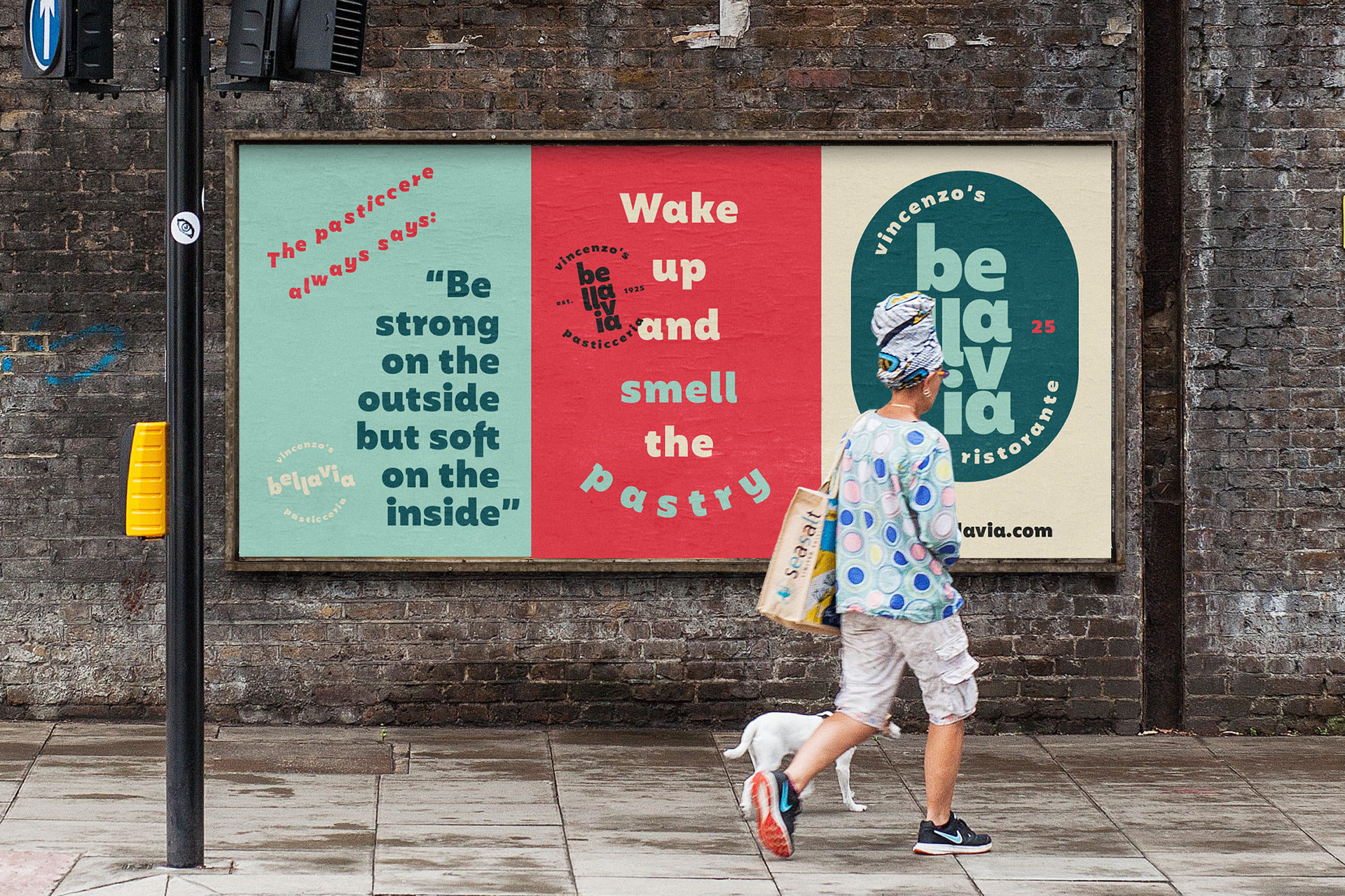
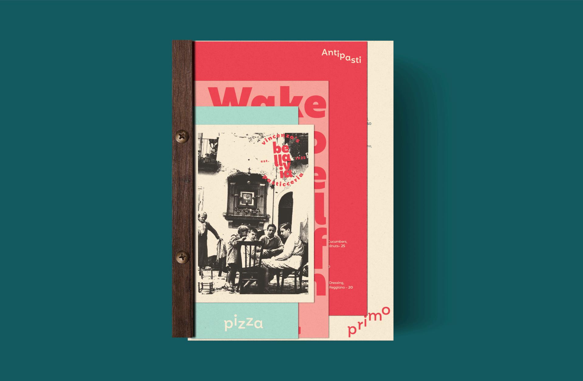
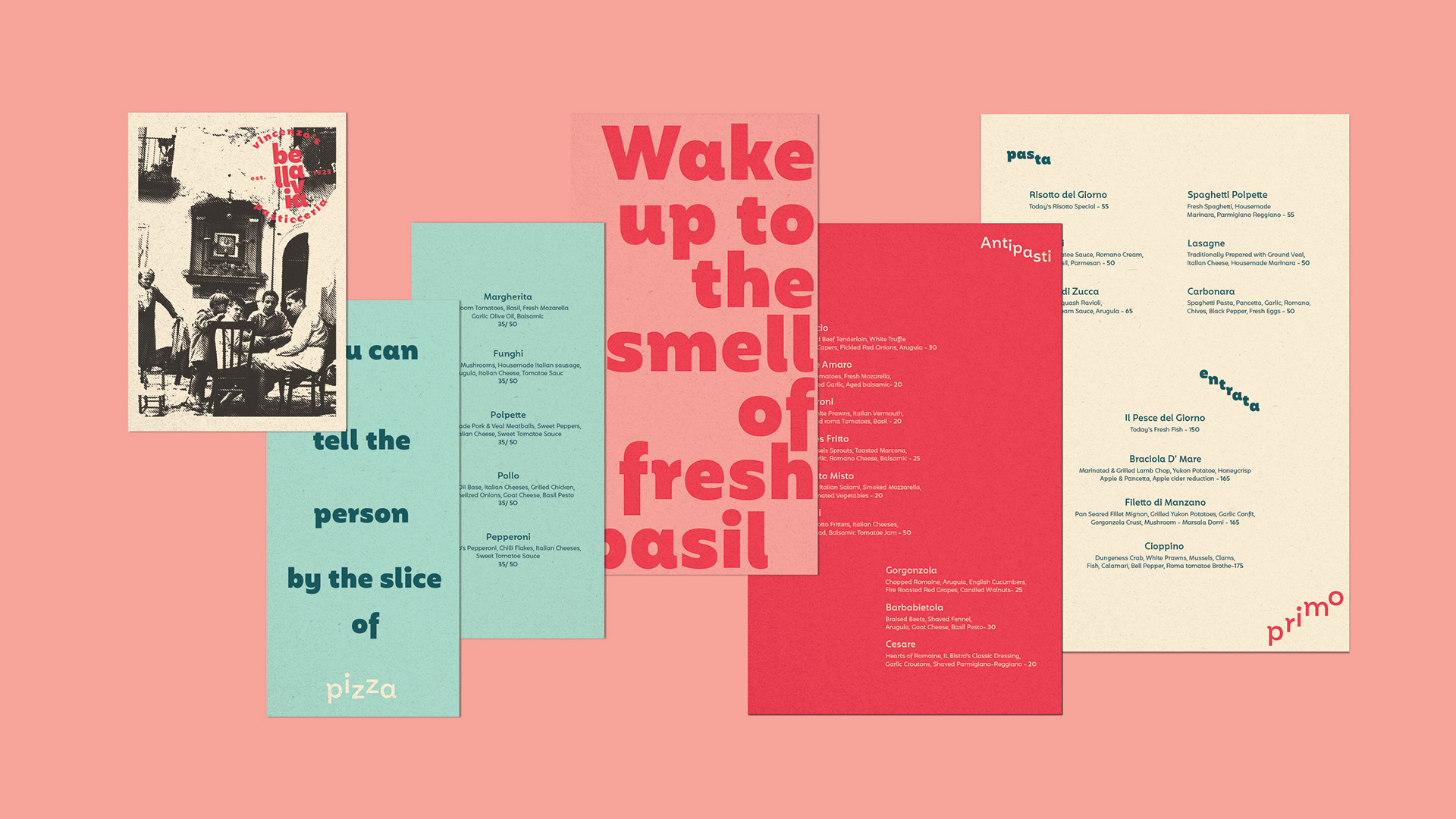
The traditional street signage of small town Italy is reminiscent of Italian traditions. Capturing what is truly a signature of the Italian street sentiment. Not difficult to imagine the elderly sitting under the street signage with a deck of cards and a bottle of wine. This serves as an inspiration for the visual communication and brand expression. Signage on the street, on windows, over doors. All inspiring a very nostalgic and authentic Italian lifestyle.
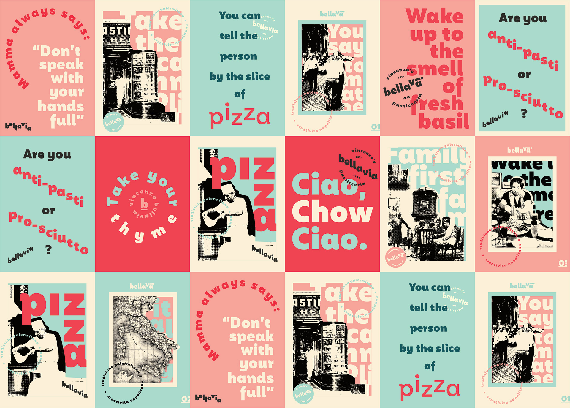
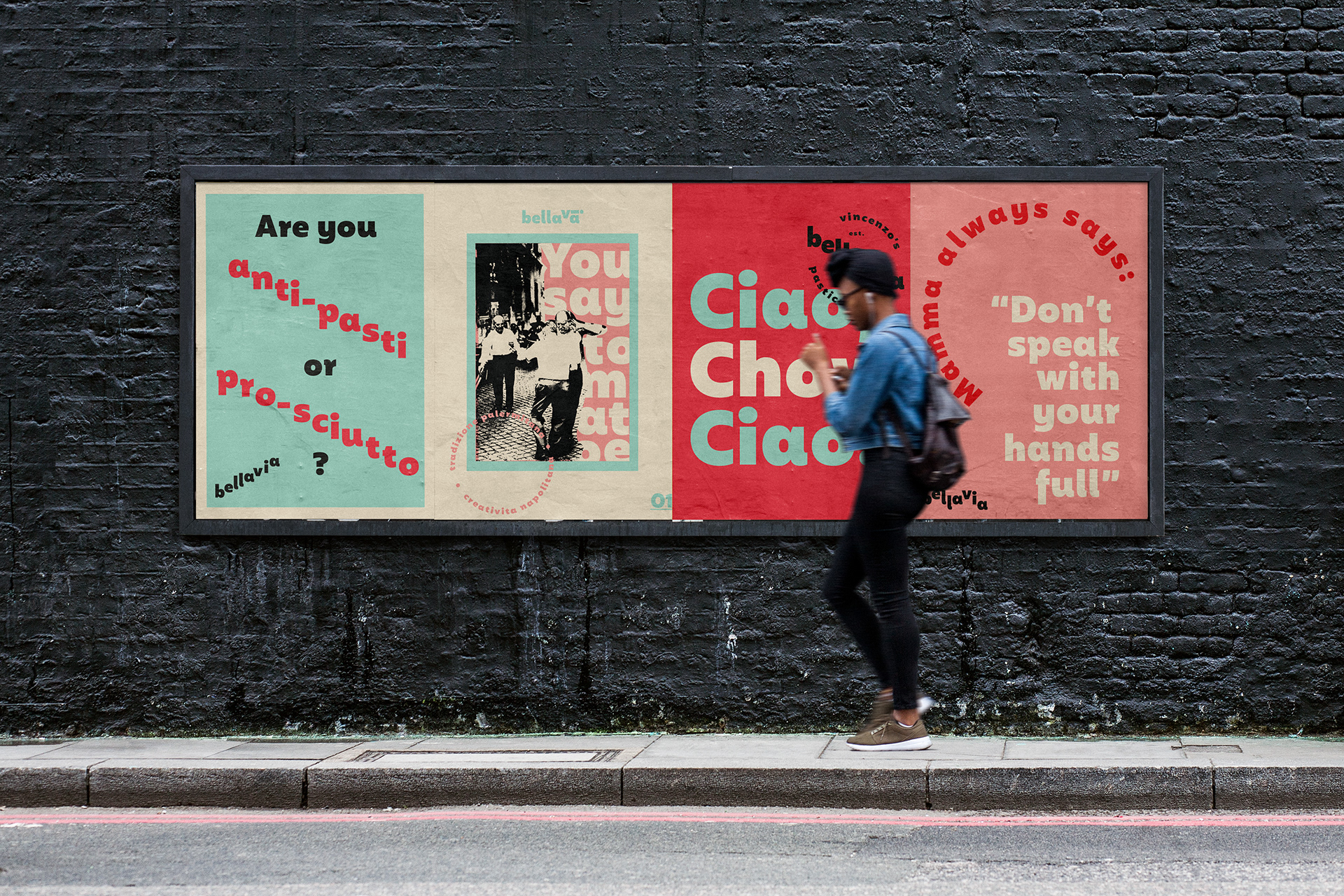
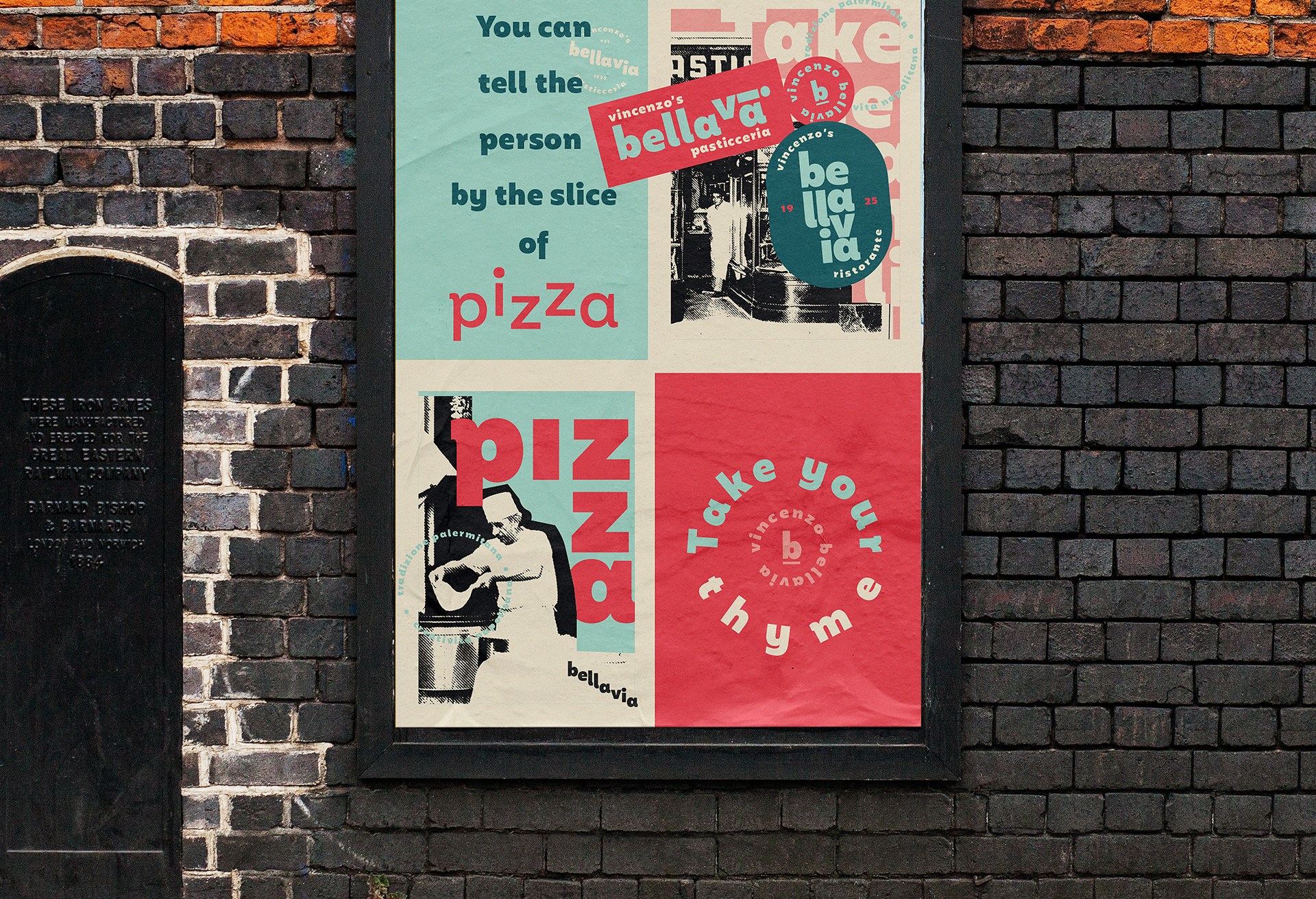
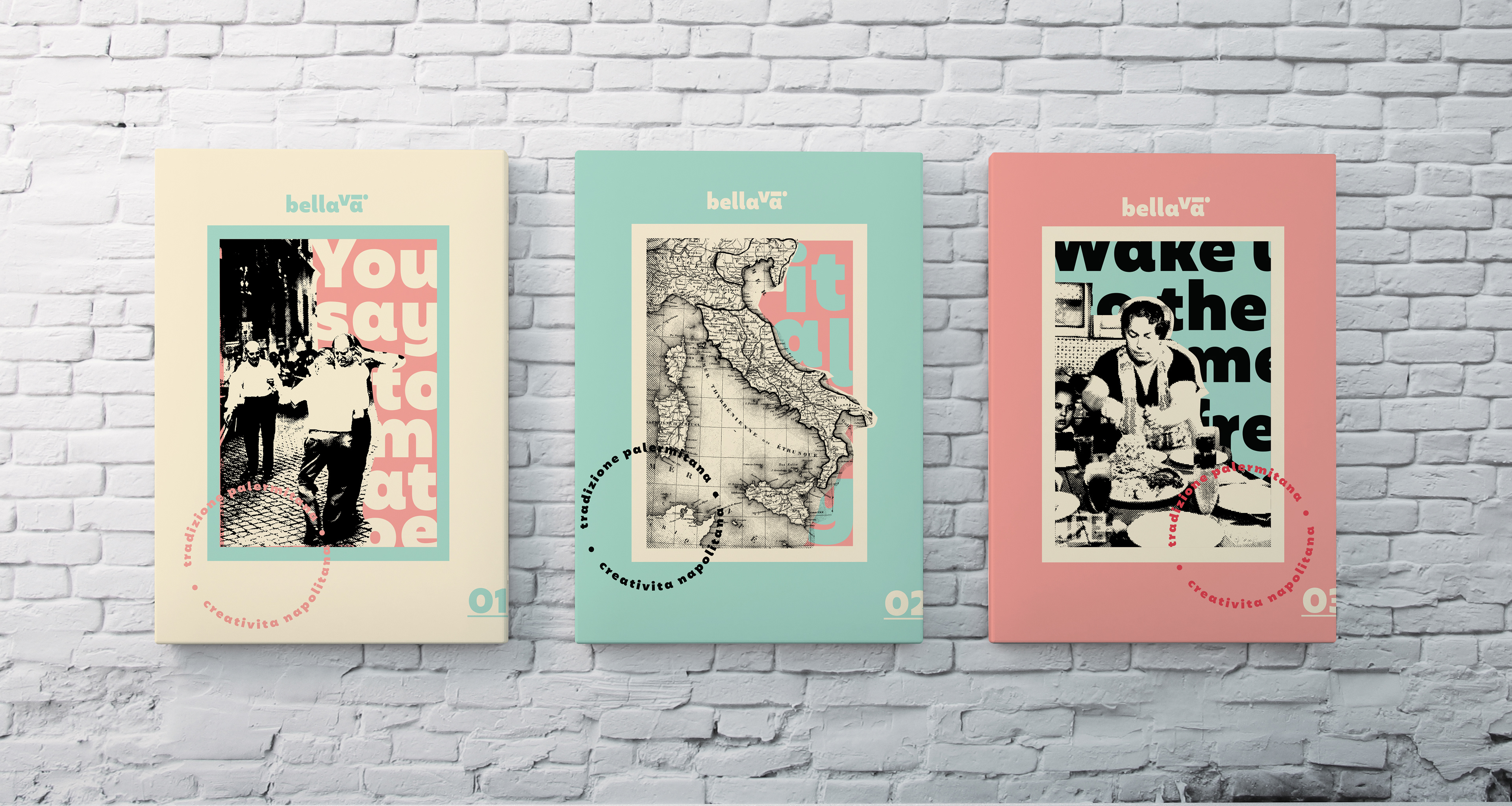
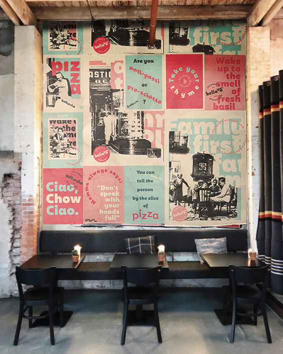
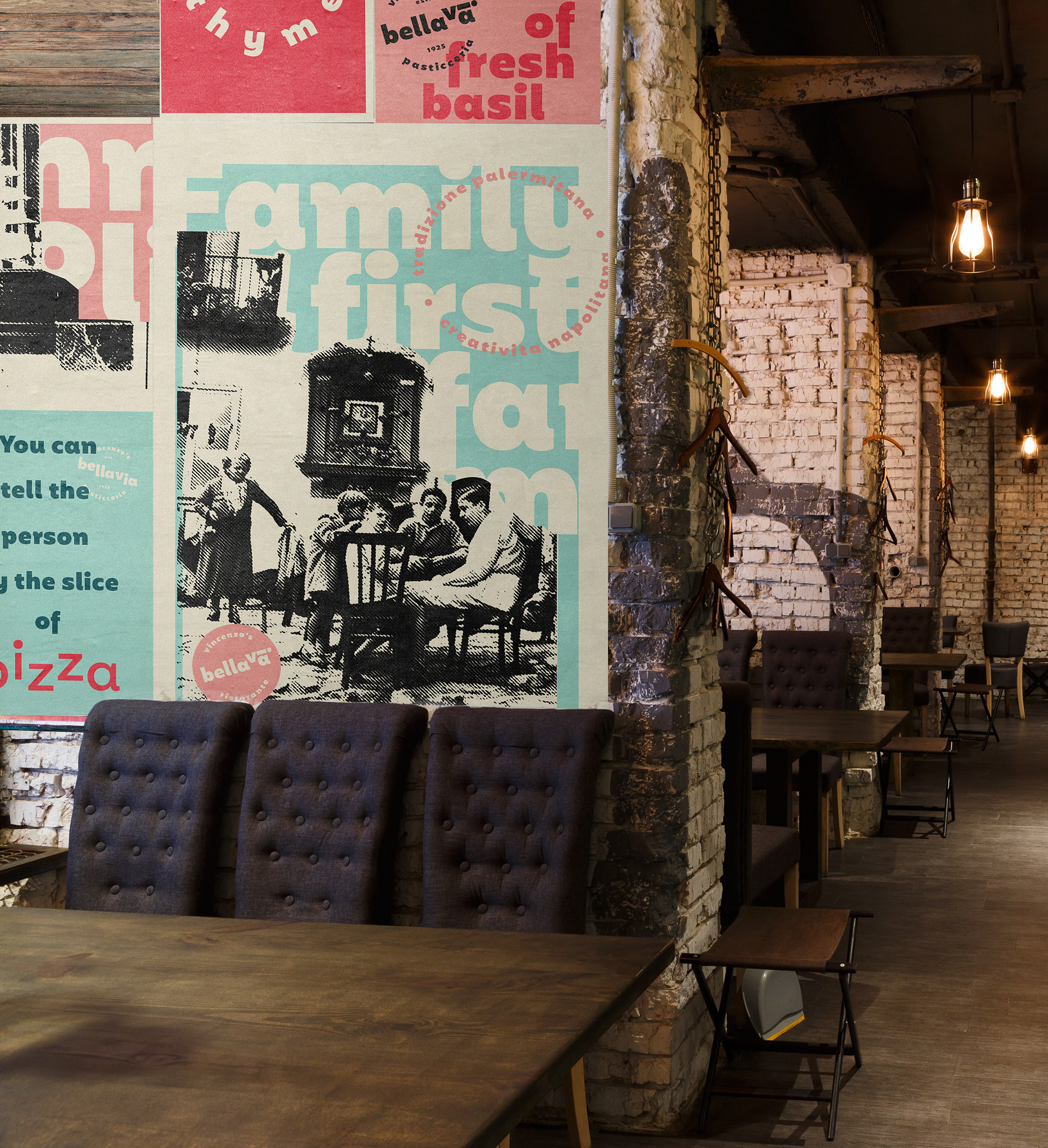
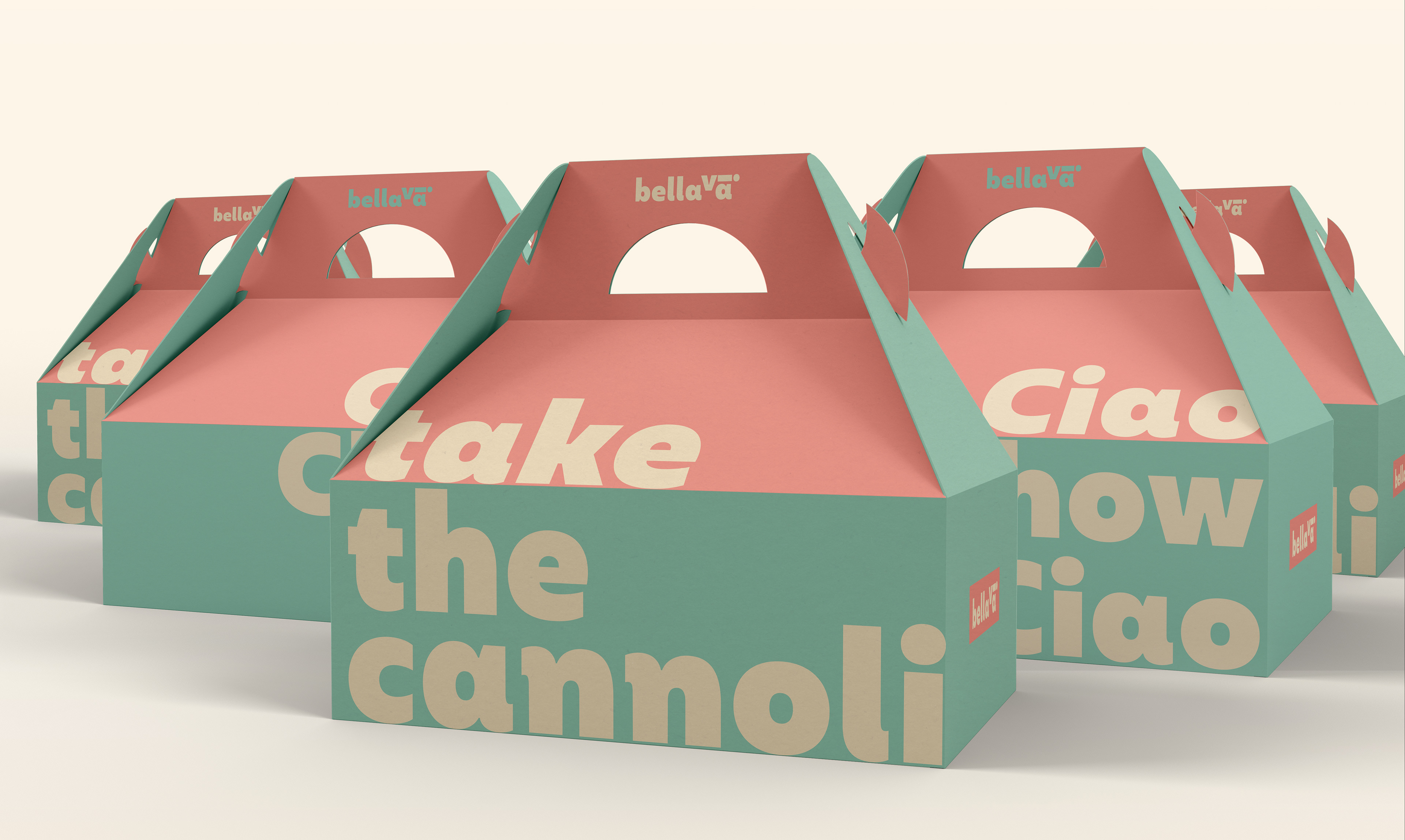
An expressive Italian culture inspires an expressive tone that serves as the brand voice.
The tone of voice also takes on a traditional Italian spin, playing on local expressions, small town whimsical phrases that mamma or nonna would say out of the blue or while strolling to the local bakery. Reminiscent of previous generations. Each one is meant to evoke a smile or transport you to a part of Italia you've yet to explore.

To be continued...