Papercuts Agency
Brand Strategy
Visual Identity
Verbal Identity
UI / UX Design
Motion graphics
Visual Identity
Verbal Identity
UI / UX Design
Motion graphics
Project Details
Papercuts is a new production house built to rethink how branded content gets made, sharper in intent, bolder in execution, and clearer in impact. In an industry overwhelmed by output, it was created to bring focus, craft, and conviction back into the process.
Born from the ambition of its founder, Founded by a filmmaker with a clear point of view, it was created to do more than just produce content , it exists to create work that demands attention and leaves a lasting impression.
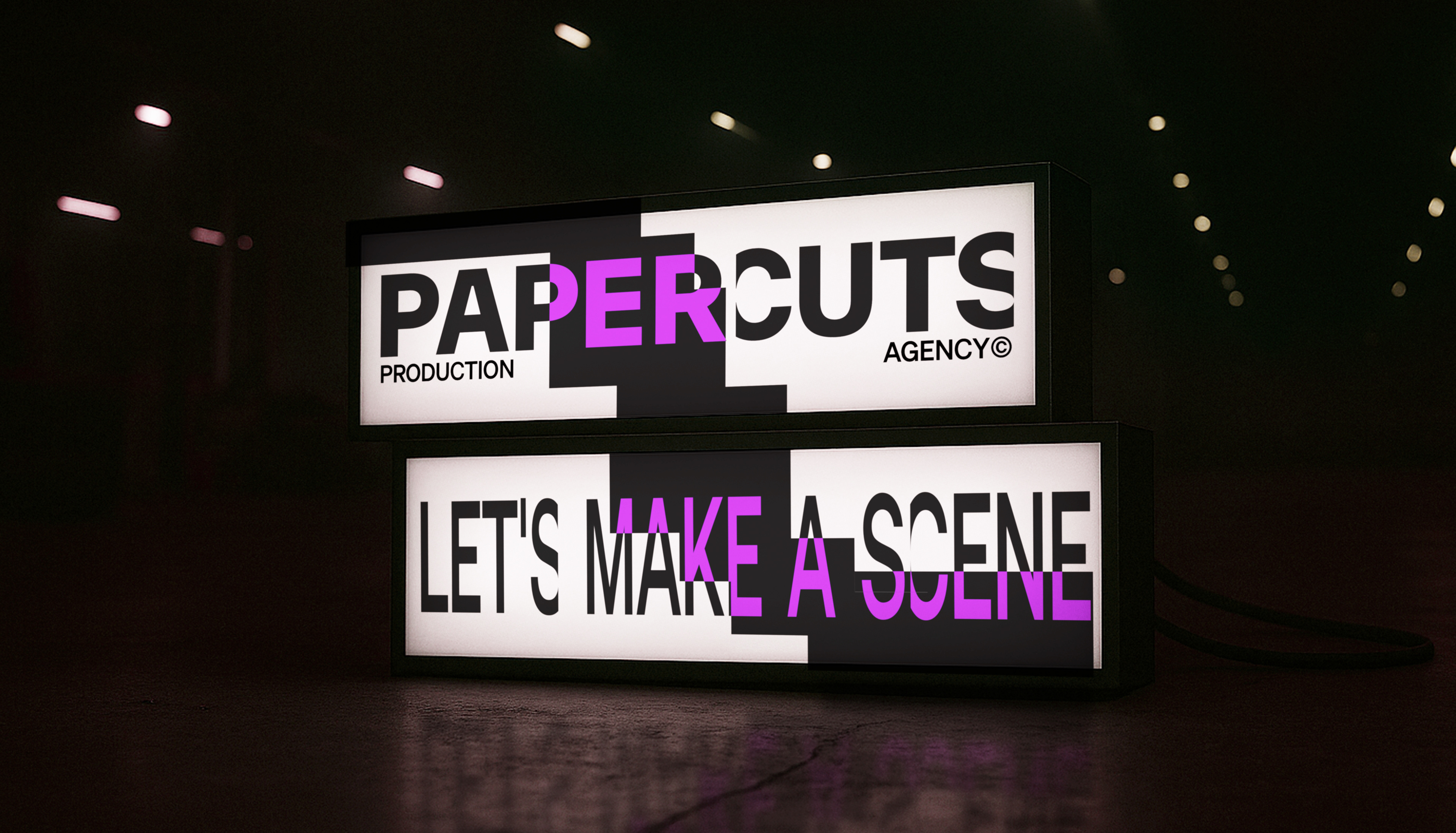
The name “Papercuts” comes from the idea of something deceptively simple, almost invisible, yet sharp enough to leave a mark. Like an actual paper cut, you often don’t feel it until it’s there. It’s a metaphor for the kind of work the agency aims to create: precise, unexpected, and impossible to ignore.
Identity System
In the darkroom, every image begins with a process of trial, testing, and controlled imperfection. Test strips are exposed in fragments to find the right balance. Prints are stacked, trimmed, overlaid. Paper is reused, cropped, and reassembled, not just to save material, but to chase the exact moment where light meets intent.
This process became the foundation for our visual language.
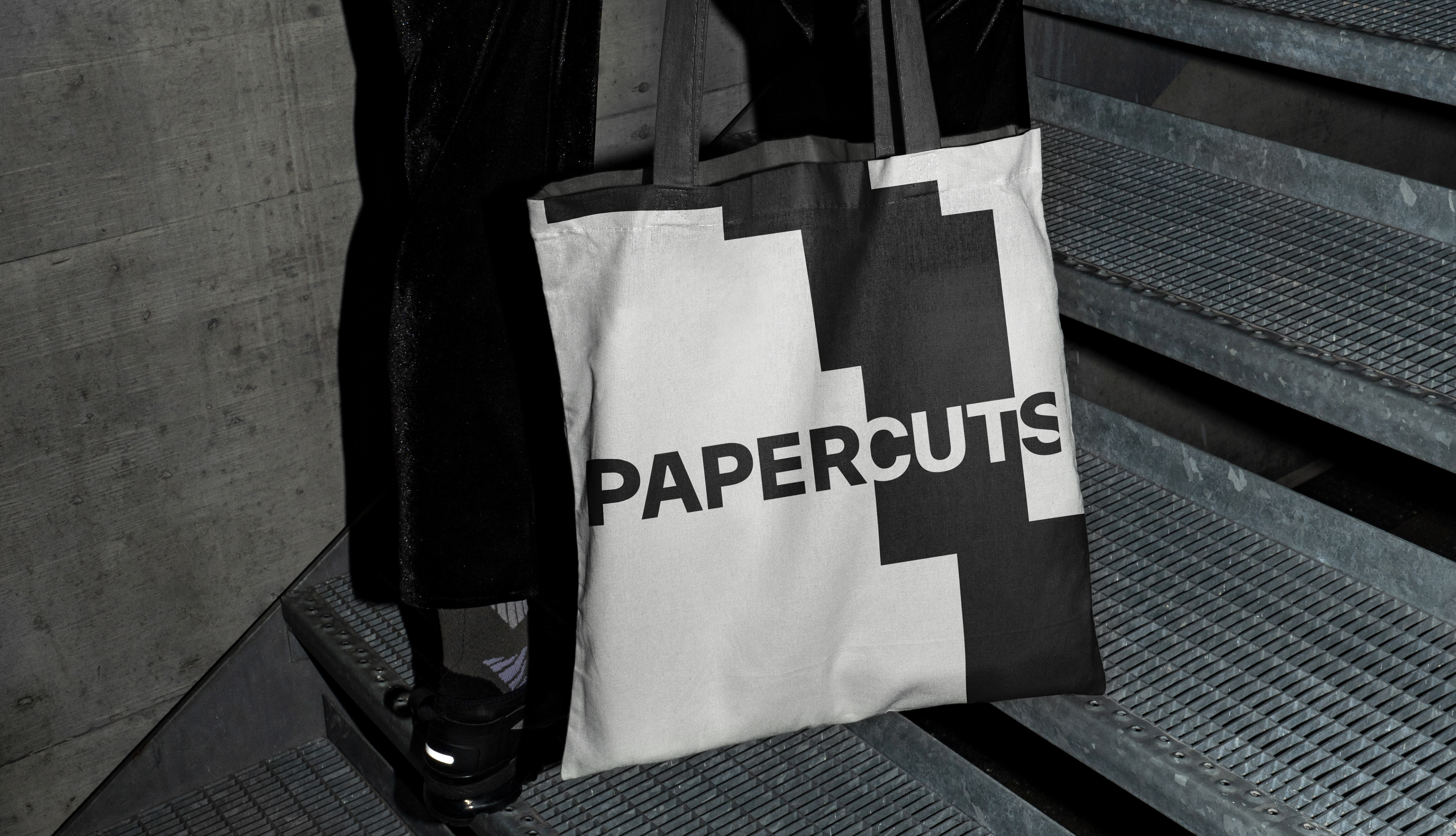
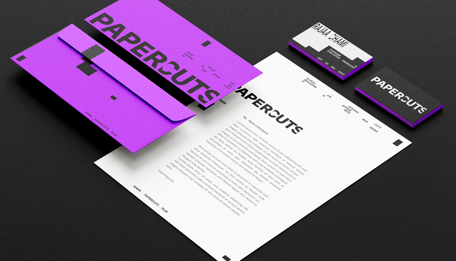
The overlapping strips in the Papercuts identity echo the hands-on choreography of the darkroom, where pieces are tested, stacked, obstructed, and revealed. Nothing is wasted. Every cut, every layer, every obstruction has purpose.
Each composition holds space for content, just like photo paper holds light. The stack is never random, it builds tension, suggests motion, and sets up the reveal.
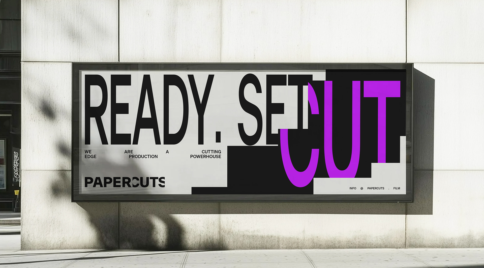
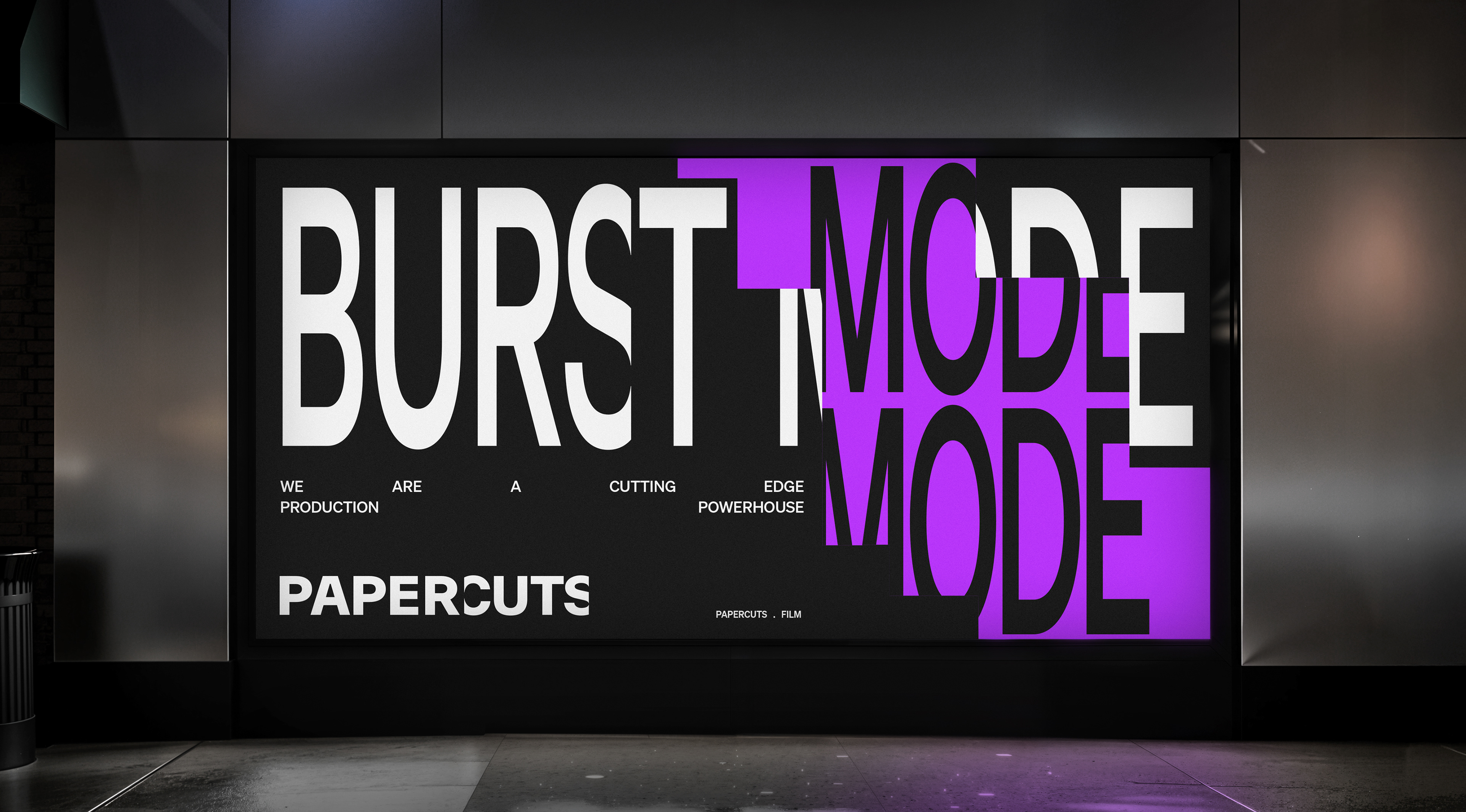
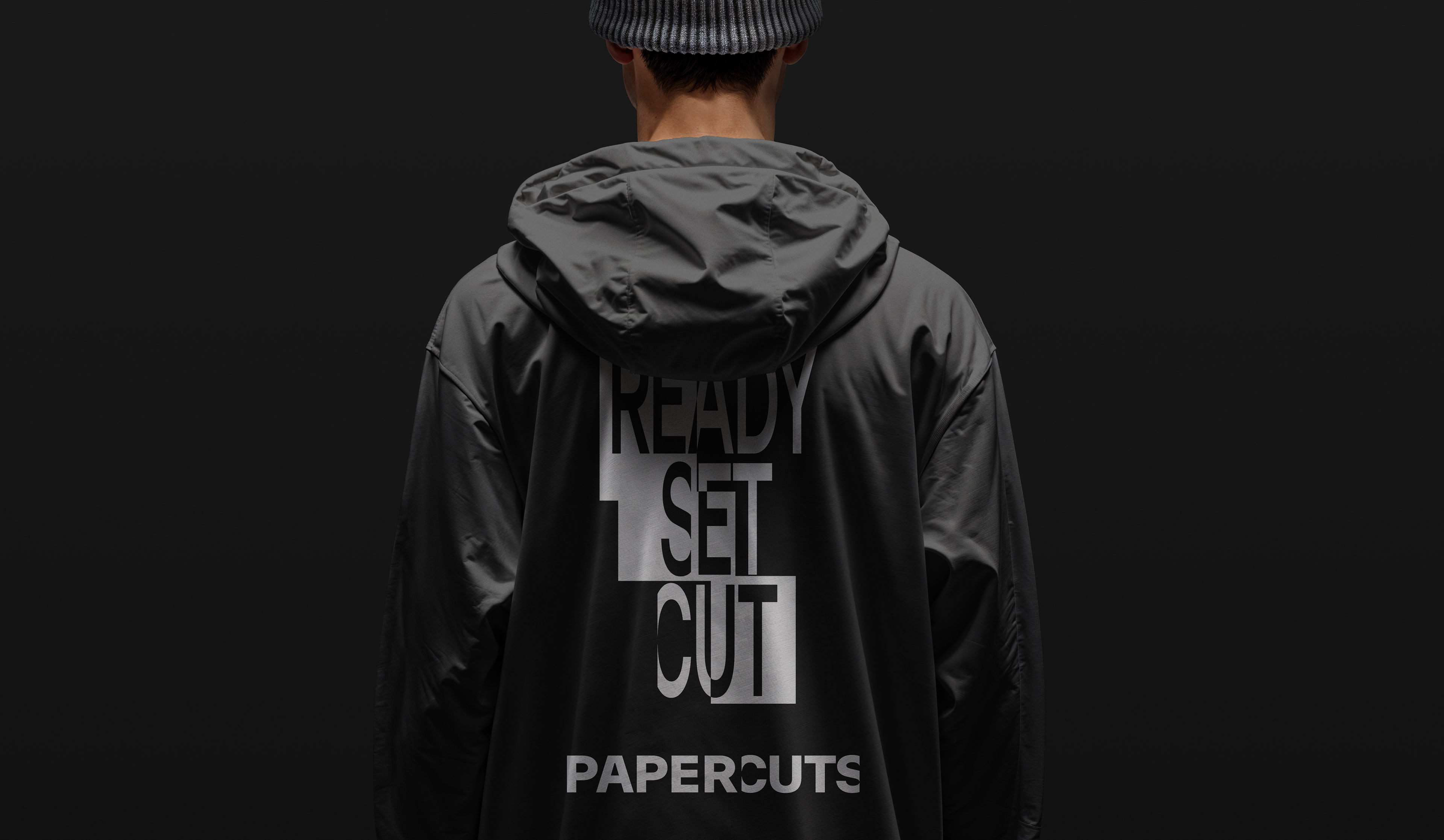
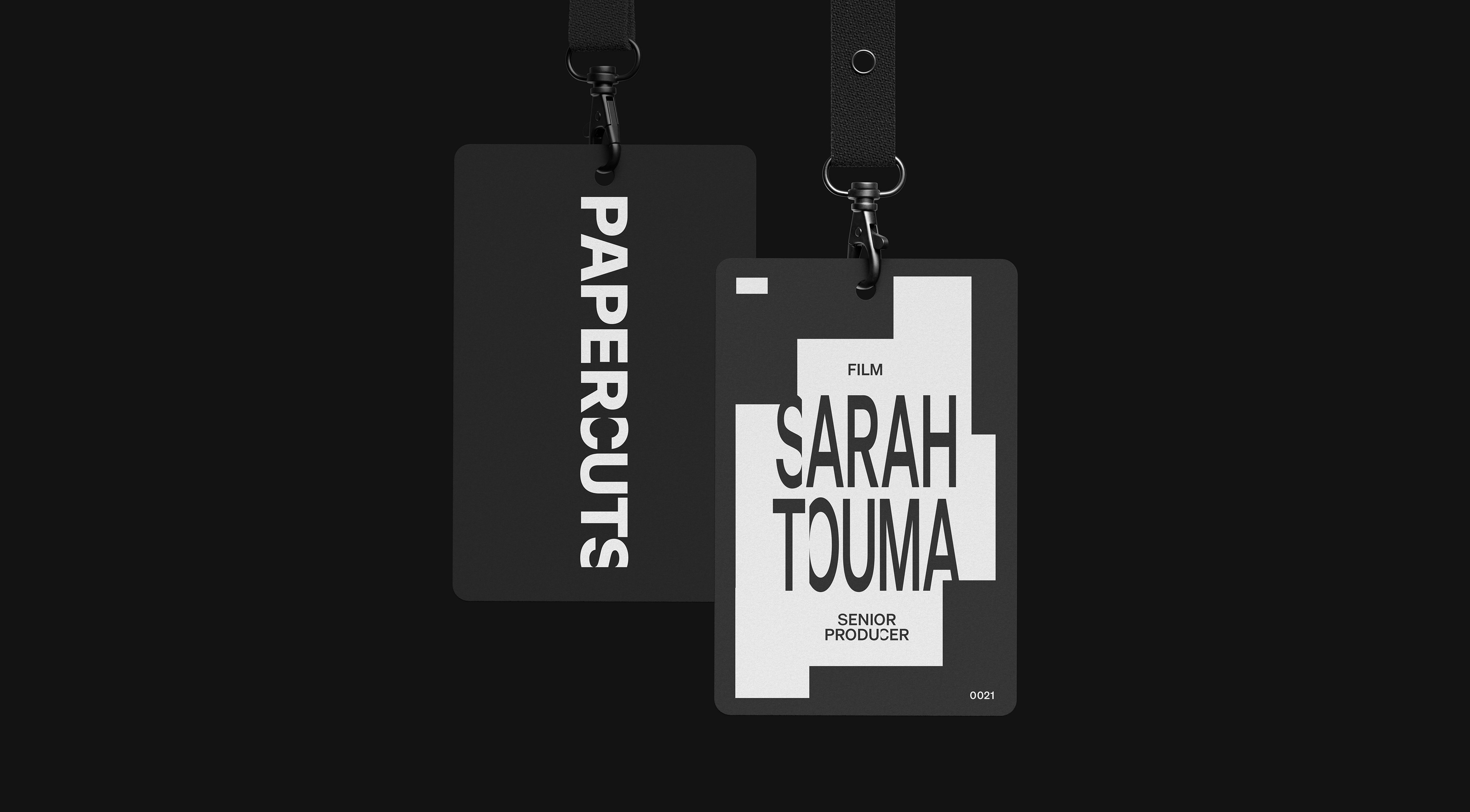
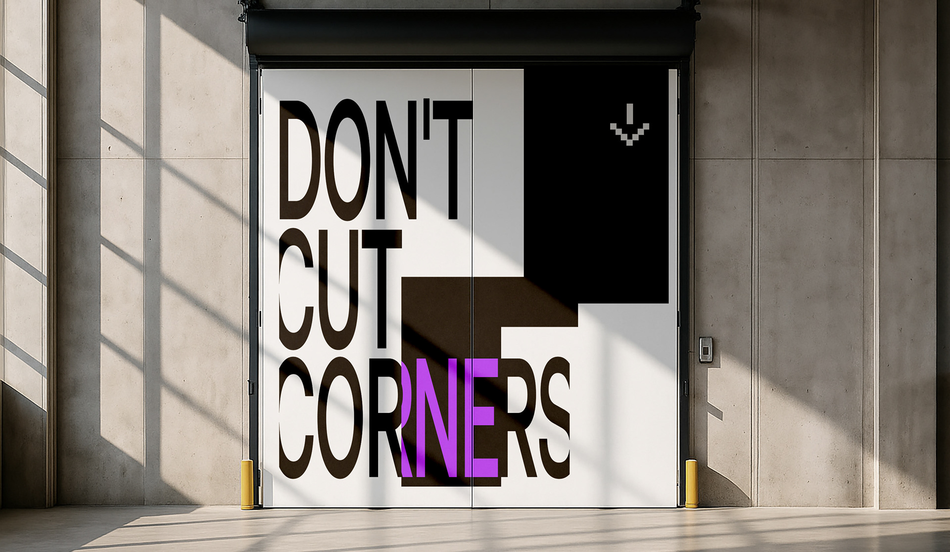
What emerges is a brand system that mirrors the creative process: tactile, intentional, and always cutting through, from exposure to clarity. The distinctive touch of the agency's creative process. A reflection of the owners determination to cut through the noise.
The typography treatment in Papercuts plays with distortion and interruption, stretching type like film ratios and slicing through letters with deliberate cuts. Inspired by the visual language that echoes anamorphic film projections and widescreen formats, the type feels cinematic, physical, and bold. It’s typography that doesn’t just communicate, it disrupts, framing every word as part of the brand’s visual narrative.


Credits
Executive Creative Director: Giovanni Borde
Designers: Giovanni Borde
Copywriting & Storytelling: Giovanni Borde
Animation & Motion: Giovanni Borde