Onic Telco
Brand Strategy
Naming
Visual Identity
Verbal Identity
Motion Graphics
UI & Visual Design
Naming
Visual Identity
Verbal Identity
Motion Graphics
UI & Visual Design
Project Details
ONIC was created as a new digital-first telecom brand for a generation whose lives move continuously between connectivity, entertainment, social interaction, discovery and everyday digital services.
Launching initially in Pakistan, the ambition was to build a brand that could connect with a younger audience while establishing a very different presence from traditional telecommunications companies.
This meant thinking beyond the conventions of a telecom identity. ONIC needed to feel native to the environments where its audience already spent their time, and flexible enough to grow with an expanding ecosystem of digital services.
Identity System
he identity takes its behaviour from the way we navigate the digital world.
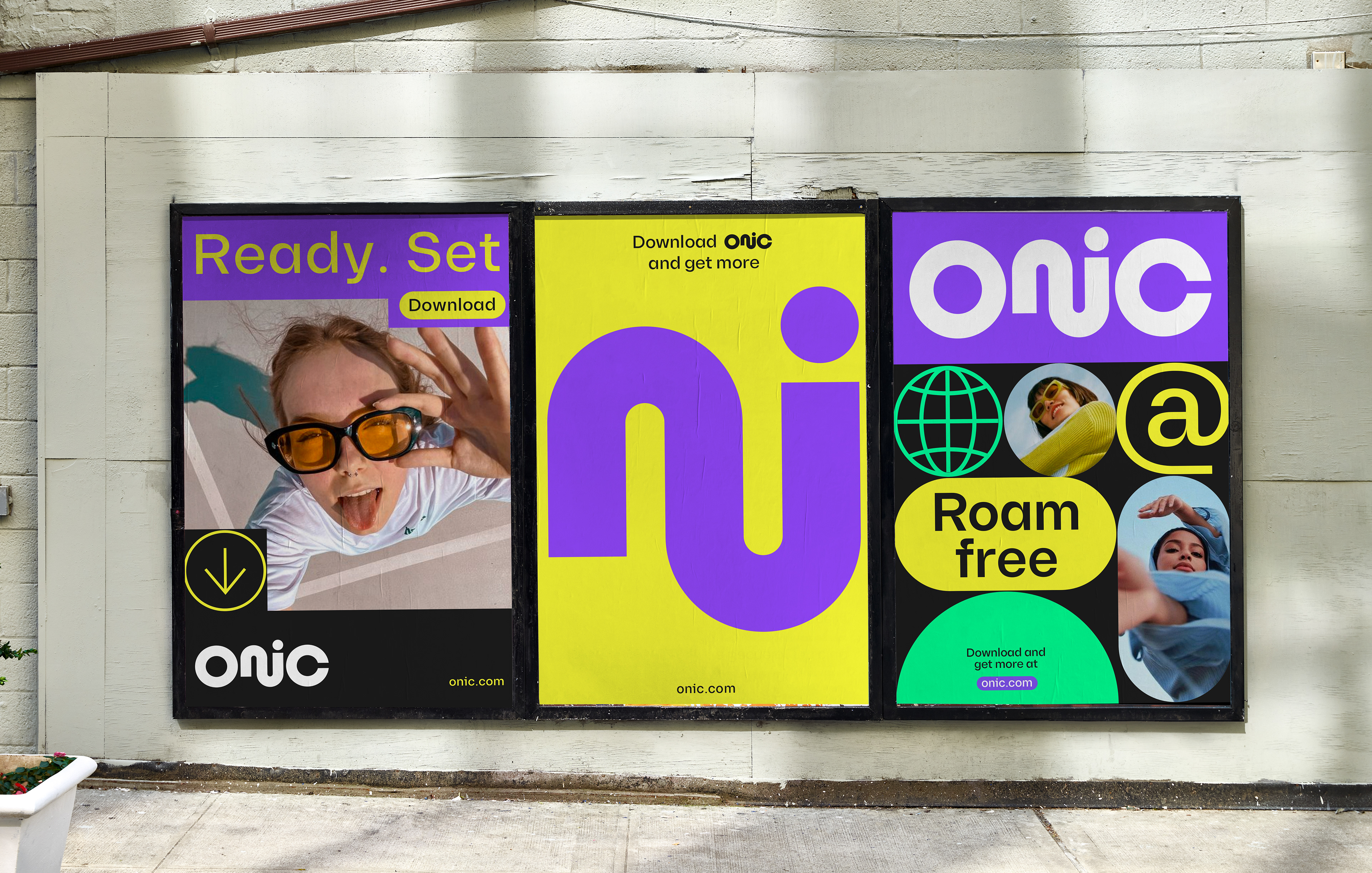
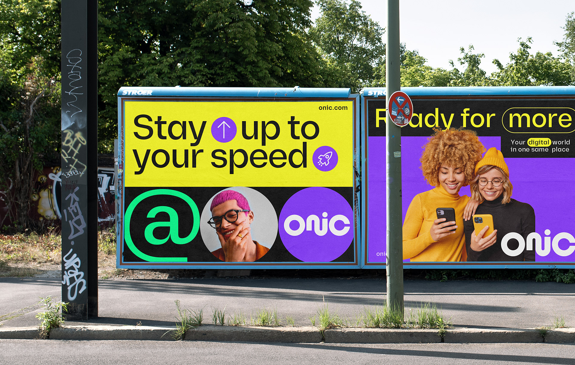
Content rarely exists as a single fixed frame. We scroll, swipe and move between windows of information that appear, overlap, disappear and reveal something new. That continuous movement became the basis of ONIC's visual language.
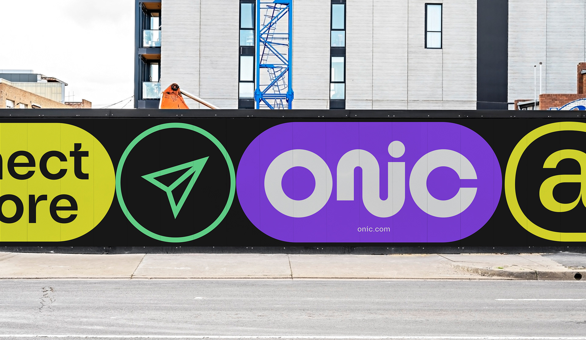
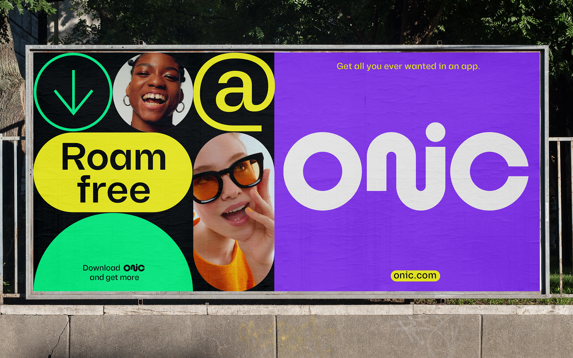
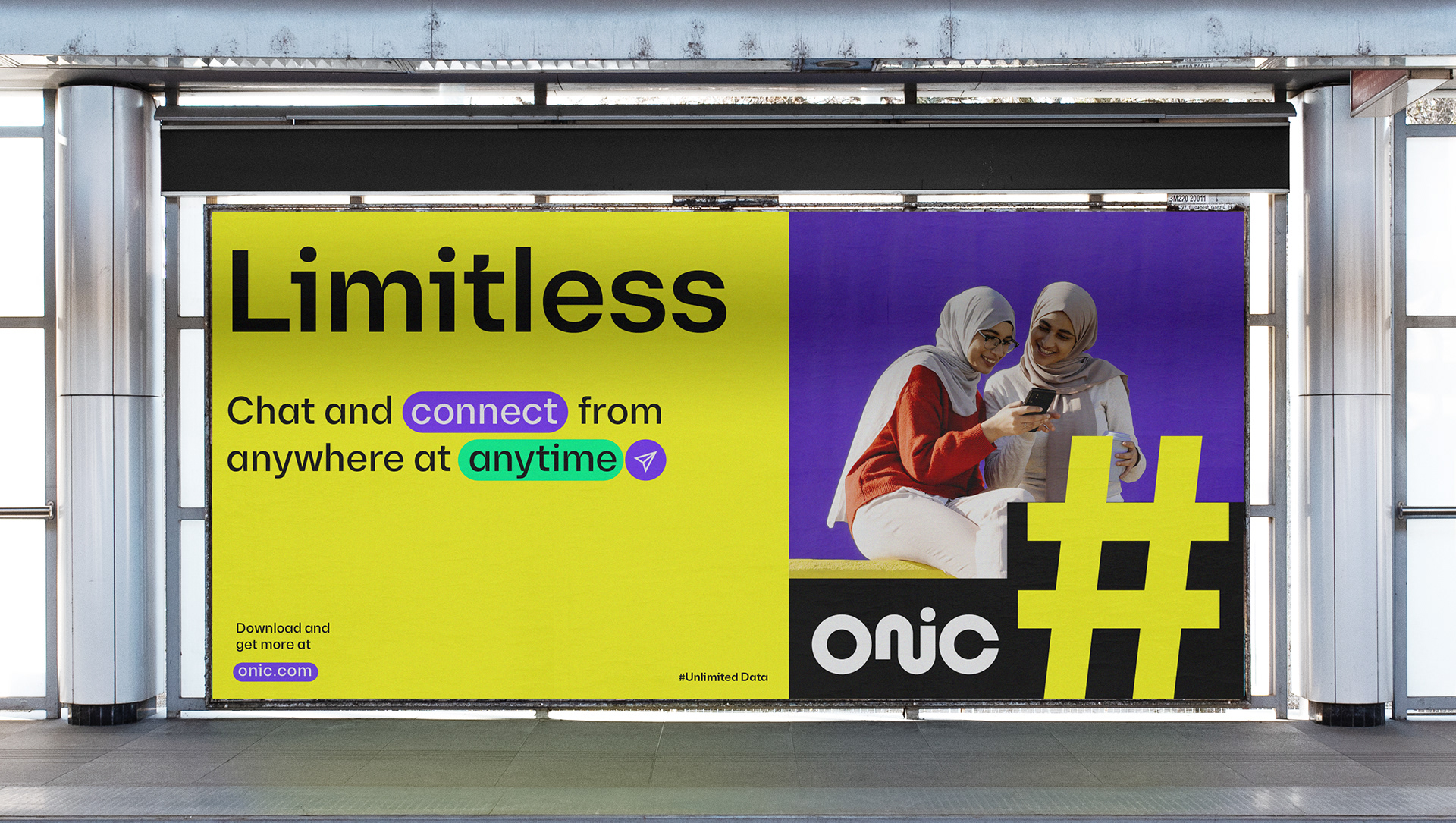
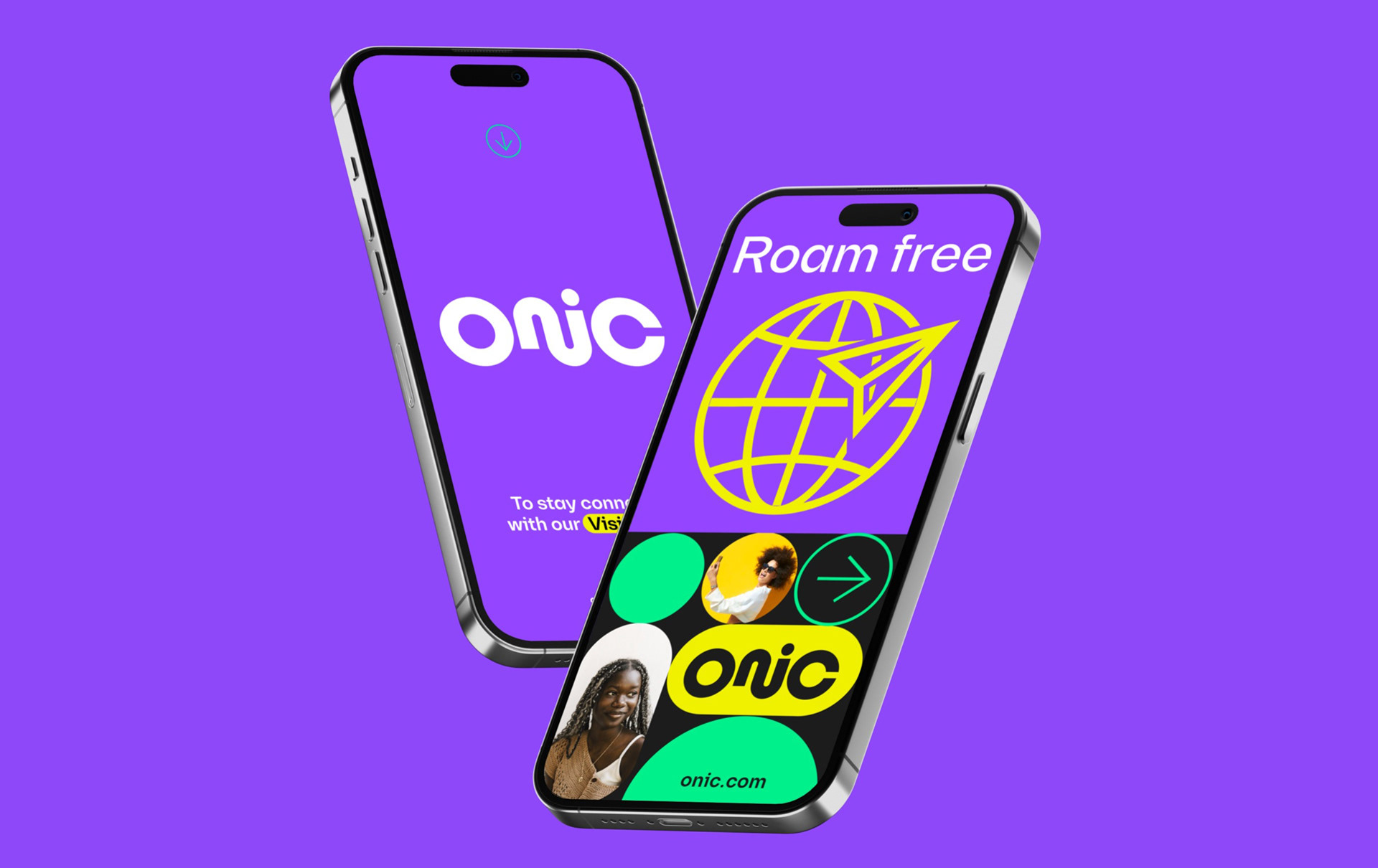
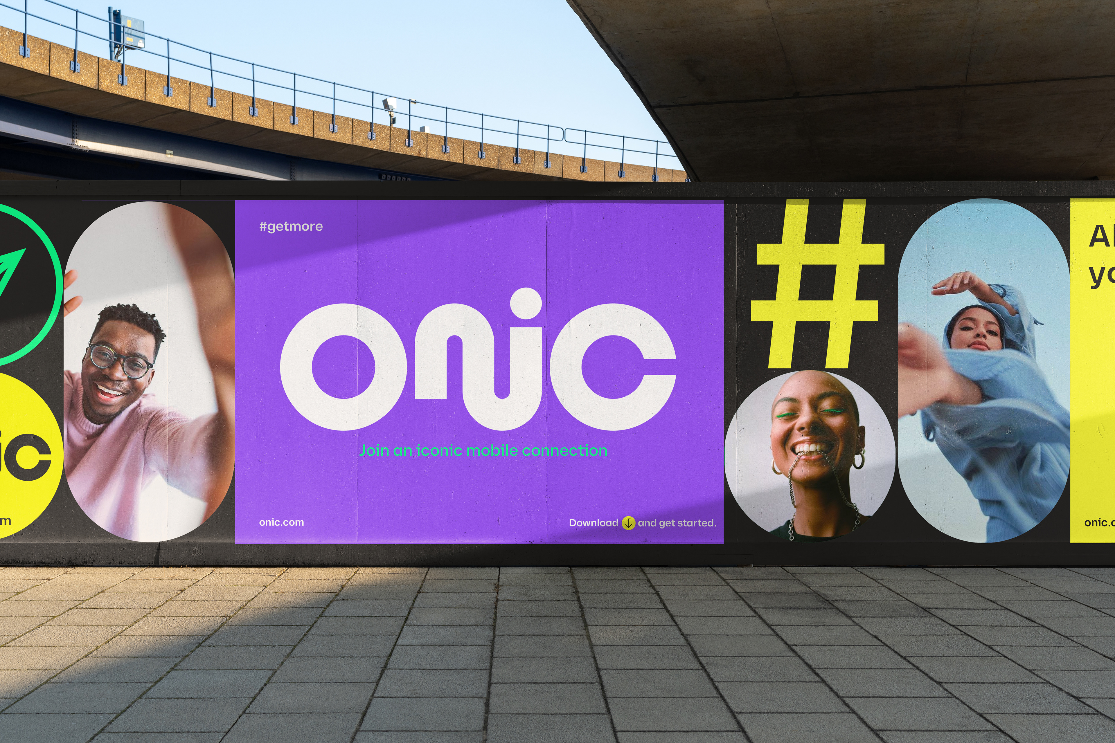
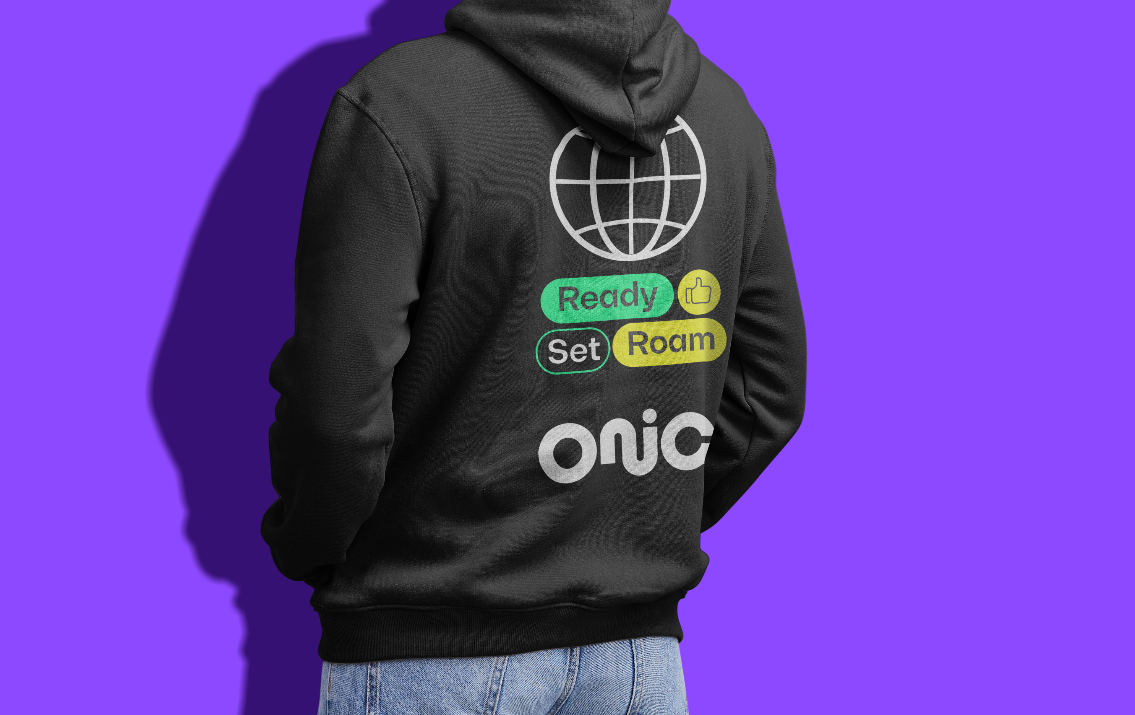
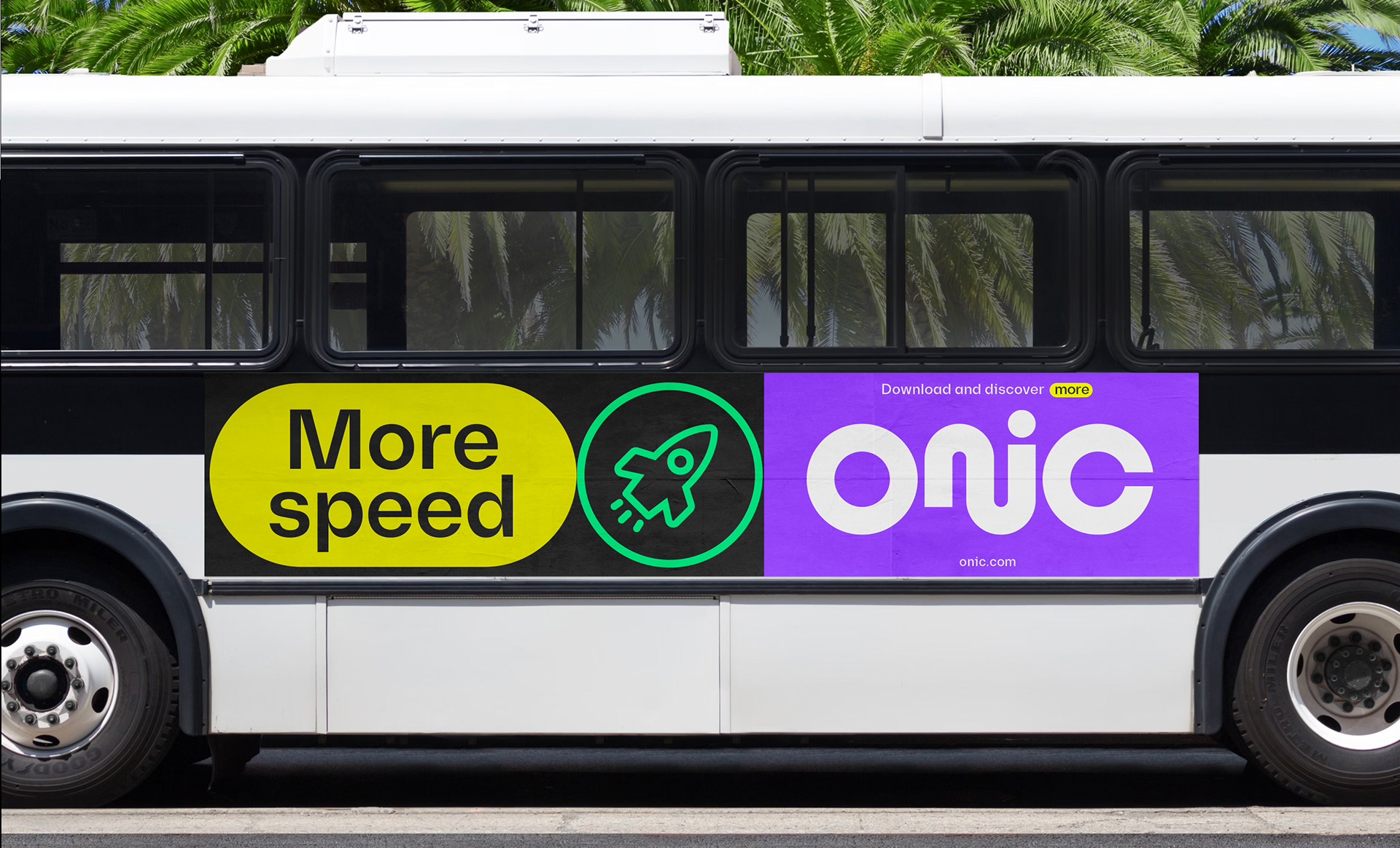
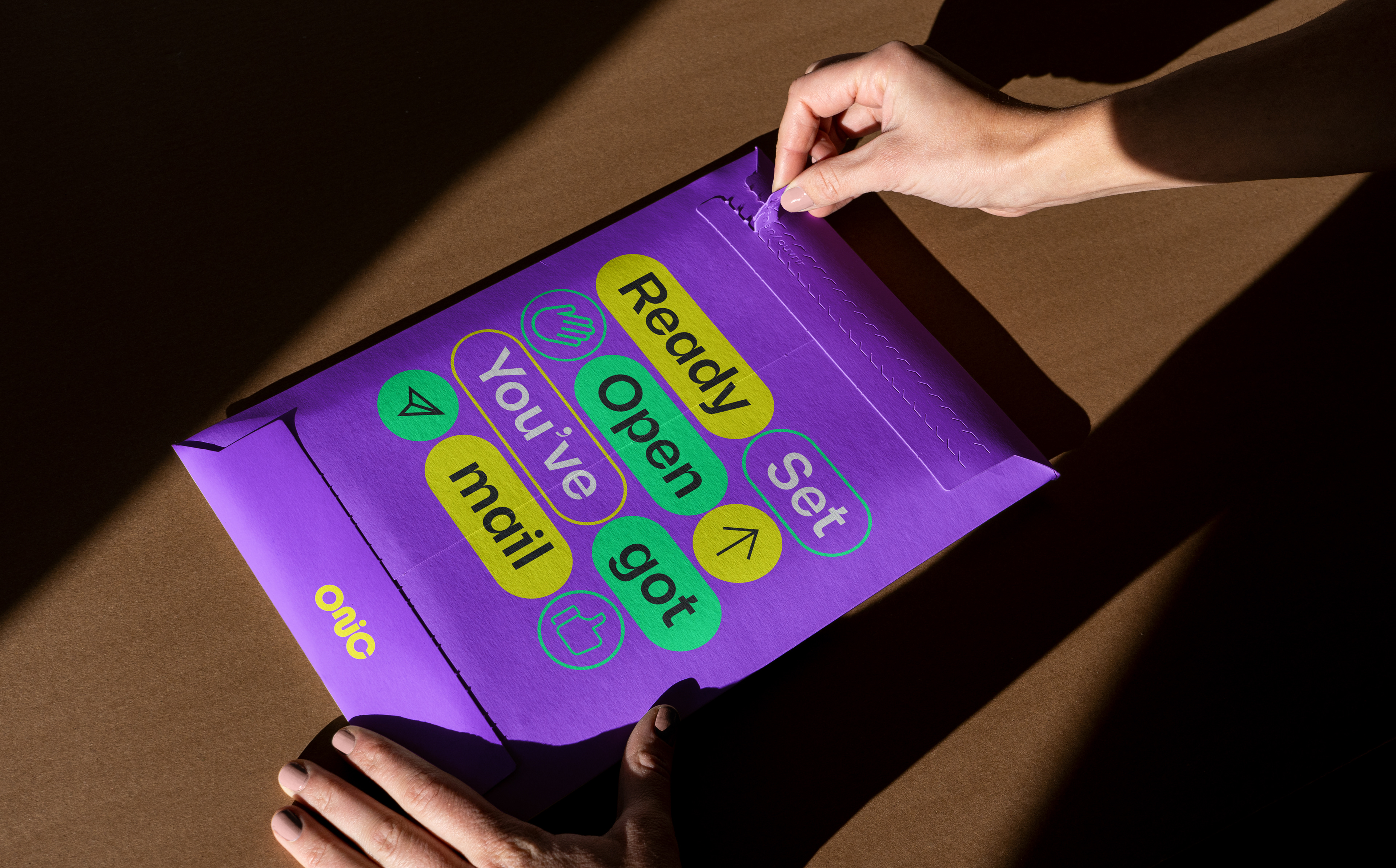
Simple geometric windows create a flexible framework for imagery, typography and information. They can expand, crop, stack and move across the frame, allowing content to continually change while the behaviour of the brand remains recognisable.
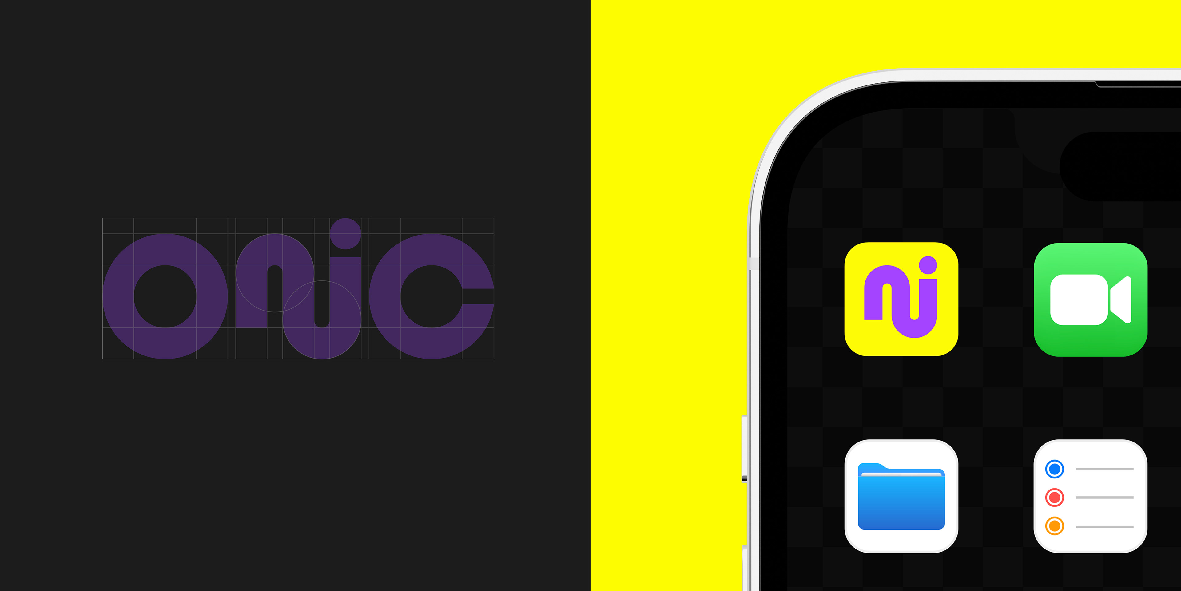
The logo follows the same principle. The connection between the N and I creates a continuous form that reinforces the sense of movement running through the wider identity.
Together, these elements create a brand designed to behave like the environment it belongs to: continuous, responsive and always moving.
Credits
Creative Director: Giovanni Borde
Designers: Giovanni Borde, Maria Saade
Copywriting & Storytelling: Priya Naidoo.
Animation & Motion: Giovanni Borde.