LIFT HOTEL
Lift Hotels is a concept boutique hotel developing in Dubai, UAE. As a new competitor in the High-End Boutique hotels, Lift is aiming to be ahead of its competitors by offering a disruptive, and transformative view on boutique hotels. Aimed to attract high-spirited, young millennials and entrepreneurs, the hotel offers an ever-changing theme that evolves every 6 months to reshape the hotel constantly.
Based on its different disciplines: Art, Music, Food, Mixology, and Fashion. Lift hotels invites current and new talent to be part of this dynamic. Building on the idea that the hotel is not only a place created for guests to spend the night, but also a hub for artist to take over the scene. A platform for Dubai's best and a differential within the hotel sector.
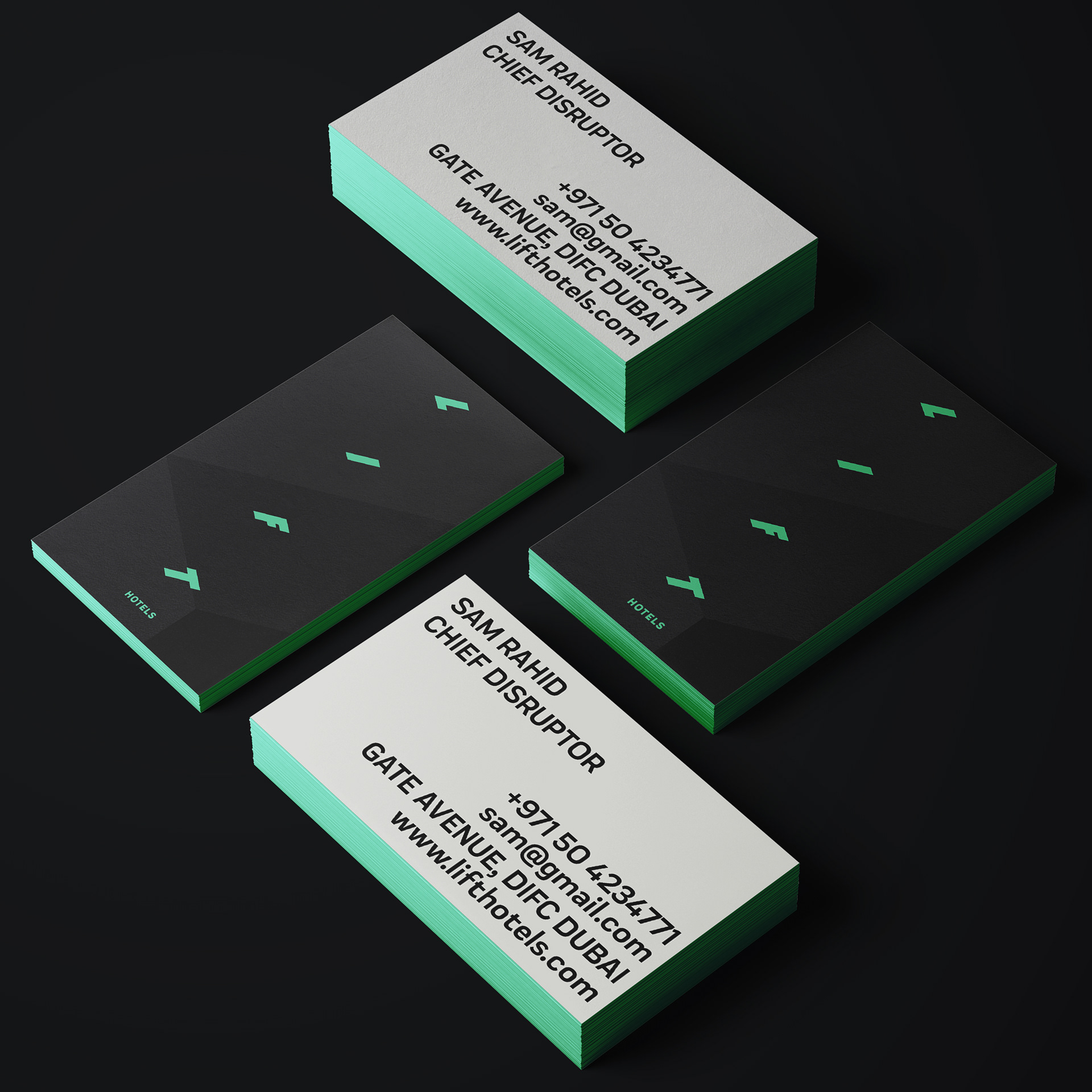
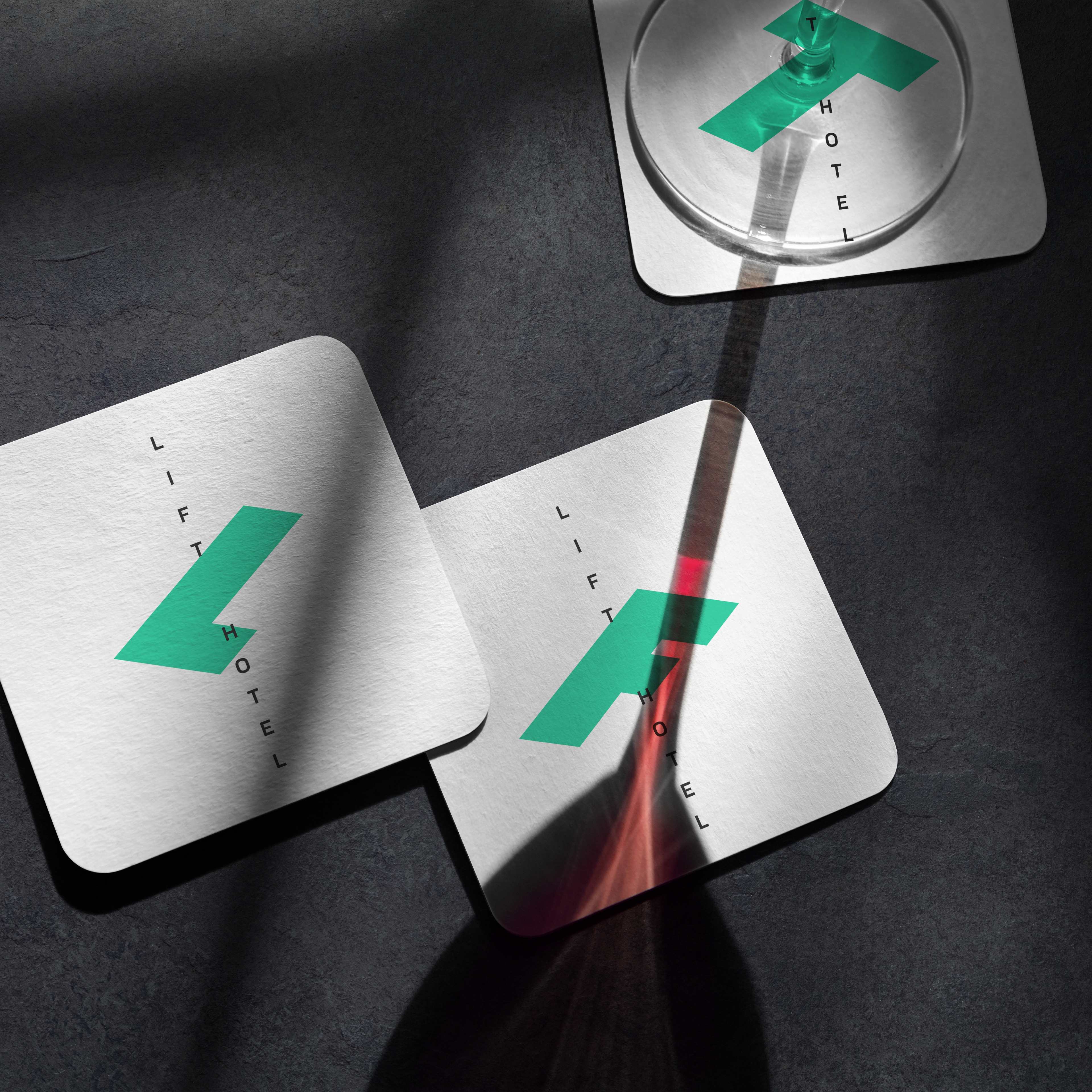
The different levels of the hotel come together to create the unique experience of LIFT. This was the inspiration behind the logo structure and design strategy that helped unify the brand identity concept with the brand promise.
The brand identity had to reflect the nature of the hotel and it's offering by being ever-changing itself. We created a logo and visual identity that showcased the brand's promise of ever-changing and uplifting, and would be flexible and transformative as the hotel itself.
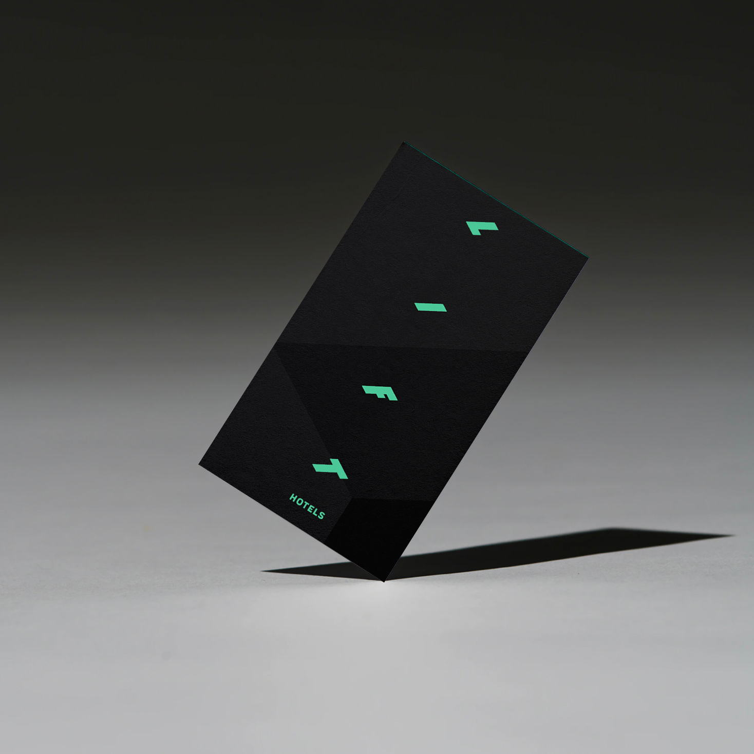
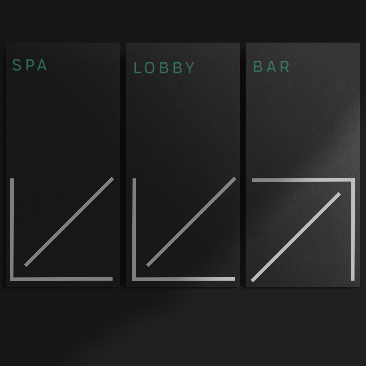
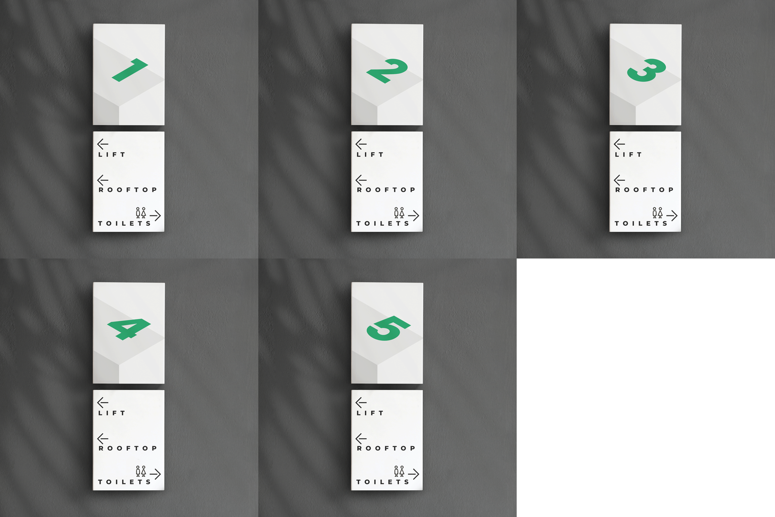
The logo structure represented the different levels of the hotel, in a metaphorical sense and in a real physical sense. A vertical structure that represent the floors of the hotel. As the continuous transformation of the hotel, these layers are the device that reveal the content in a dynamic and unexpected way.
At the same time, the logo is enhanced through digital and social media through an expression of its own. As the main element to drive the unexpected nature of the hotel is its lift, or elevator. It takes the guests through a journey that reveals as the doors open. This serves as an inspiration for a flexible and adaptable logo system that works at the same time as a container for the communication, a device that represented the principle of journey and reveal.
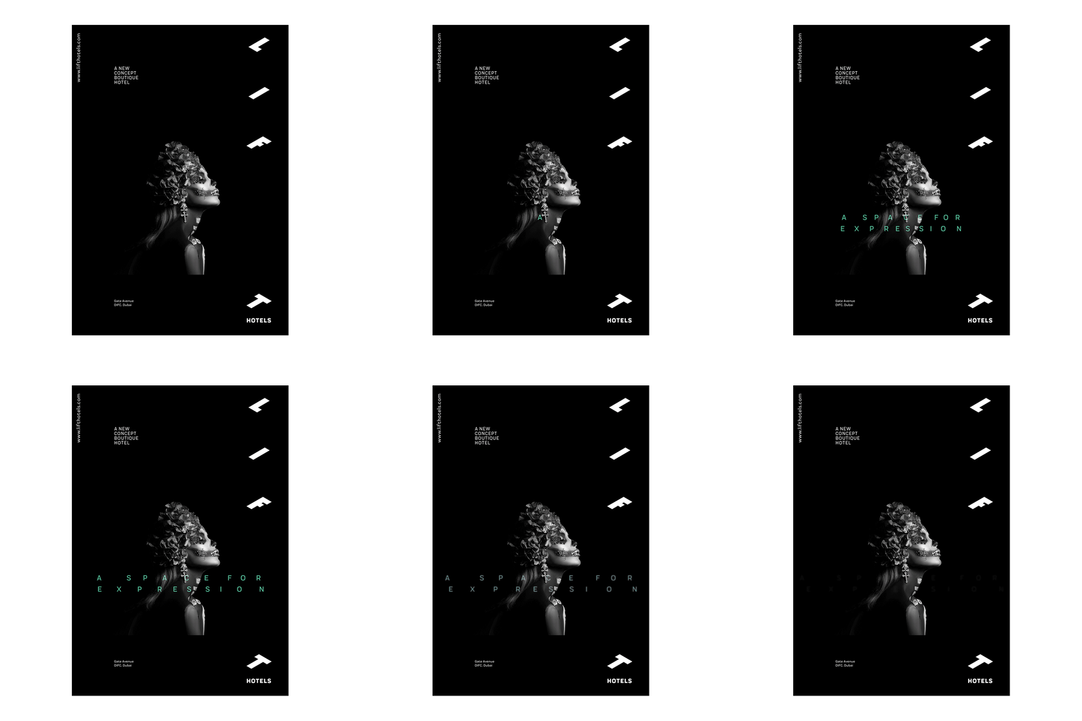
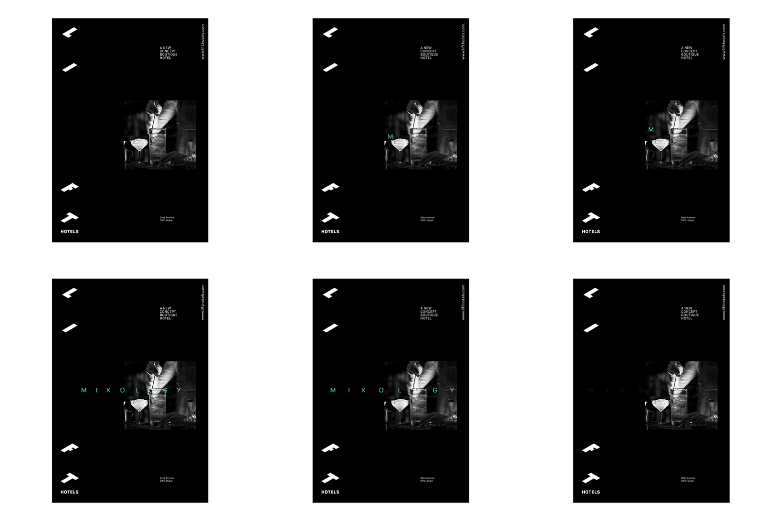
The horizontal reveal from opening sliding elevator doors serves as inspiration for content reveal in social media and digital brand expression.
Content and Typography serves as an anchor to the brand communication. Reinforcing the metaphor as they reveal in a horizontal expansion. Adding to the signature of the brand's visual communication.
As a brand that would live in multiple channels, we needed a system that could be adaptable and transformative throughout. One that harbors the many different themes the hotel had to offer, revealing the brand essence and personality while at the same time keeping the stylish nature of the brand itself.
