Beperly
Packaging Design
Visual Identity
Verbal Identity
Iconography
Animation & Motion
Visual Identity
Verbal Identity
Iconography
Animation & Motion
Project Details
Beperly began with a personal ambition: to create a brand under the name of the founder’s champion racehorse , Beperly. From the outset, this wasn’t about launching another vitamin drink. It was about transforming that name , and the energy behind it , into a brand that felt relevant, expressive, and unmistakably distinct.
The goal wasn’t to sell functionality. It was to craft a brand with presence. Something that would connect with a younger generation not just through what it says, but through how it behaves, engaging, energetic, and culturally in motion.
At the heart of Beperly is the horse, Not as a design motif but rather a living metaphor. A symbol of defiance, dynamism, and momentum. Our strategy was to personify that energy, and build a design system that mirrors the horse’s behavior, unpredictable, animated, full of expression.
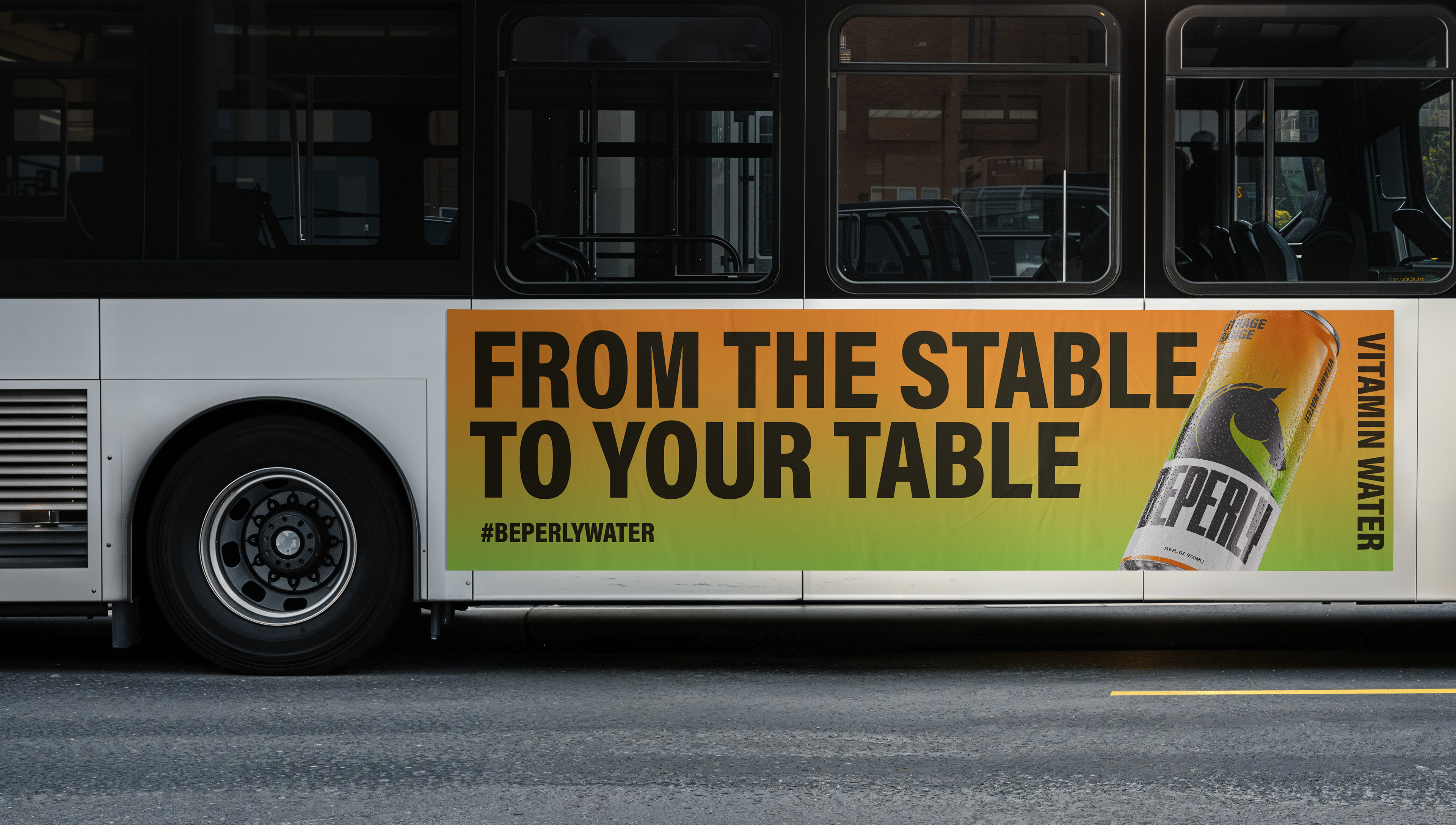
We moved away from conventional health and wellness cues, choosing instead to create a brand that feels alive. One that moves, reacts, and plays, in shelf environments, digital platforms, and everyday culture.
The outcome is a brand built on attitude, one that feels immediately relevant and designed to be part of how people speak, move, and express themselves.
Identity System
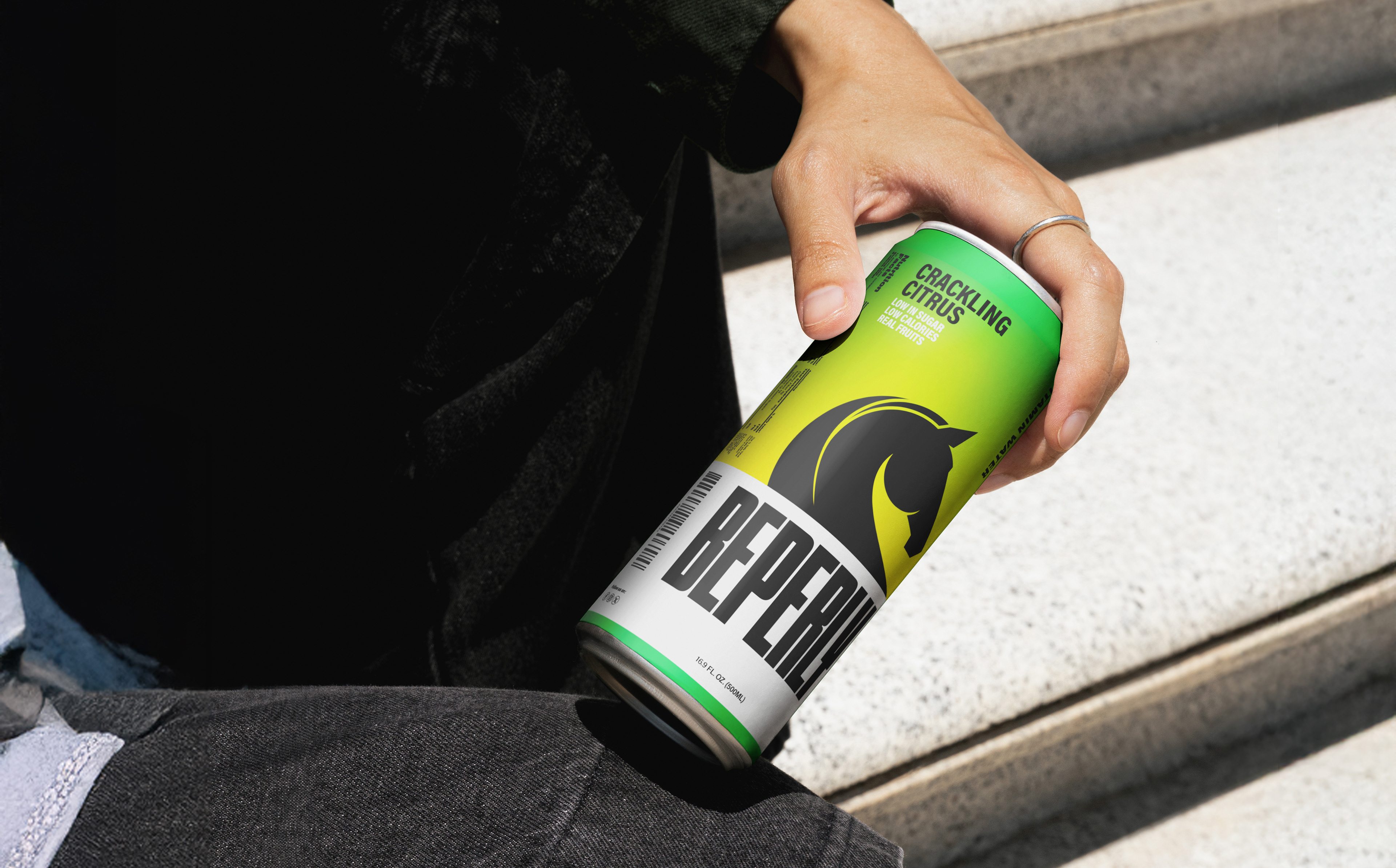
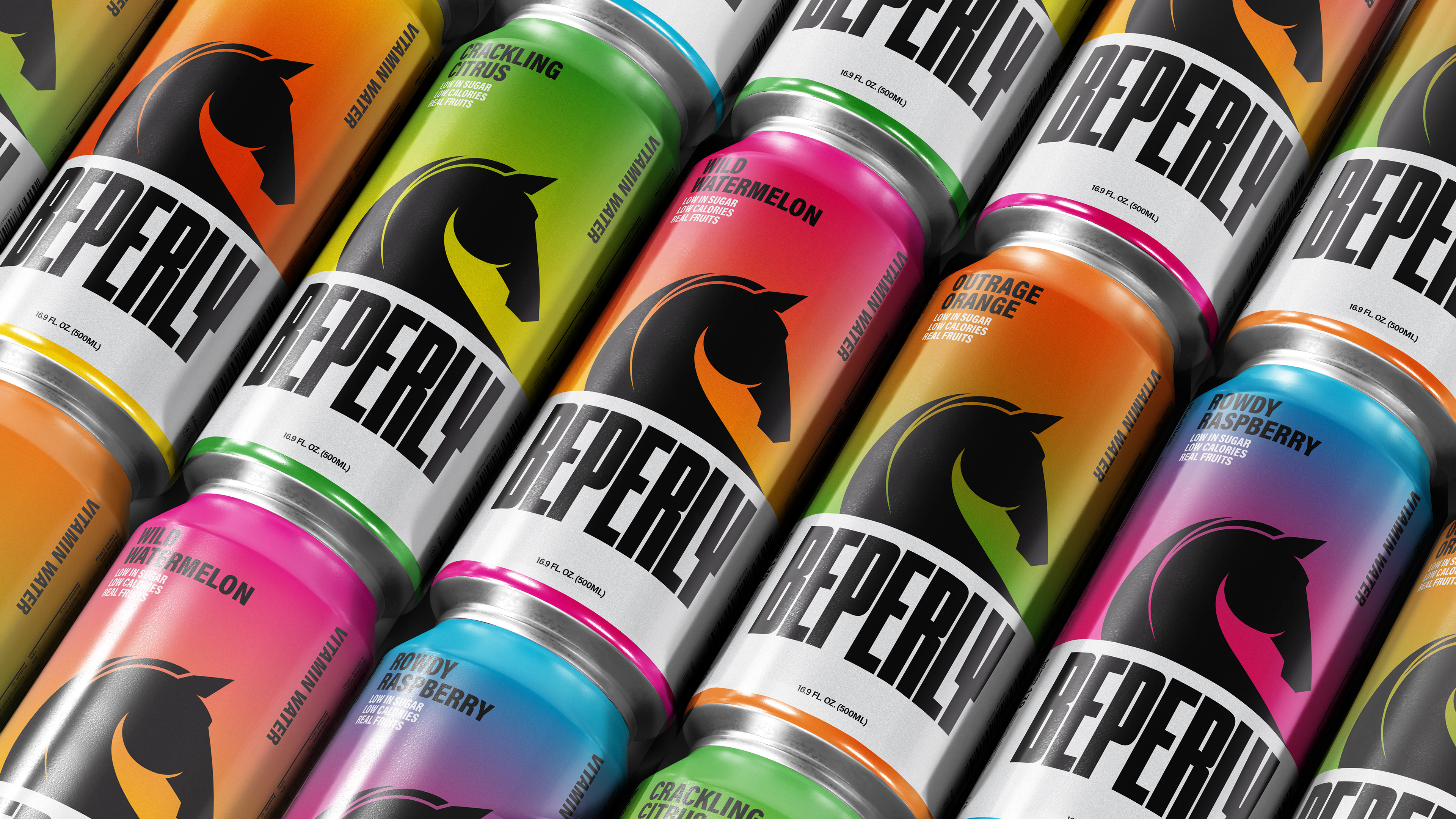
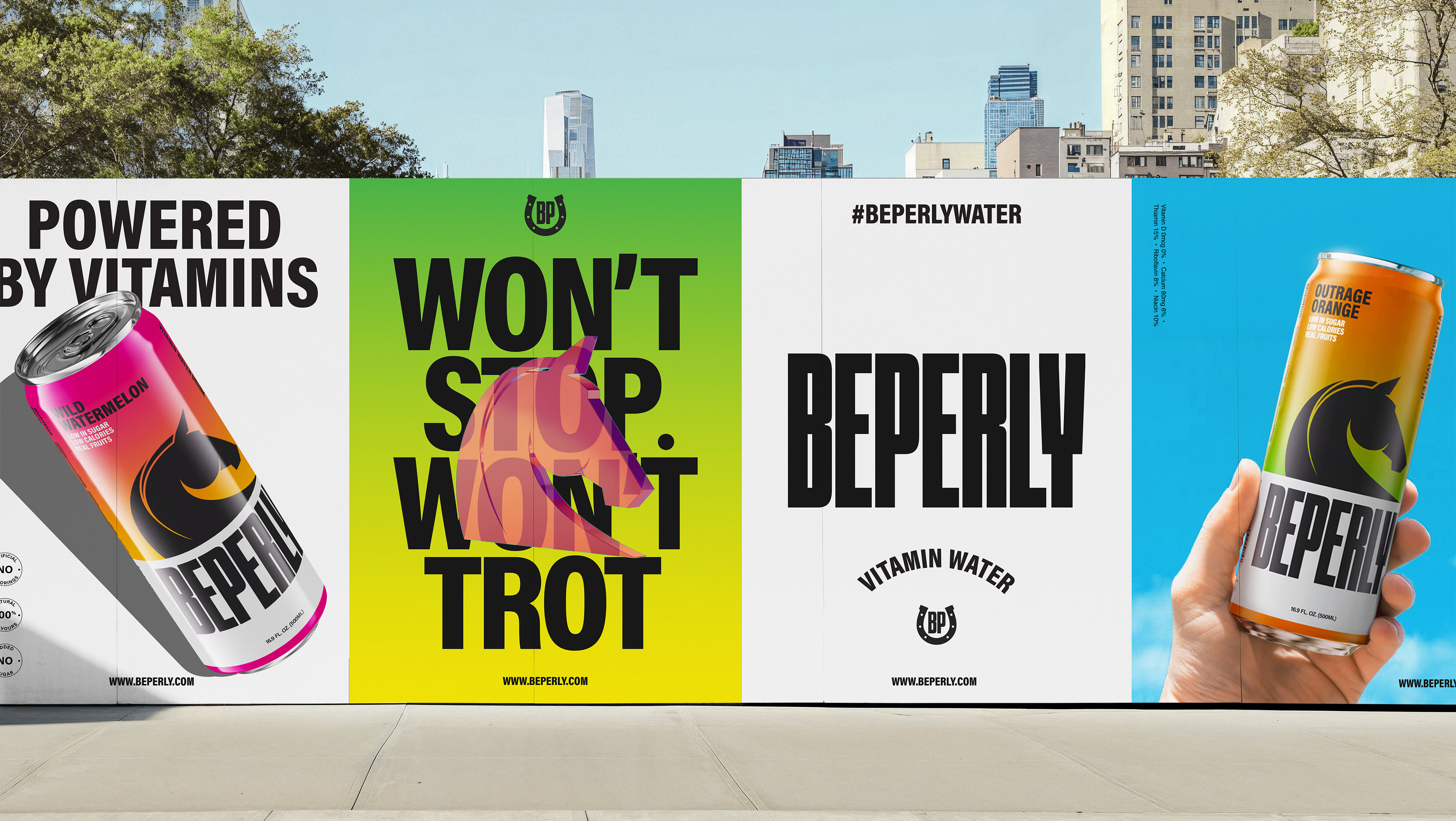
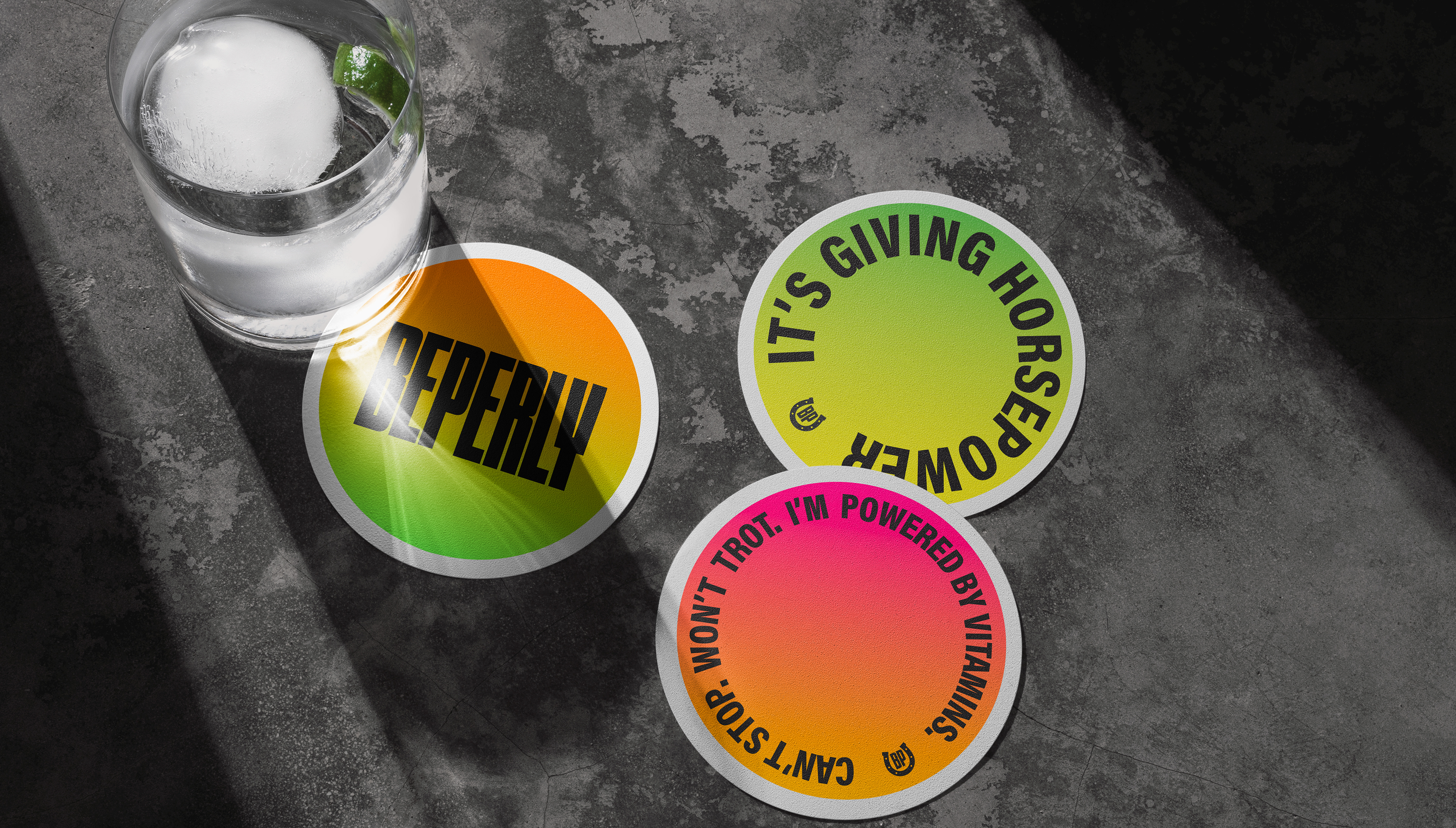
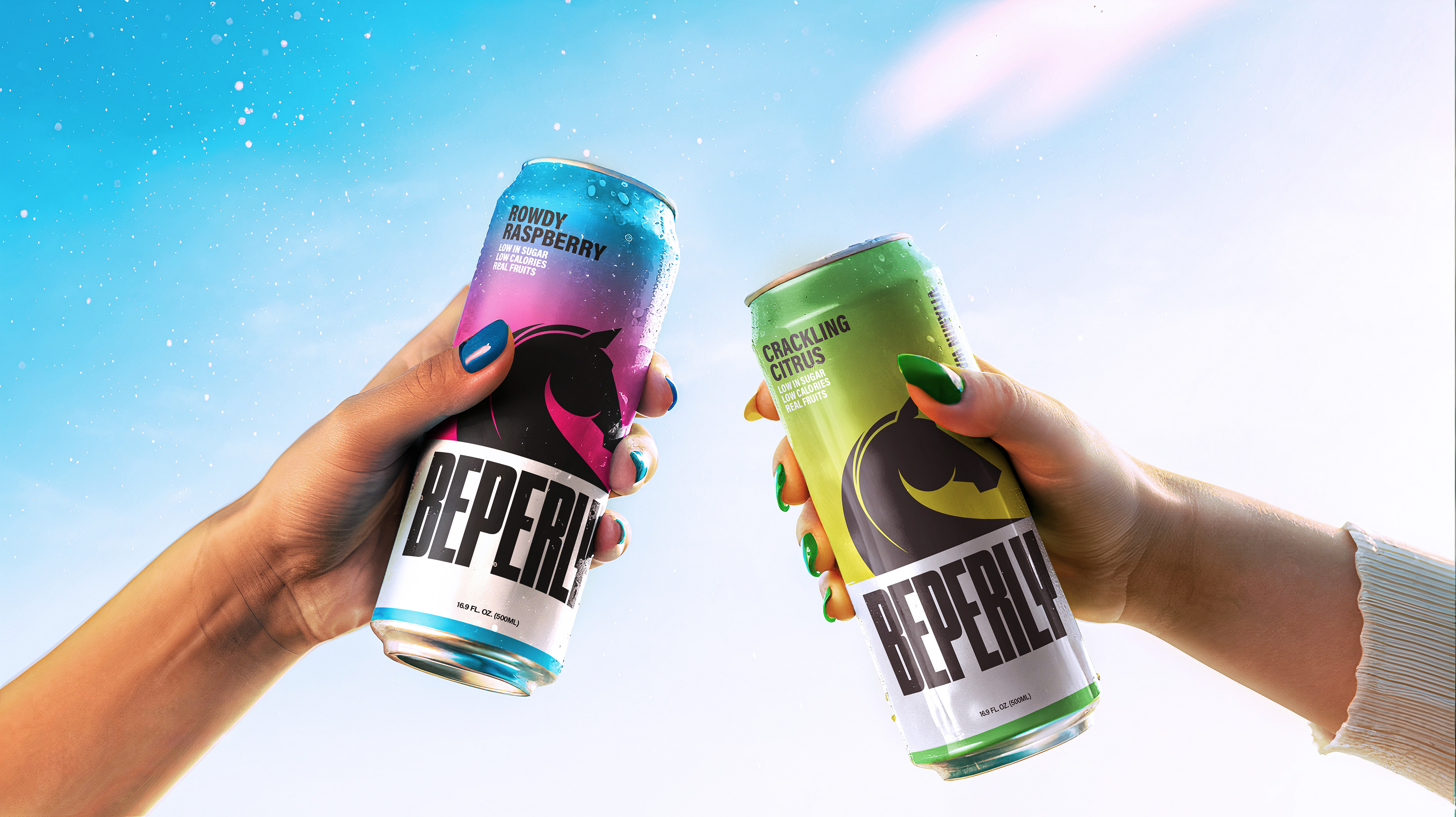
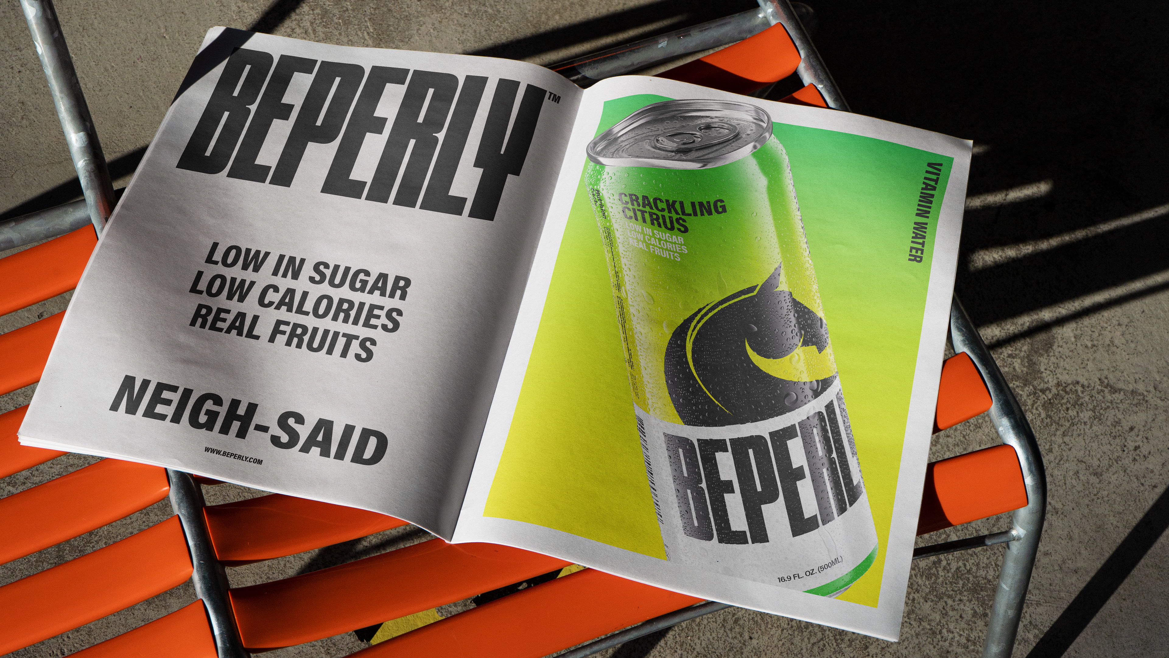
The identity is shaped around the horse’s spirit , carried through motion, personality, and a sense of ever-present energy. This idea comes to life through a bold packaging system featuring gradient-rich backgrounds and expressive horse illustrations. Each horse represents a distinct mood , outrage, roudy, wild, prancing, giving the brand adynamic emotional range.
The wordmark acts as a stabilizing force grounding the system and delivering impact.
The brand expands into a digital-first universe. The horses animate into short loops, used as GIFs, stickers, and social assets, turning personality into interaction reinforcing the brand’s origin without being literal.
Beperly is designed to behave. Every element, from color to motion to tone, works as part of a larger system that expresses energy, relevance, and individuality. cementing a bold and confident presence.
By treating the horse as more than inspiration, as a design logic, we created a brand that’s felt. One that exists with momentum, speaks in the right language, and invites its audience into a world they want to be part of.

Credits
Executive Creative Director: Giovanni Borde
Design Director: Elsa Antoun
Designers: Giovanni Borde, Elsa Antoun. Maria Saade. Omnia Elhusseny
Copywriting & Storytelling: Priya Naidoo. Giovanni Borde
Animation & Motion: Giovanni Borde. Camilo Rojas